A Tower
Vanguard Properties
Brand Identity
Editorial Design
2018
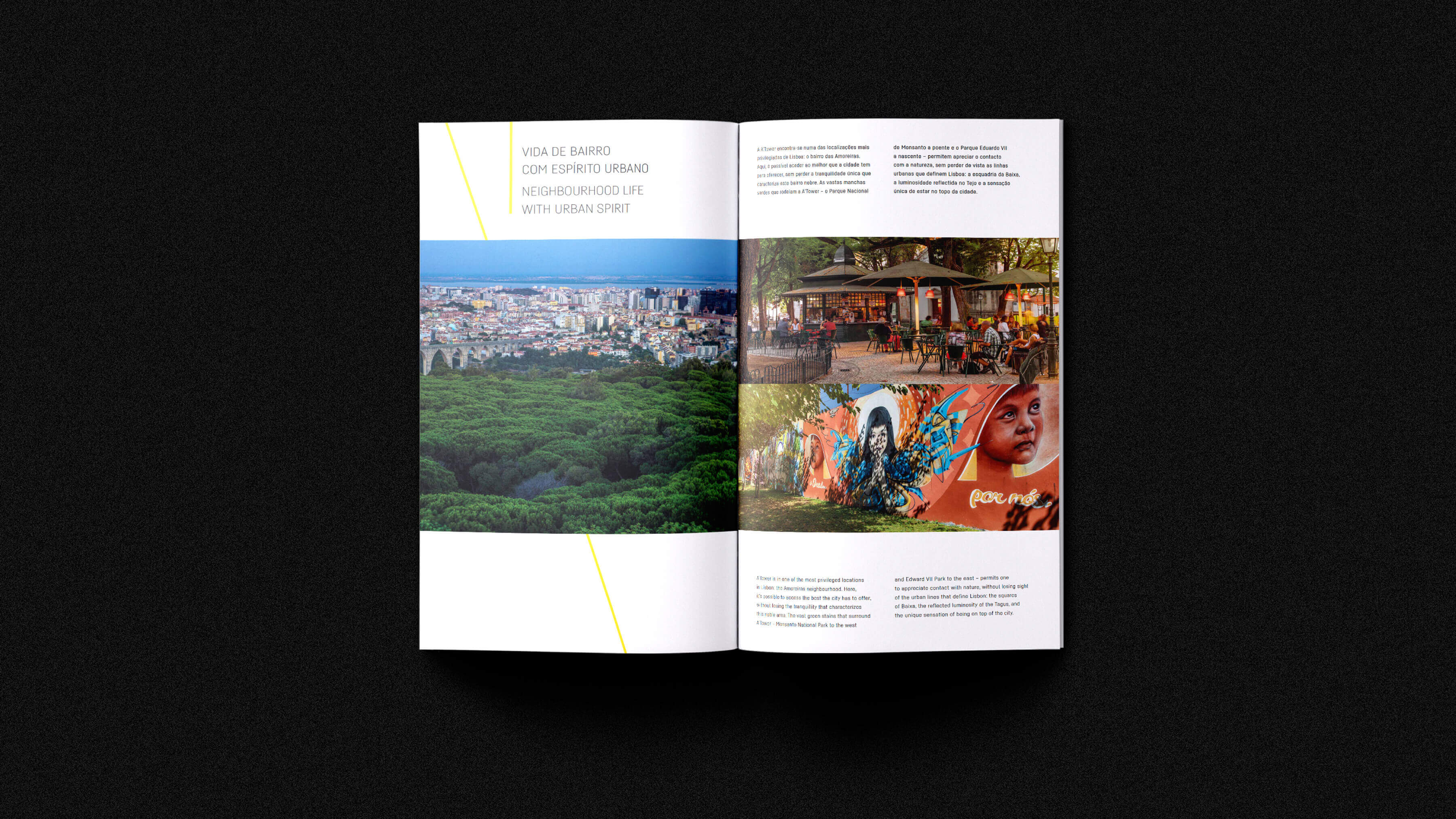
On the highest hill of Lisbon, a building defies all conventions: from the old office building to the vertical symbol that marks the new profile of the city and adds a futuristic urban note with its long balconies that seem to capture the energy of the horizon.
Its dynamic architectural lines allow the creation of a new metropolitan dimension on the Lisbon hill that is more suitable for experiences. In the presence of visual icons of the 80s, it is necessary to continue to define a multiple aesthetic and capable of containing and representing several decades and generations of urban inhabitants. In a space where this multiplicity favors individuality, A'Tower stands out.
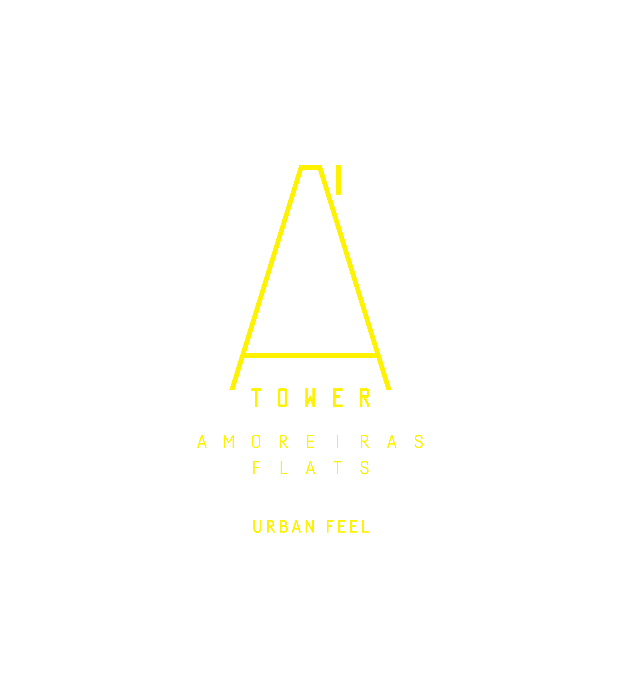
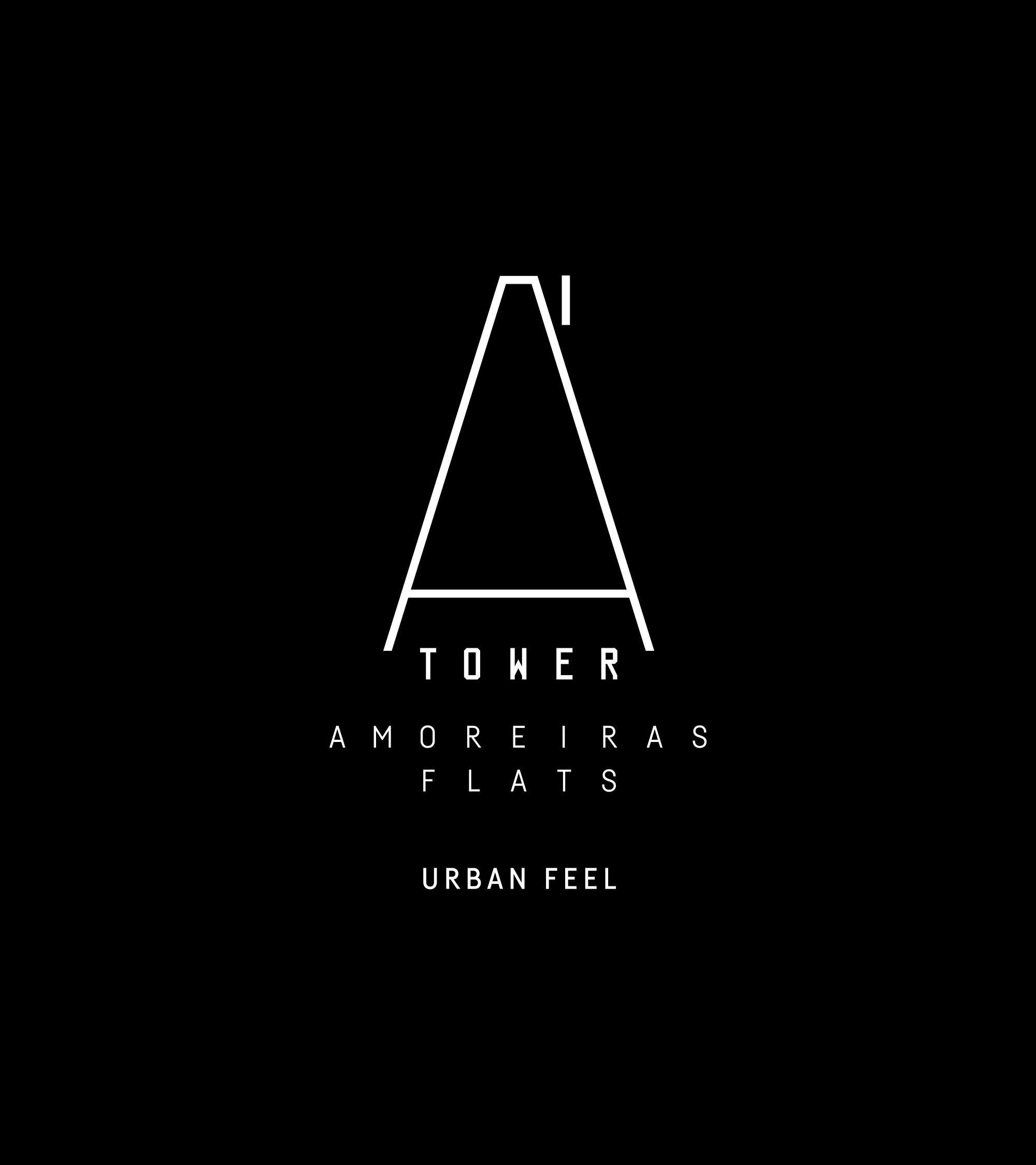
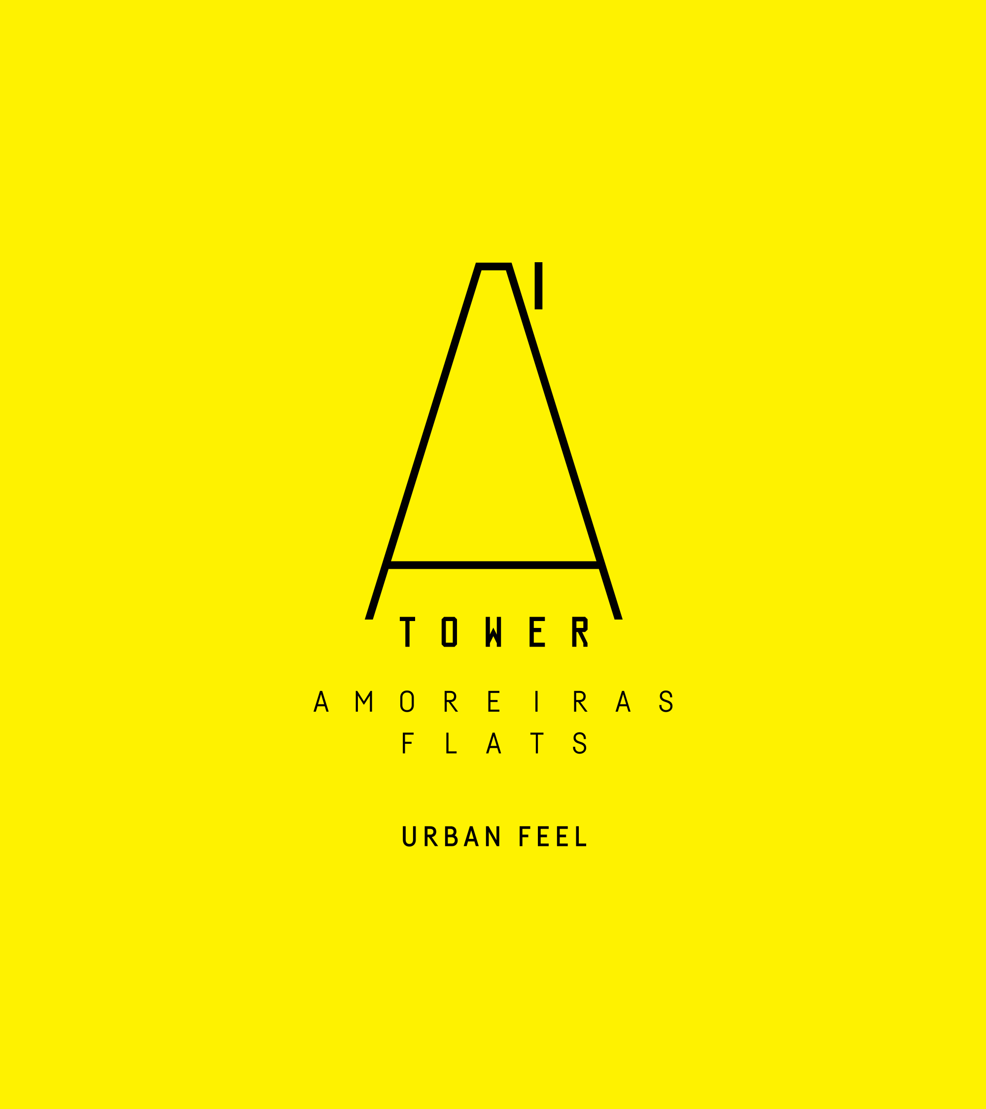
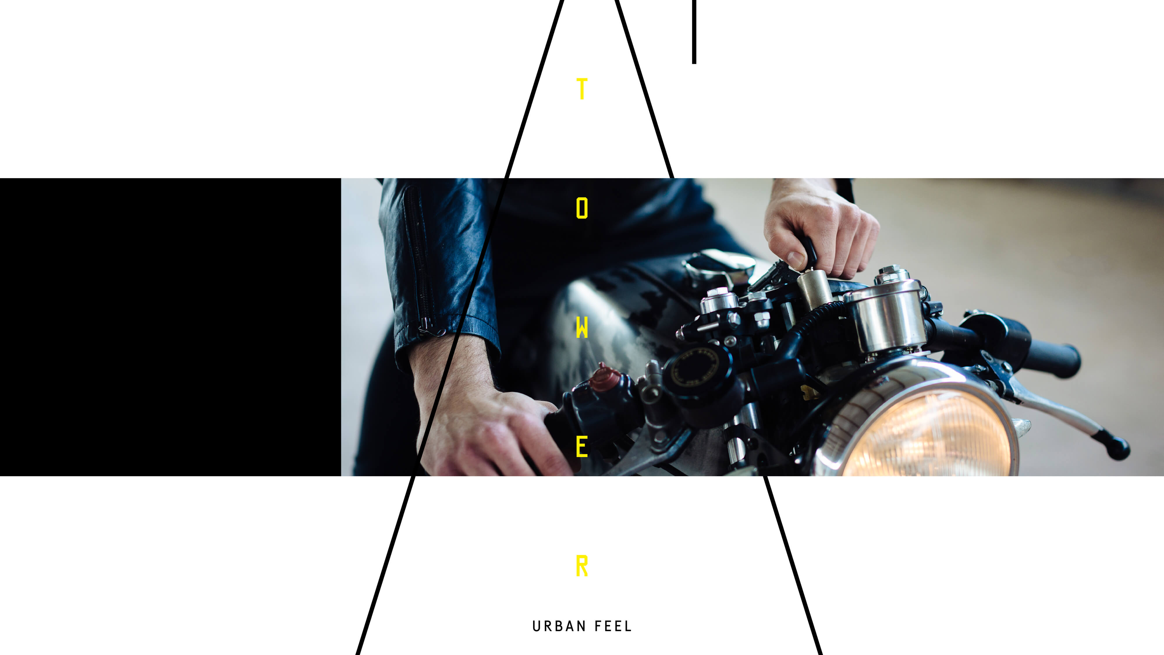
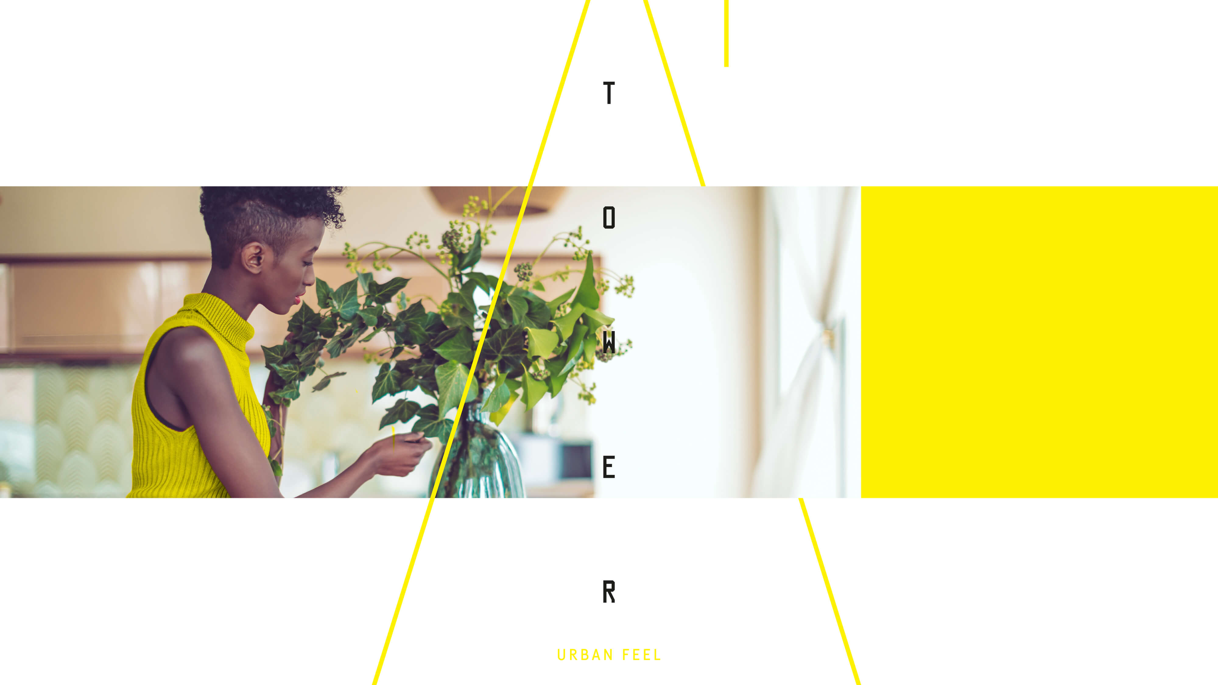
A name and a brand fully developed in line with the Urban Feel concept, which conveys the values of modernity, centrality, and personality. The pillars of the brand are contemporaneity, urbanity, and plurality.
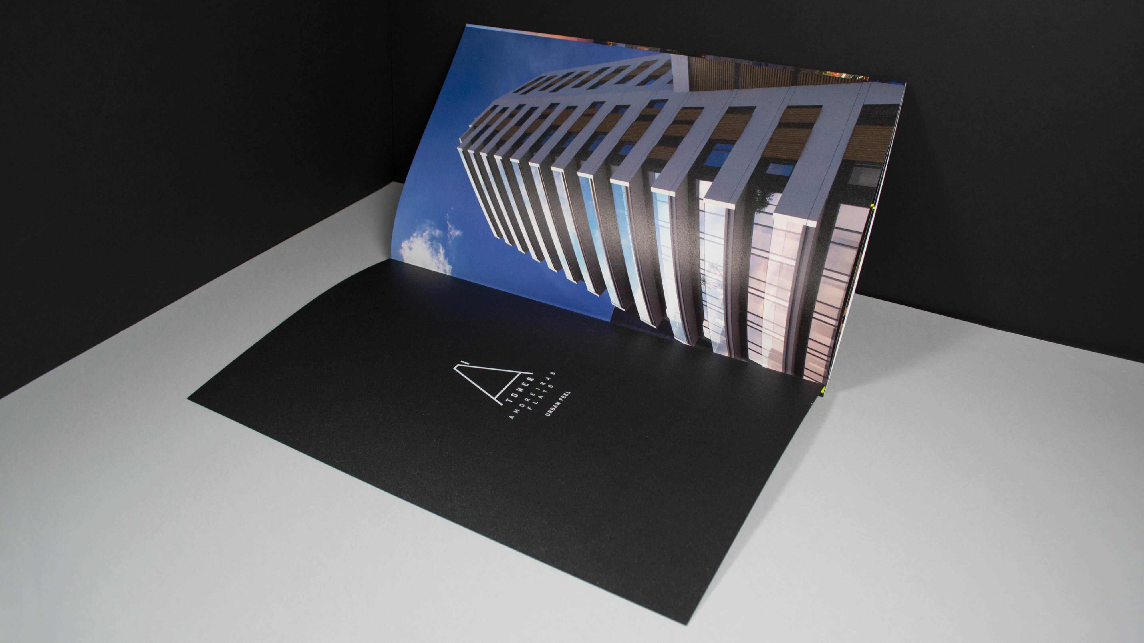
This name also reflects a more urban, dynamic, and modern phonetic and visual attitude. The A, from Amoreiras, is also the first letter of the alphabet giving a pioneering character to the building. The description "Amoreiras Flats" indicates the location, adding value to the project.
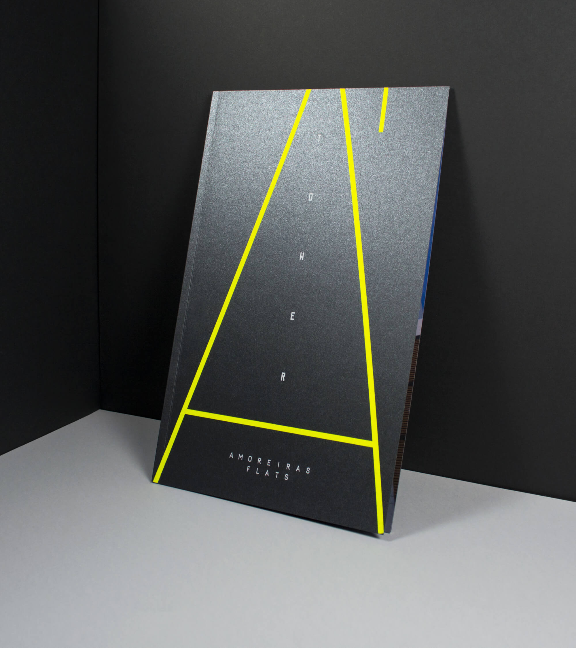
It is a cosmopolitan and elegant brand, which reflects the building, for those looking for a pulsating energy experience, far beyond the city's classic identity. The height of the Tower inspires the brand's identity. When tracing the vanishing point of the building, the symbol reinforces concepts of elevation, exclusivity, status, and distinction.
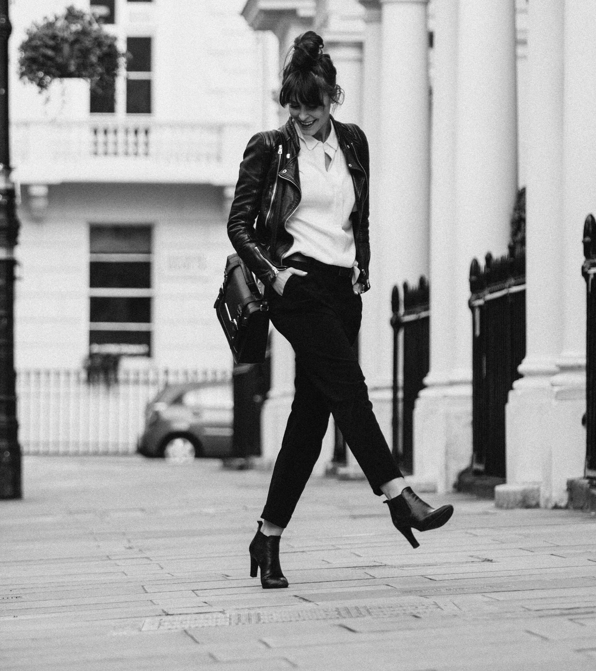
We responded to the challenge willingly; creating a brand that breathed the vibrant energy of the city and mirrored the premium and contemporary side of living, feeling, and enjoying the urban landscape. That represented the ability to isolate yourself at the top and appreciate the best that the city has to offer.
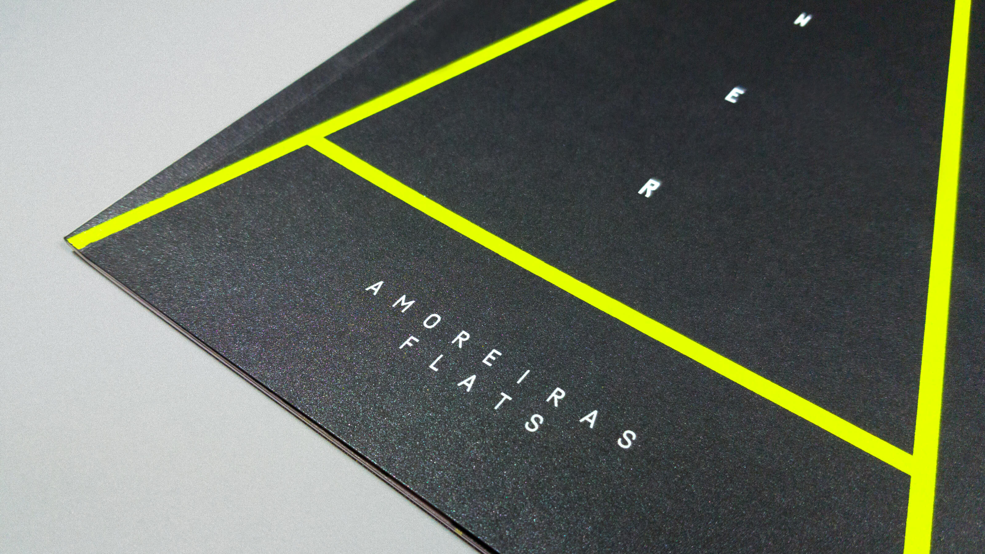
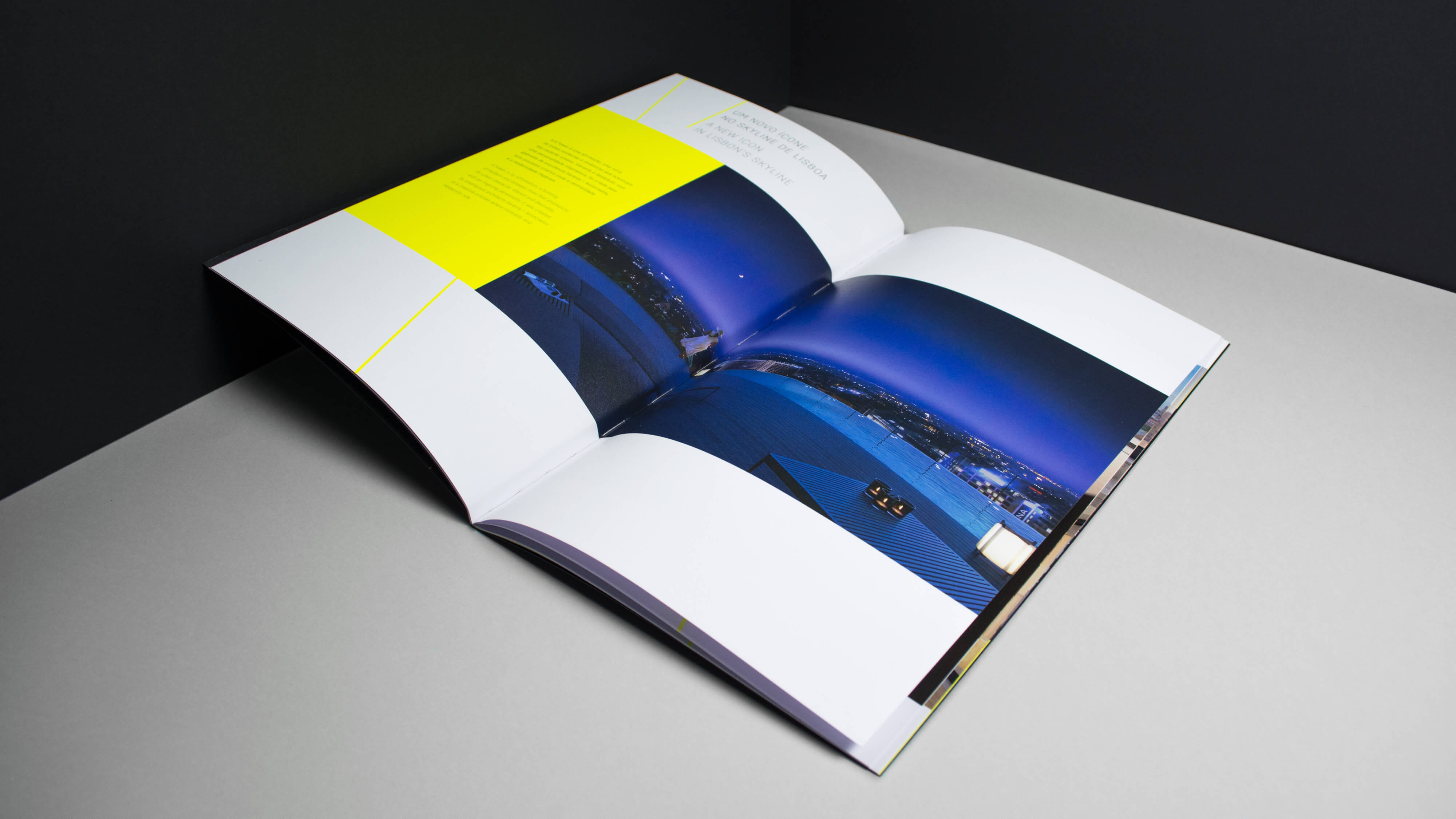
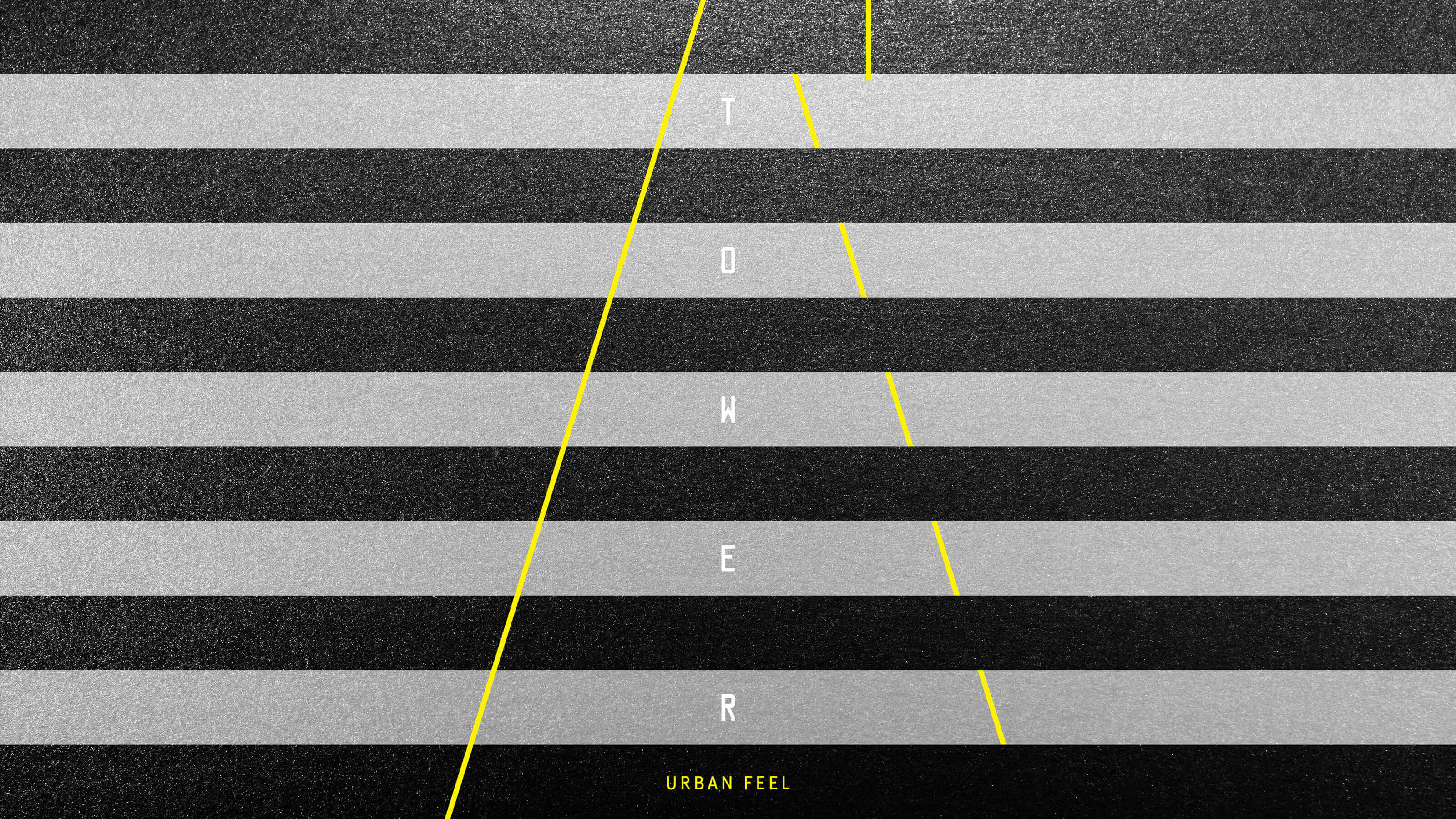
With Urban Metallic, Vibrant Yellow, and Black colors, the brochure materializes the Urban Feel concept and a trendy attitude through special finishes. The contrast between the metallic fine paper selected for the cover and the Vibrant Yellow stamping seeks to portray the difference between the urban landscape and the city lights. The rectangular images allude to the cut out of the large balconies, one of the main highlights of architecture.
We present a pinnacle, one that enables embracing the city, as well as life, at the same time.