PLMJ
PLMJ
Brand Identity
Graphic Design
Editorial Design
Signage
Motion
Illustration
2020
We want to present a case that is much more than an argument about rebranding: it is a case study about the excellent understanding found between Blug and PLMJ. We came together to communicate and emphasize the unique personality of PLMJ's presence on the market for over 50 years. And, together, we found its' ideal form of manifestation.
This is a case study of the practice of Theory, in which we interviewed witnesses and stakeholders, to make room for a continuous and evolutionary collaborative process of creating an identity, tone and brand. The result could not make us more proud: we managed to help the brand's unmistakable attitude and personality express themselves assertively in all their dimensions, throughout all of the brand's moments of communication and manifestations.
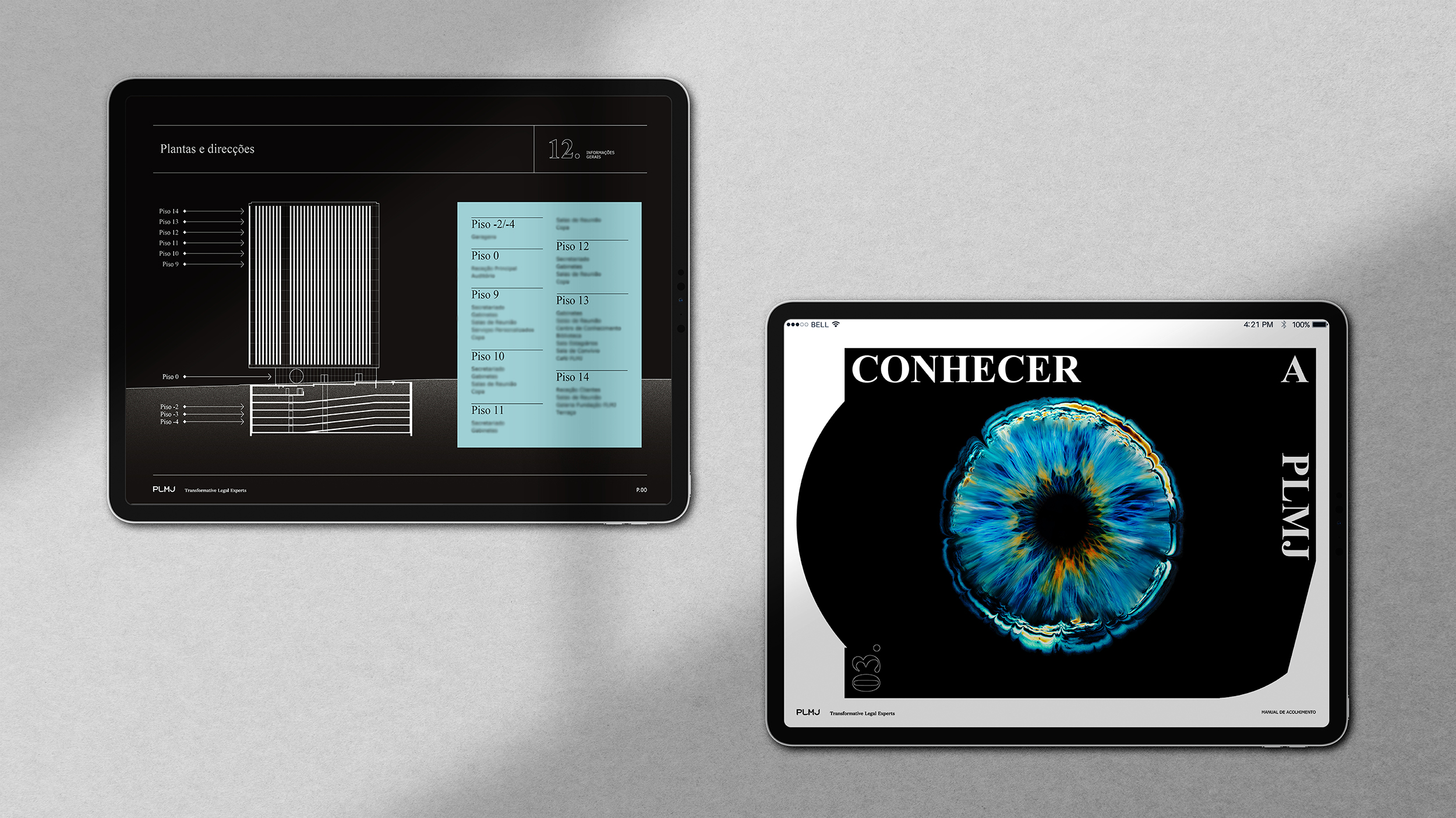
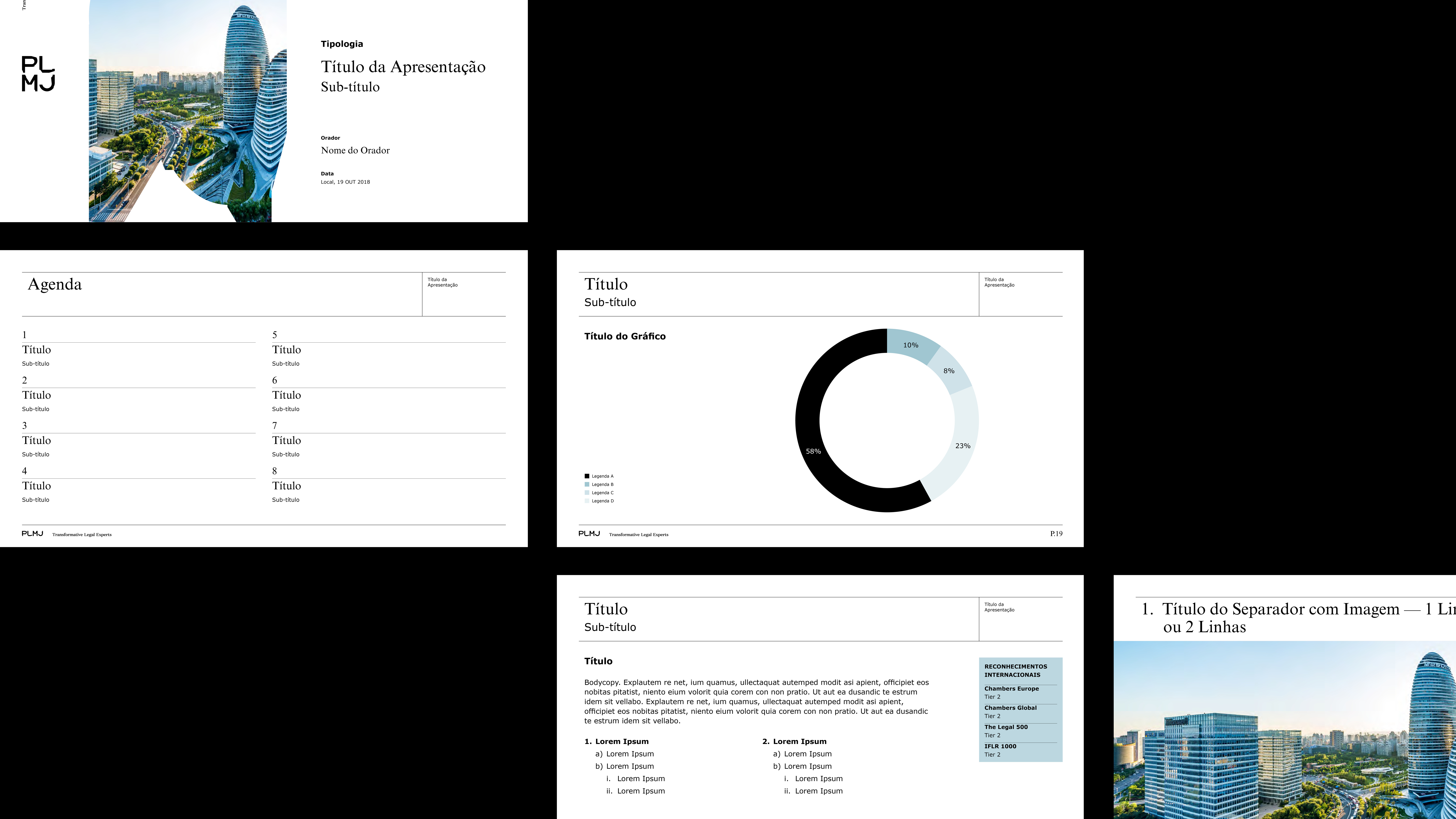
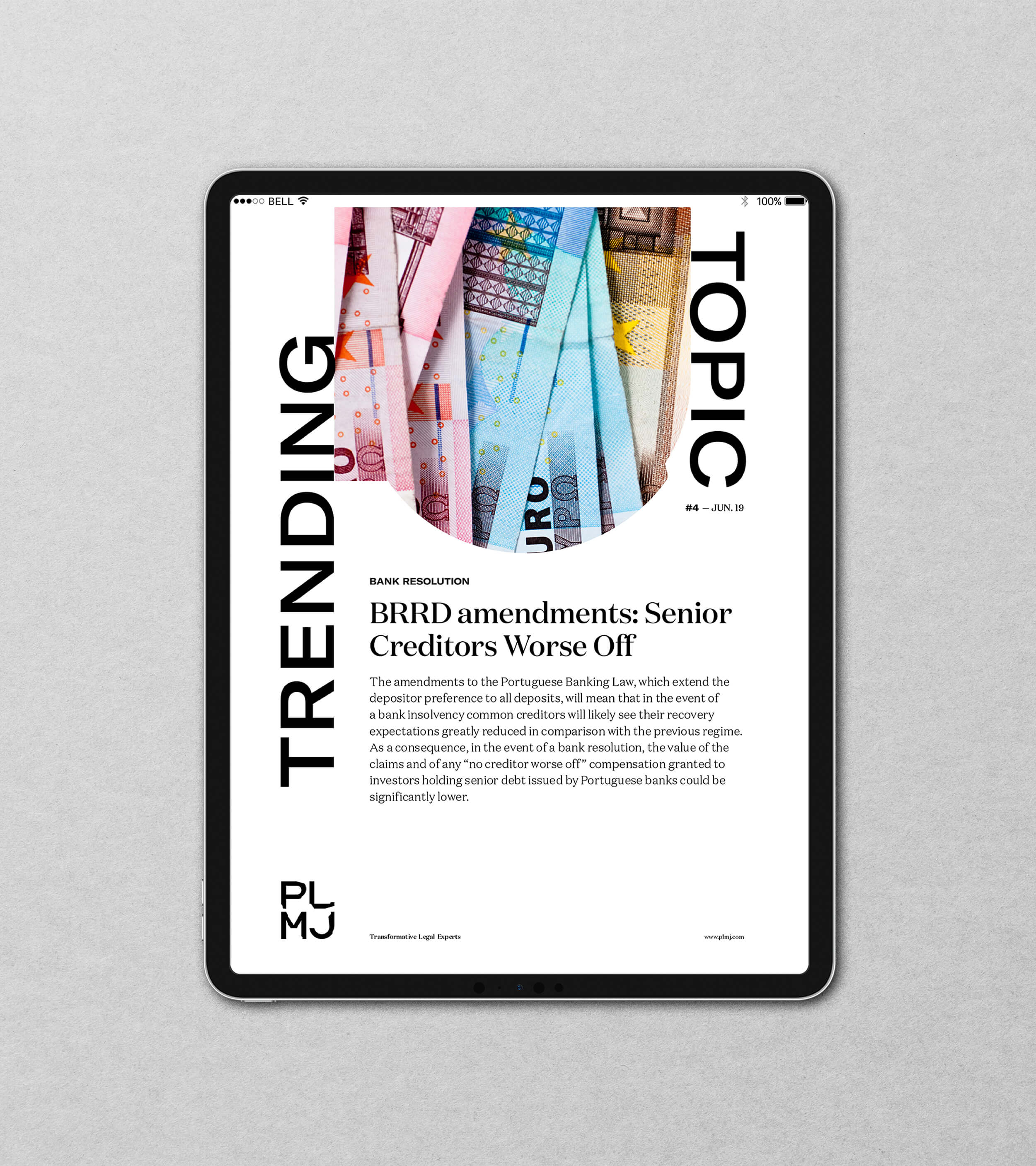
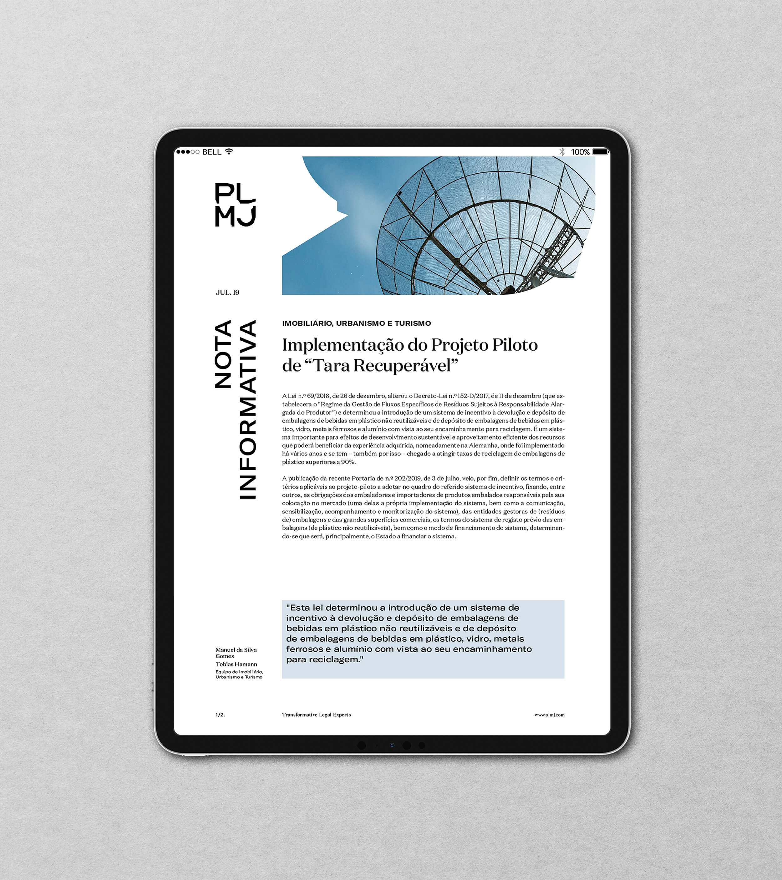
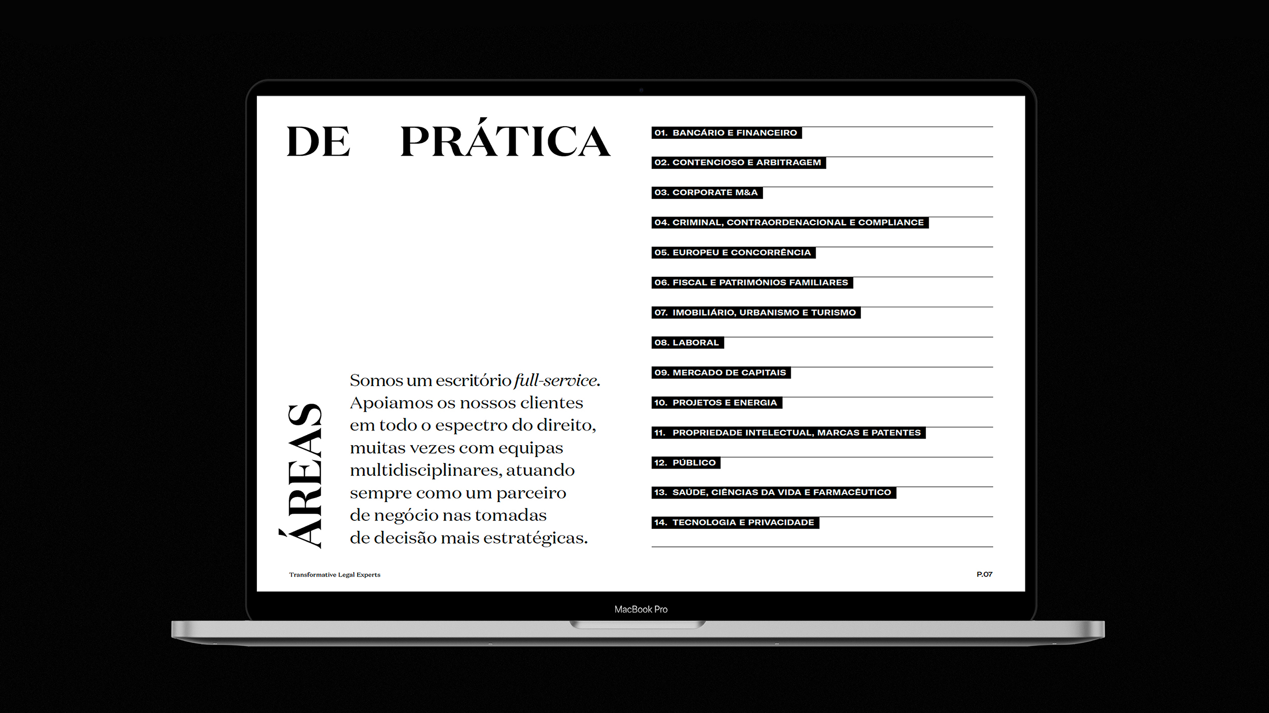
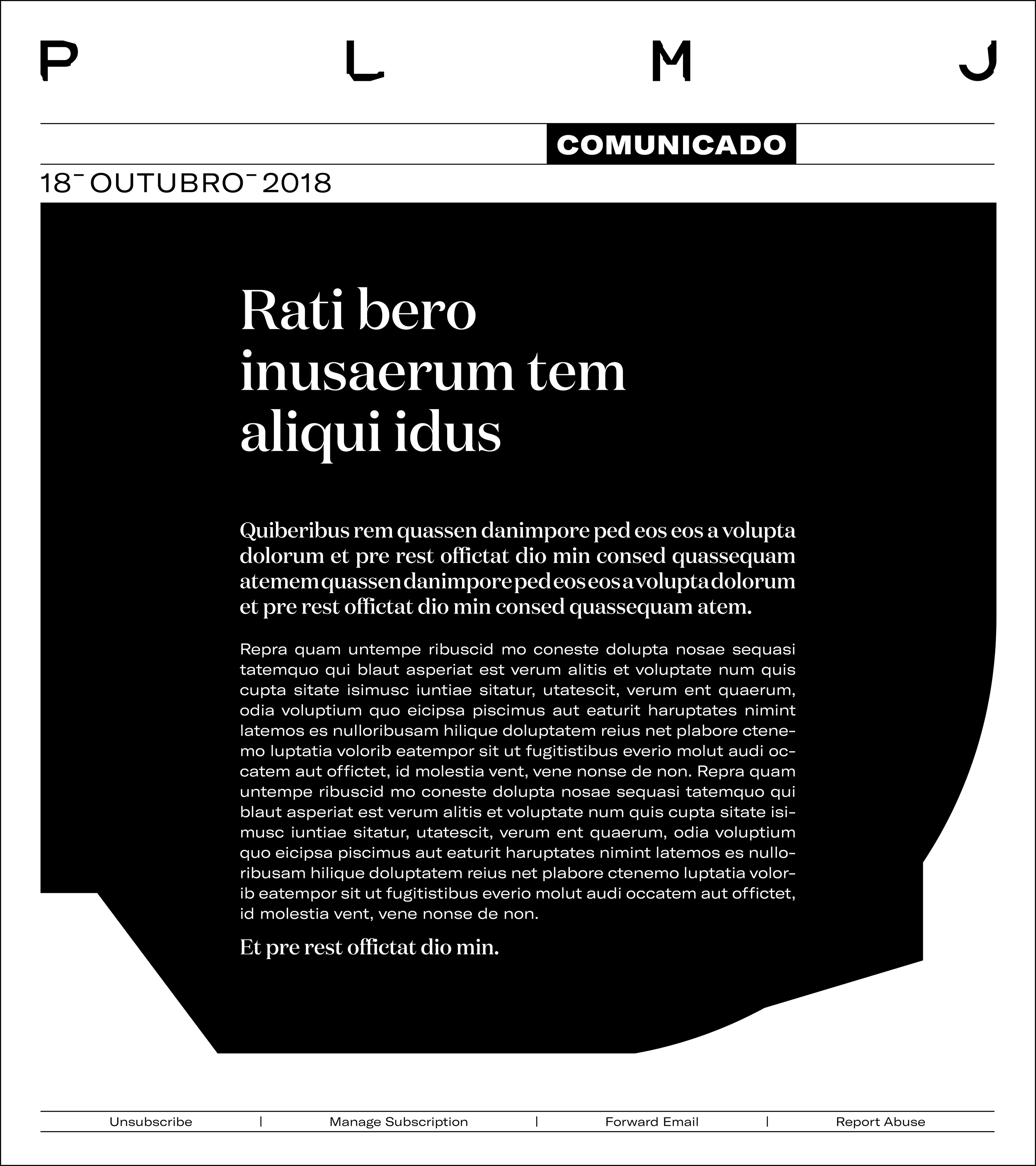
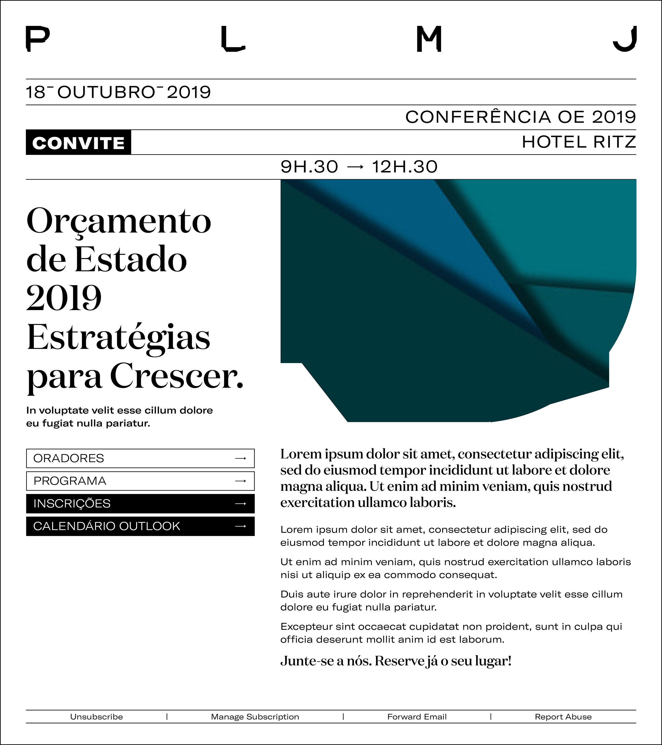
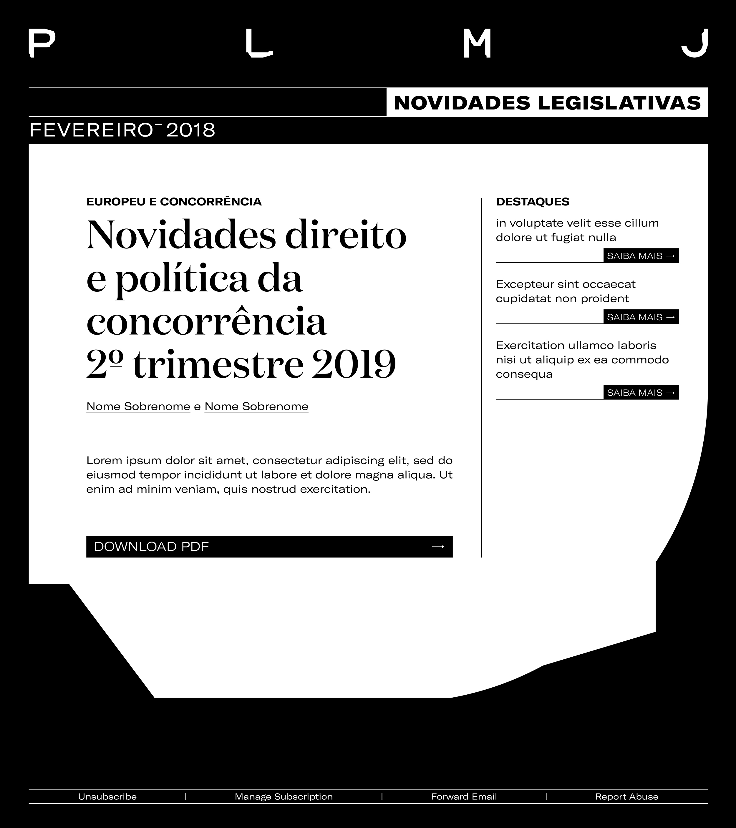
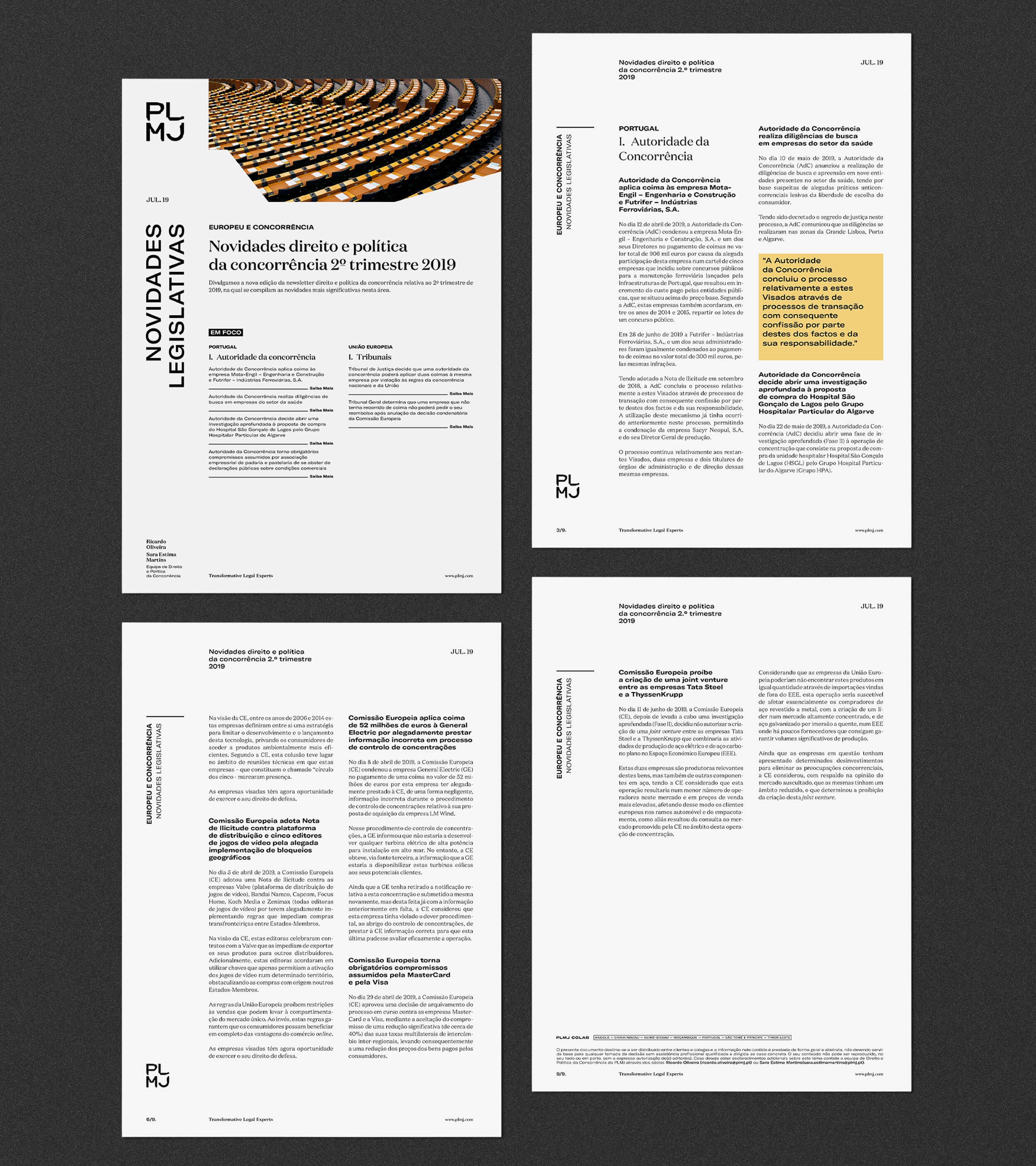
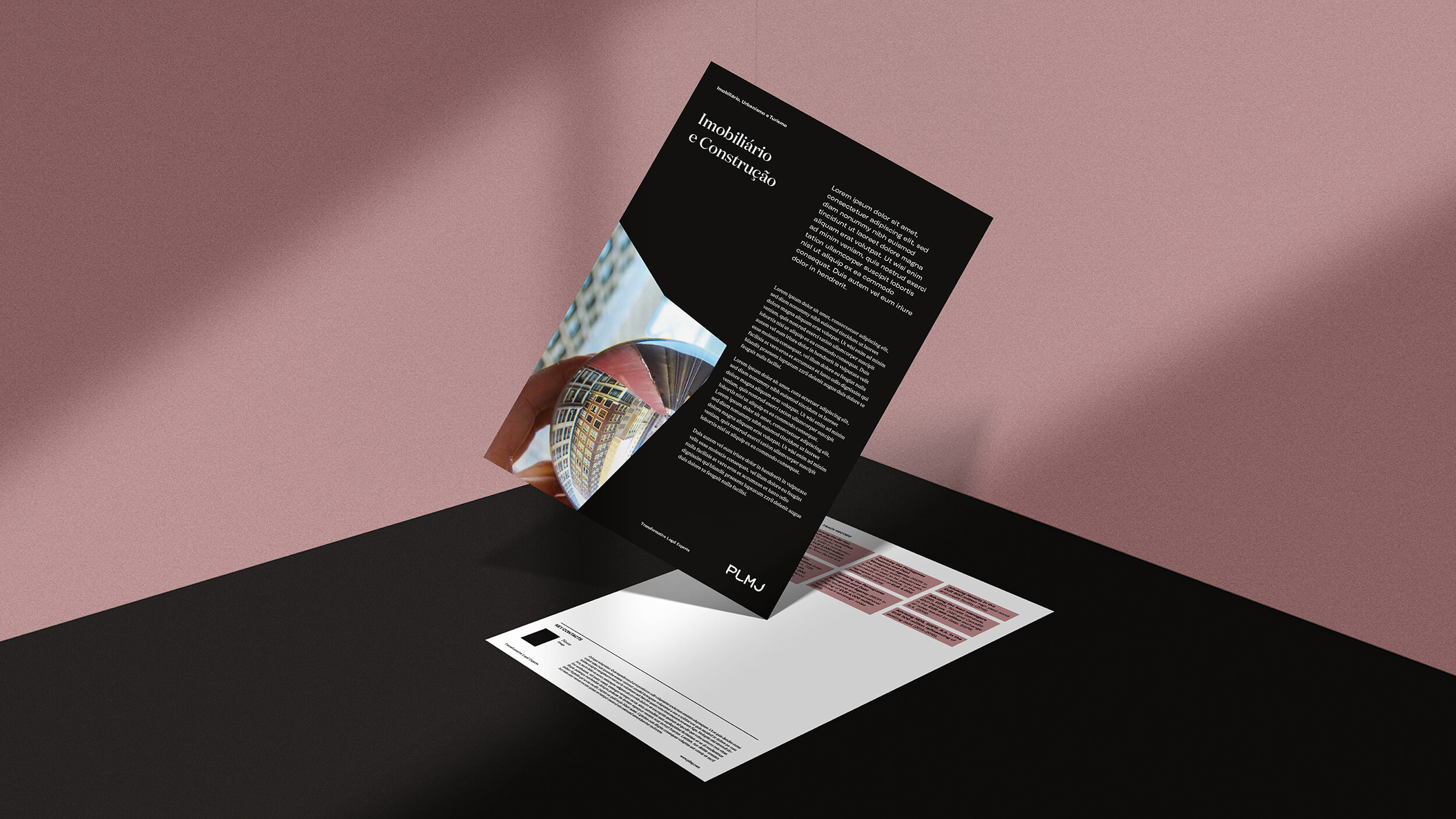
In this project, it was essential to follow rigour and simplicity, but also the quantum leaps that PLMJ is proud to make. Thus, we developed a minimalist, linear editorial line with the use of highlights and containers. The entire hierarchy of information is objective and straightforward but presents itself in a visually compelling and captivating way.
Our goal: that all the pieces convey clarity, pragmatism and assertiveness. Above all, being honest and affirmative, without ever ceasing to be surprising and adding visual richness to the sections of institutional communication.
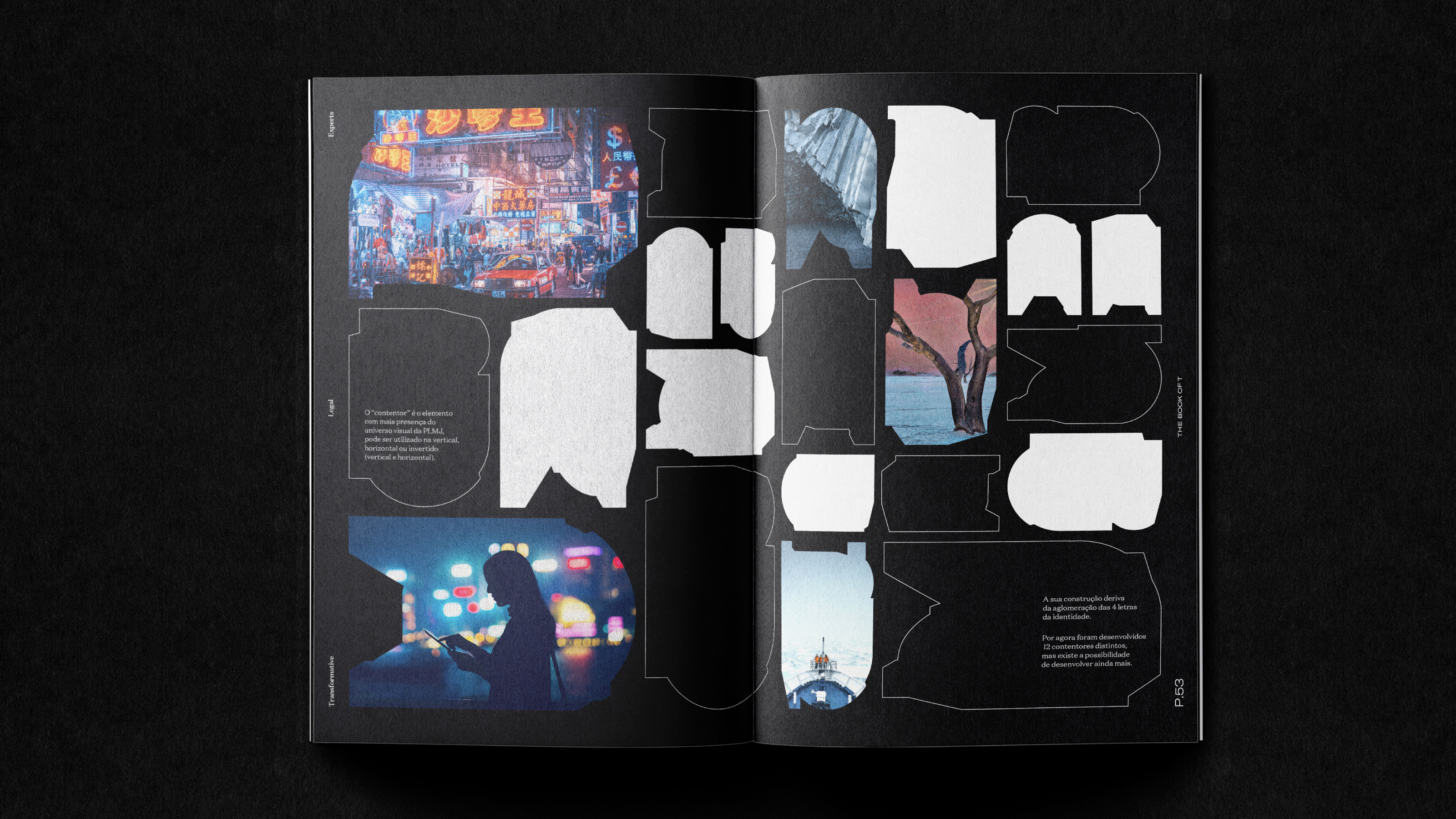
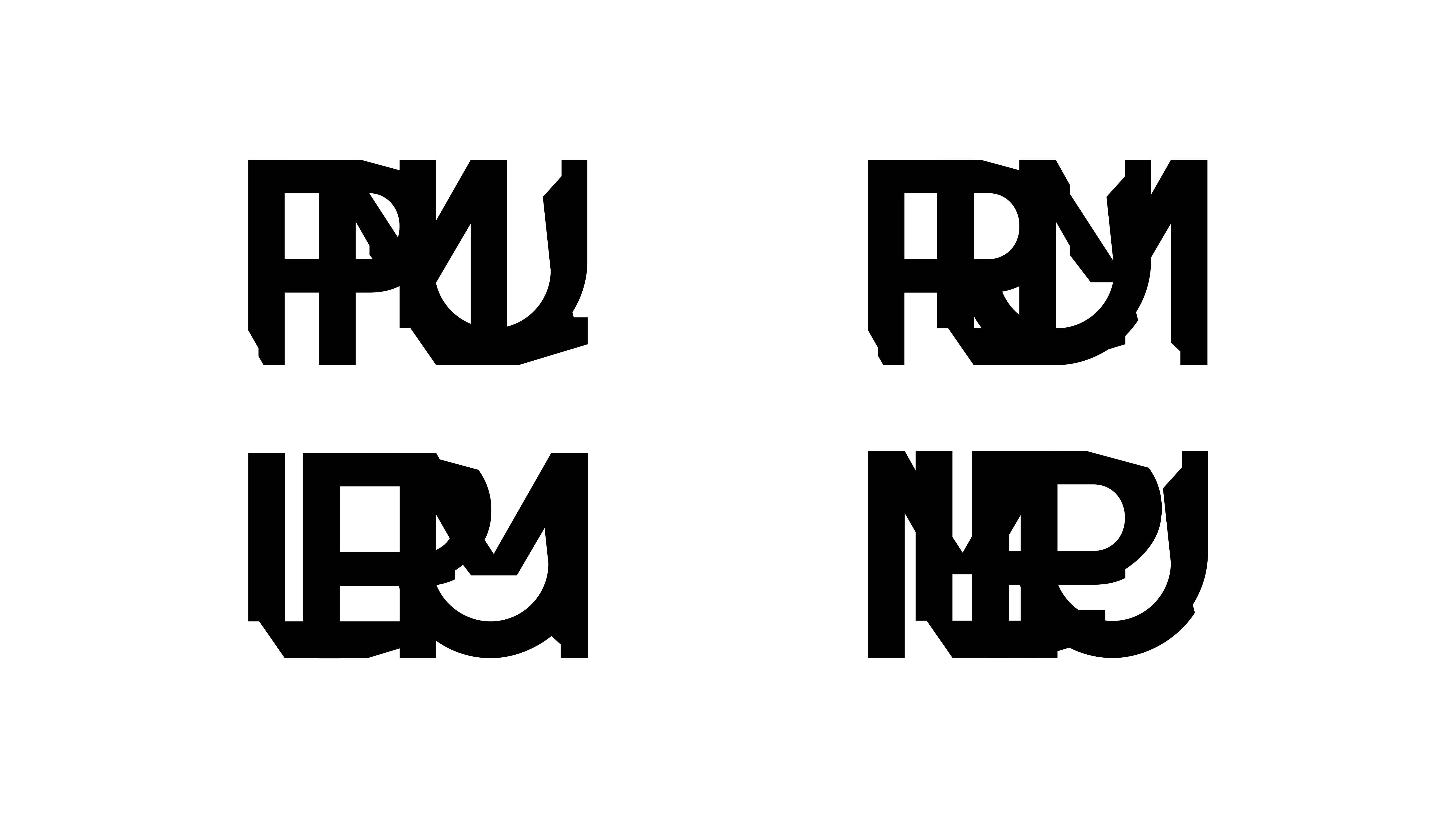
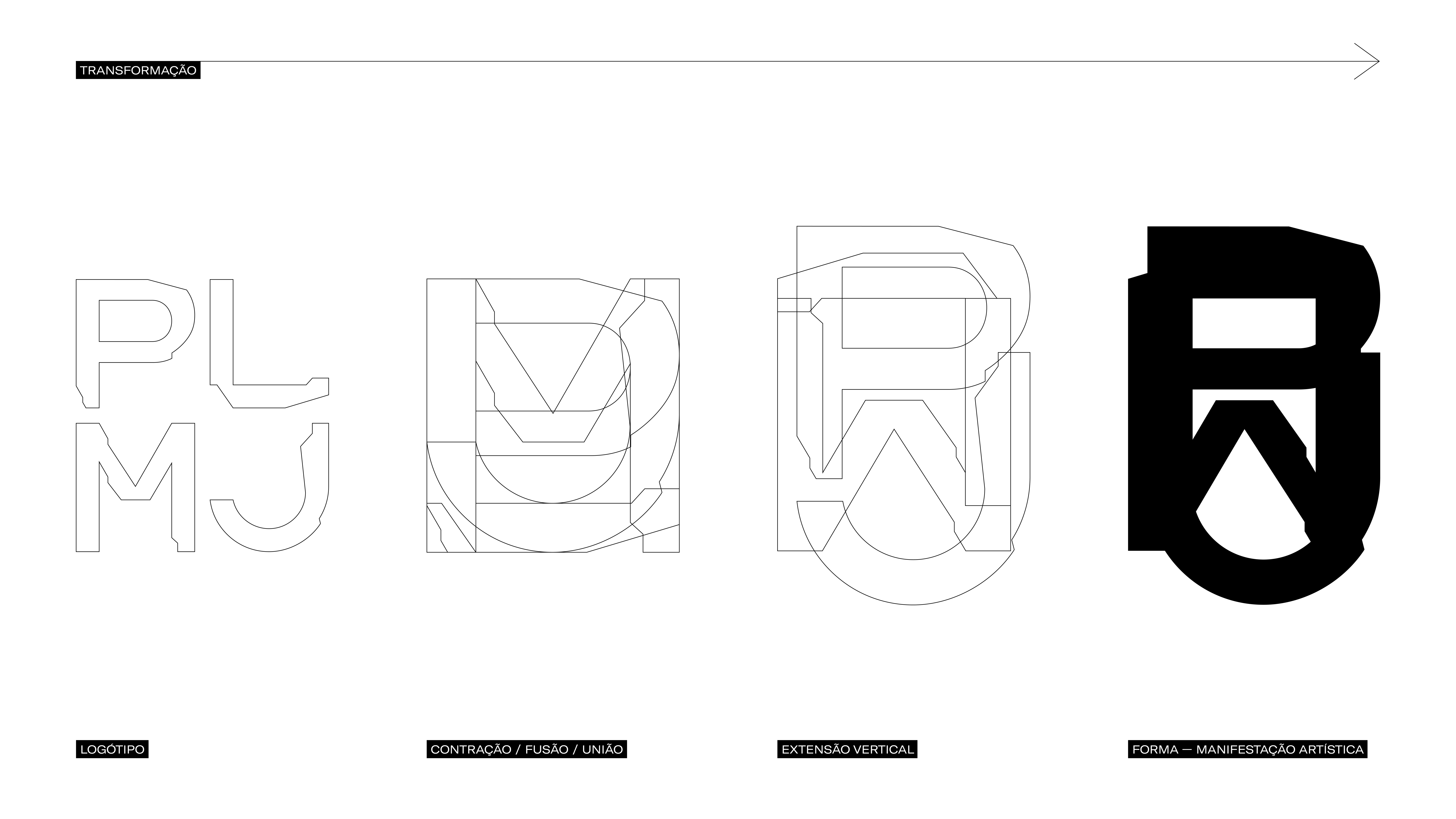
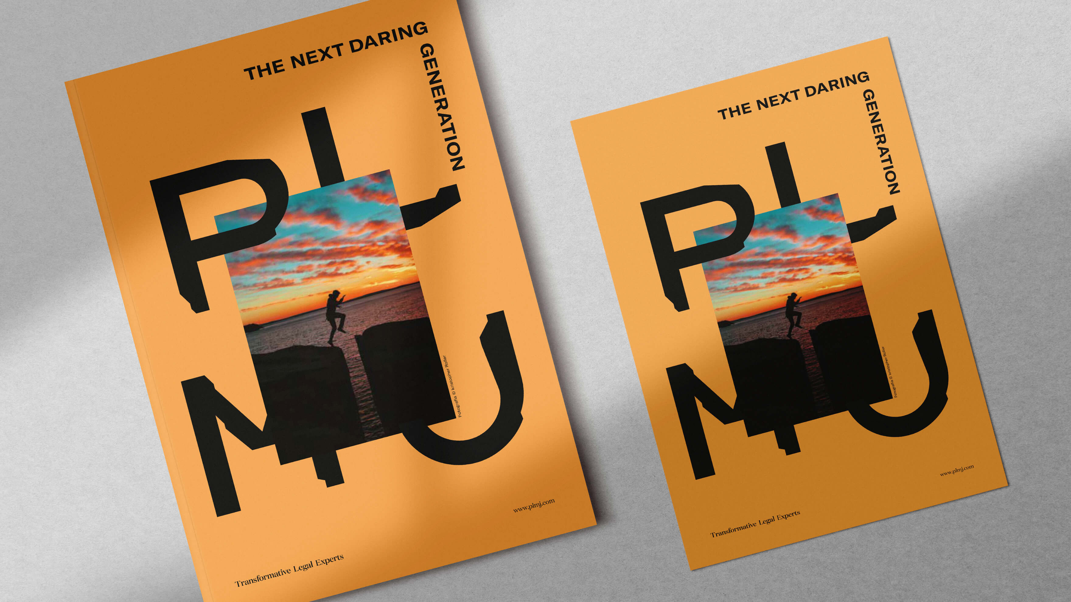
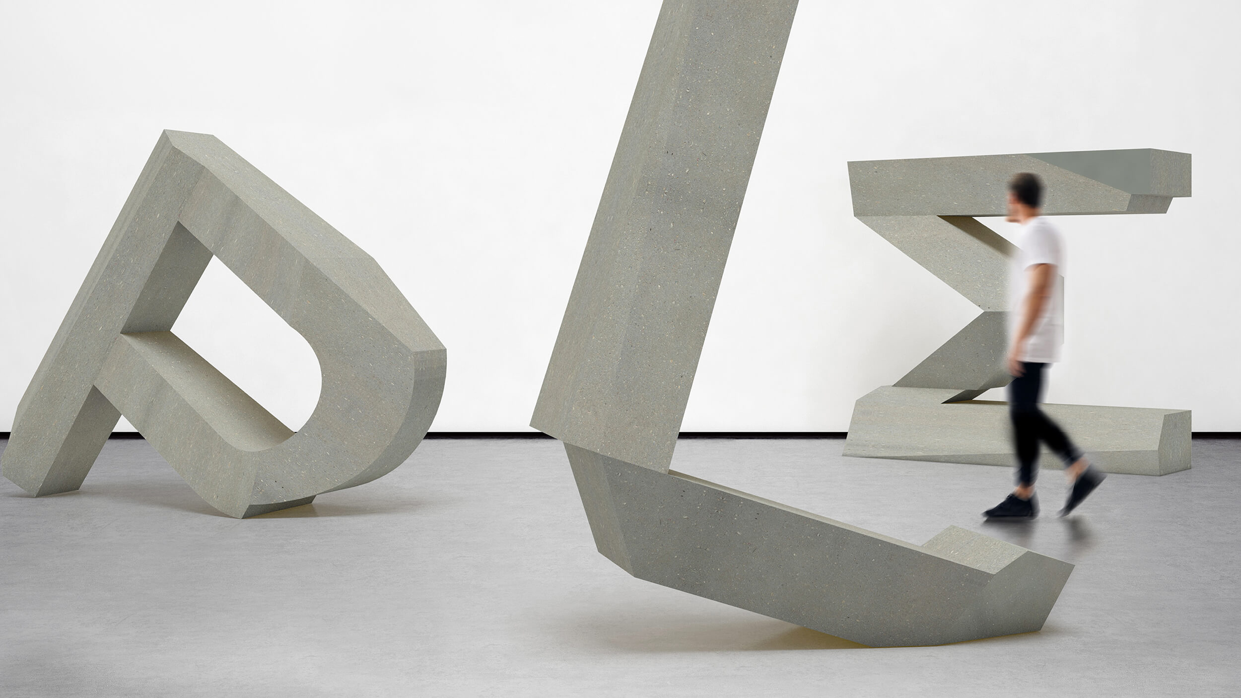
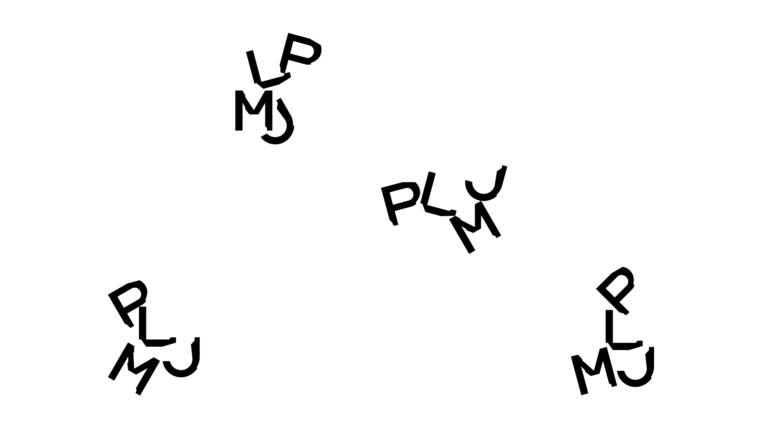
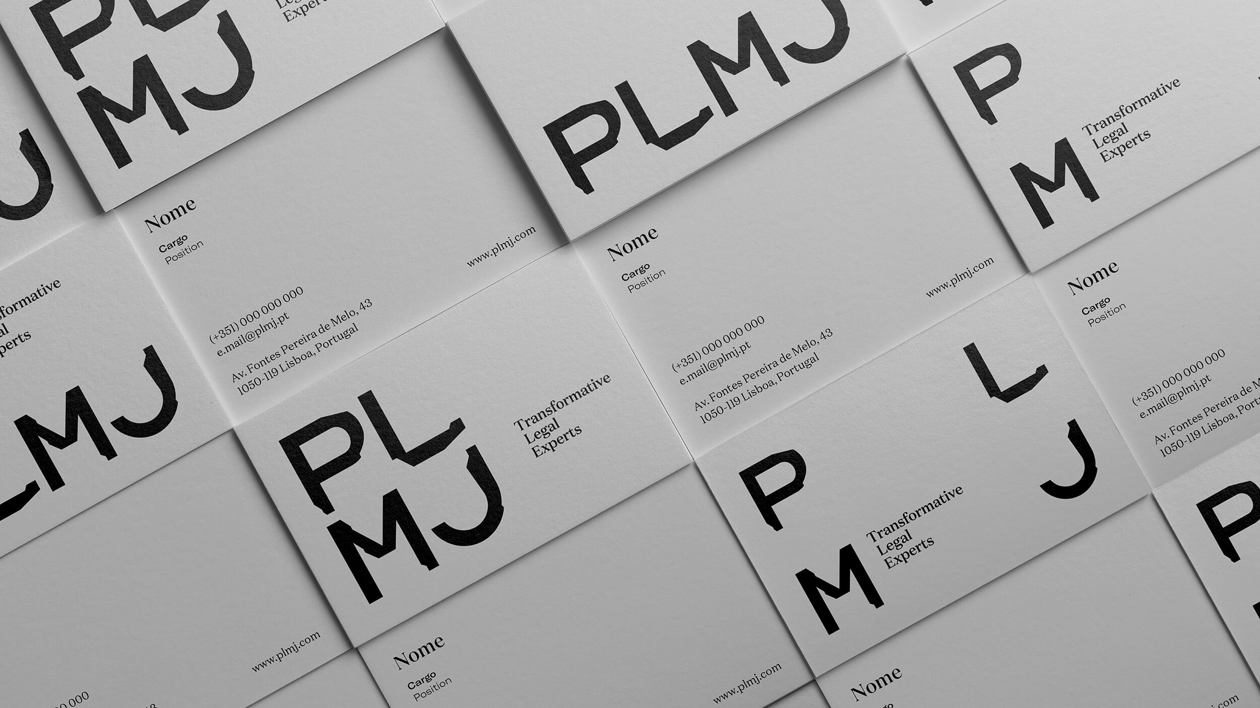
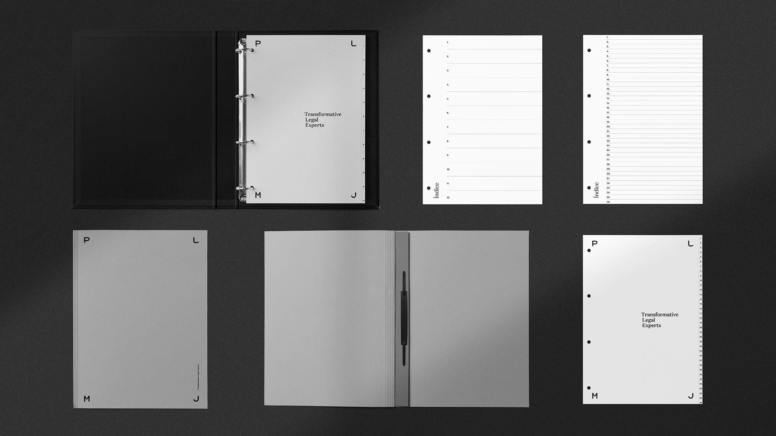
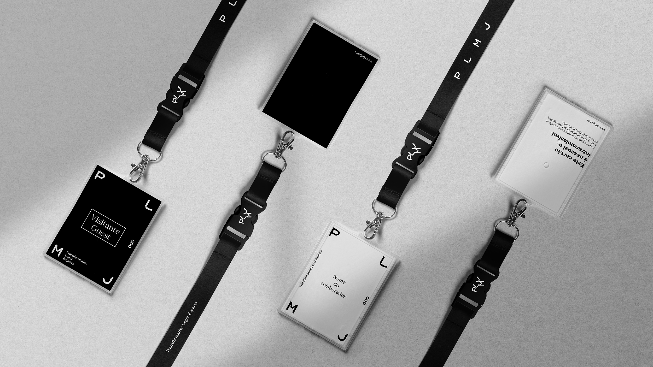
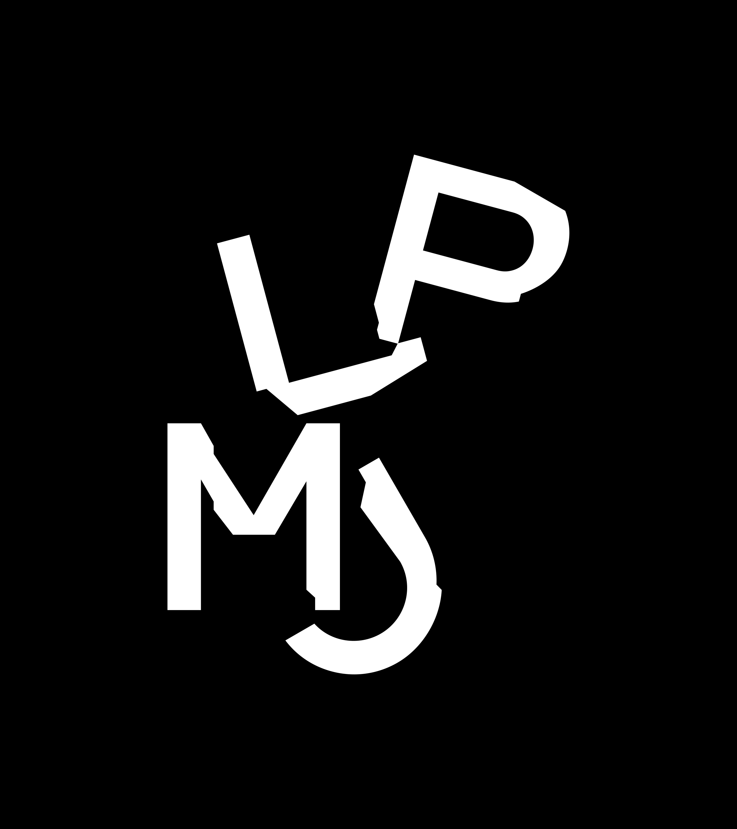
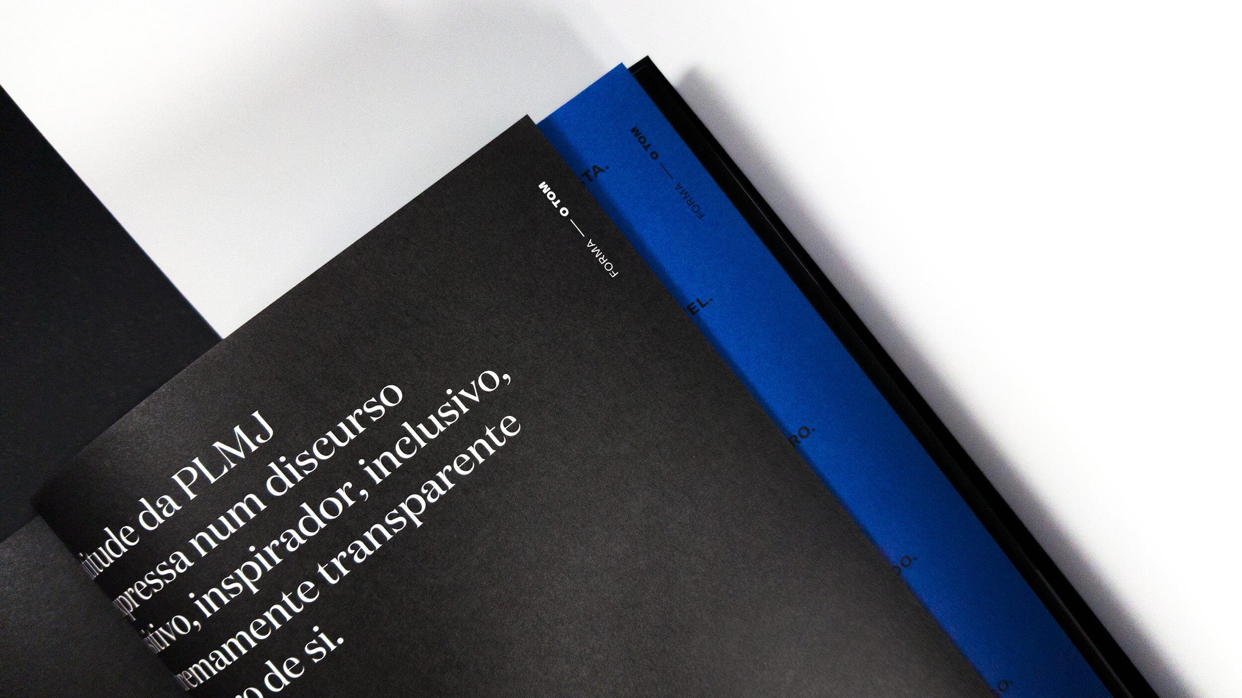
A container is a form that enchants us and allows us to convey the brand's personality with rigour and boldness. It is, along with the PLMJ identity, the main element of the brand. After the transformations of contraction, fusion, union and extension of the initials of the identity, we developed an authentic container of possibilities, which enhances the entire visual universe of it.
Twelve containers were developed, endowed with an enormous elasticity, which exists to serve specific communication functions, refusing the role of small decorative elements. With a presence in internal and external communication, these allow diversifying the form and intention with which PLMJ communicates with its audiences.
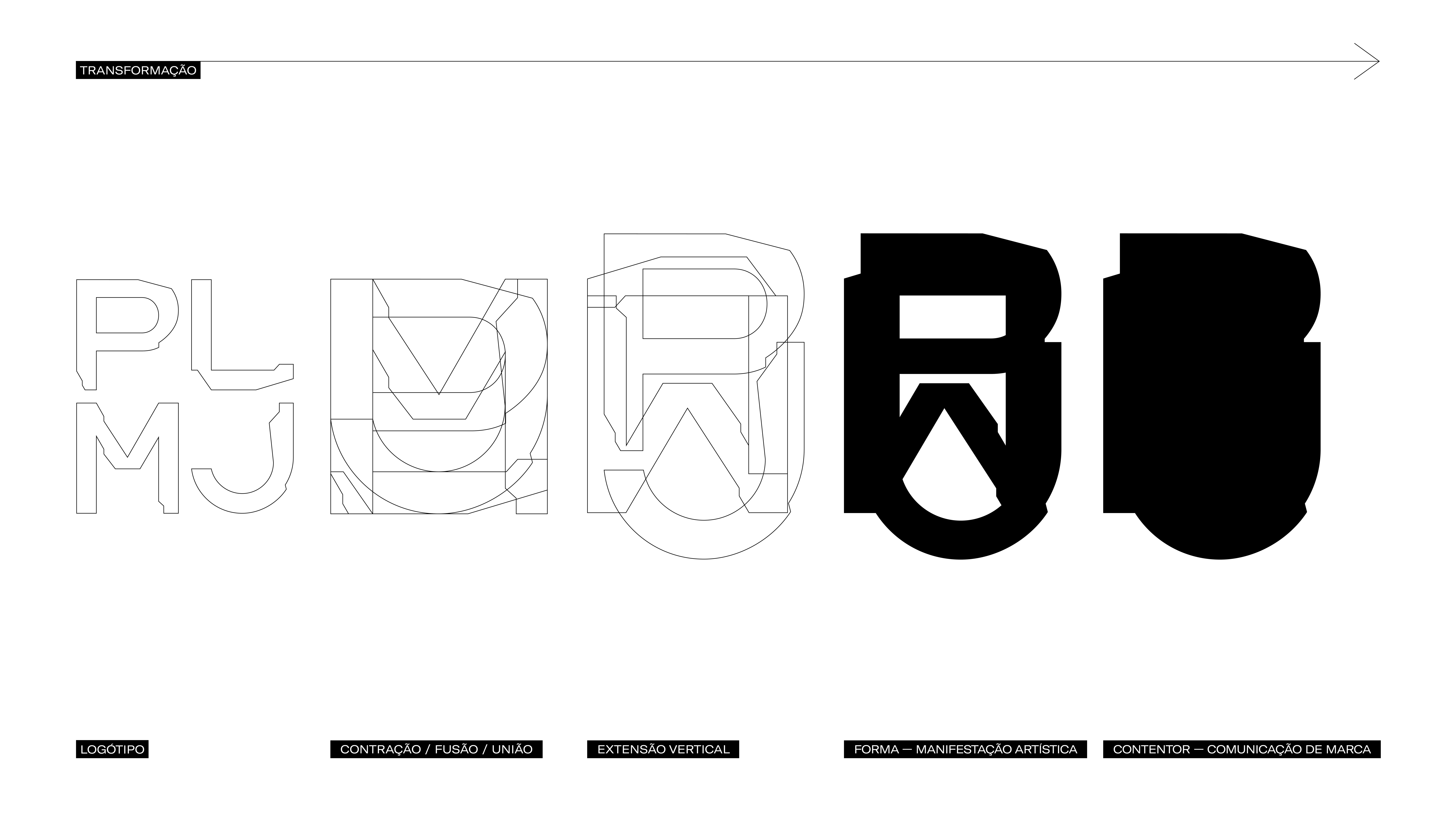
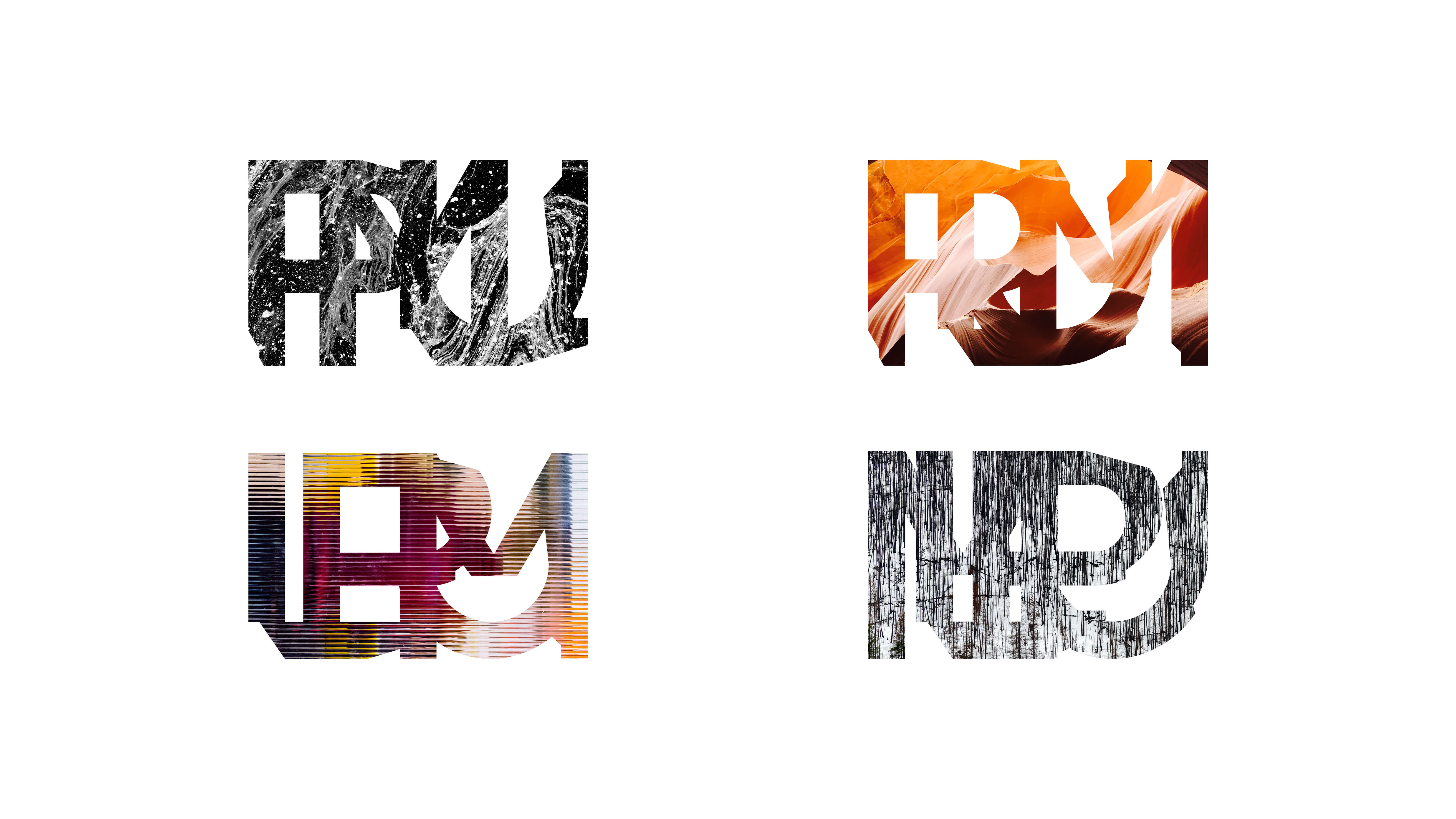
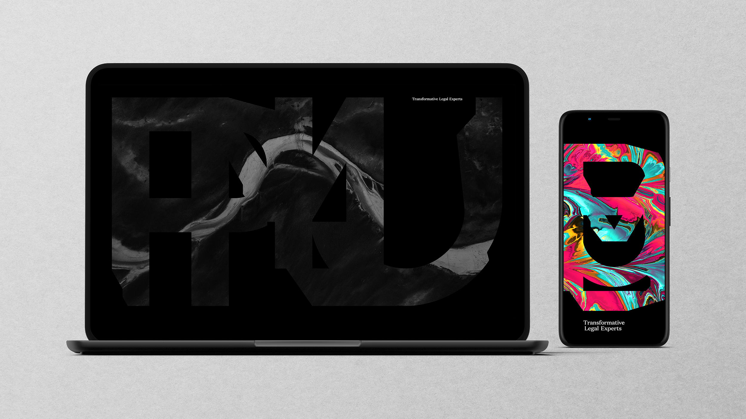
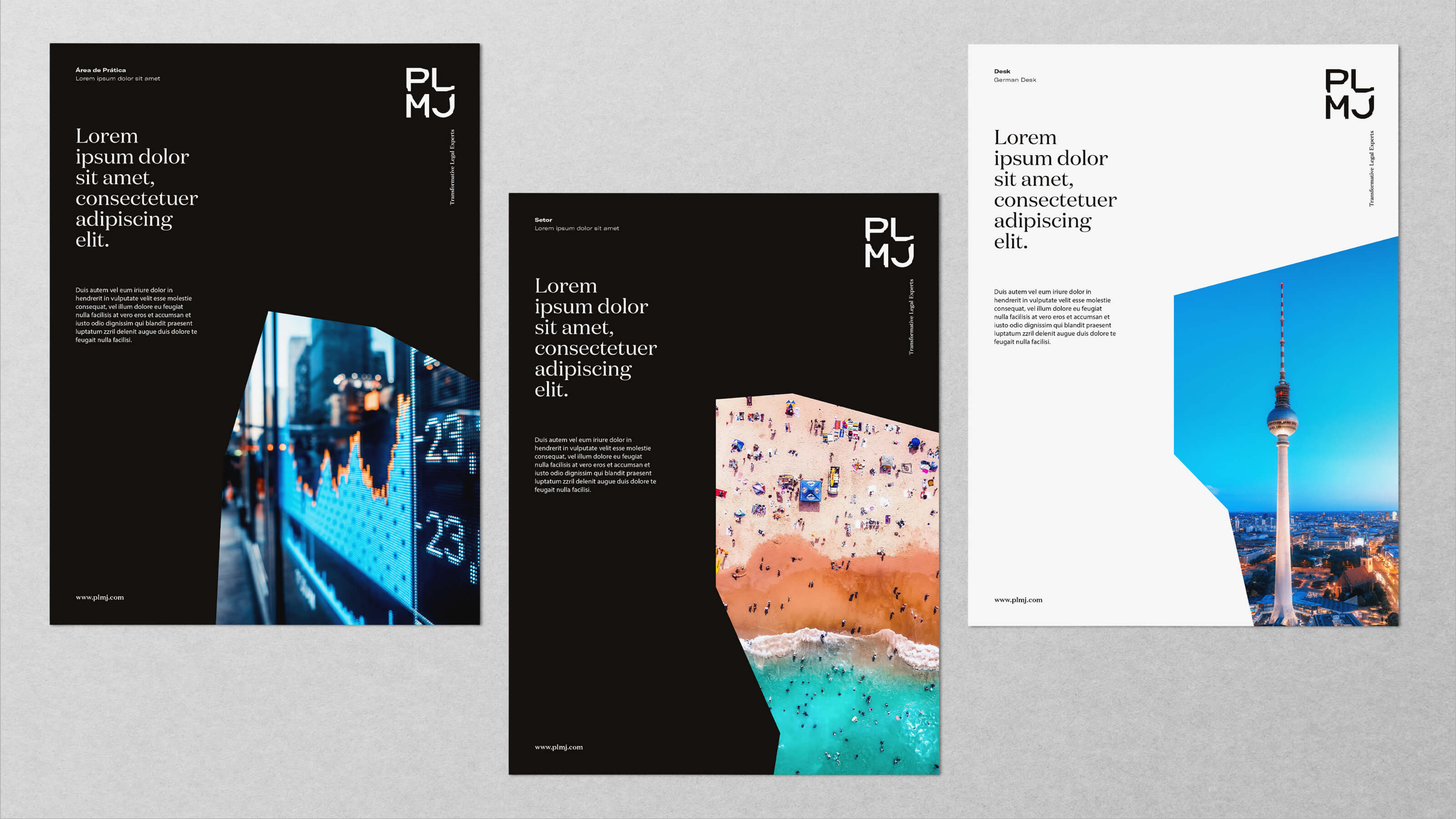
We decided that the brand's values should express themselves in an artistic form that reflects its aspirational content. Primarily created to enhance the PLMJ culture, these horizontal and vertical forms represent the universe that gives rise to the unique imagery of this firm, simultaneously contained and expansive in its purpose and attitude. Outlined or filled, incorporating images or colours, these manifestations work as semiotic ambassadors of the PLMJ culture.
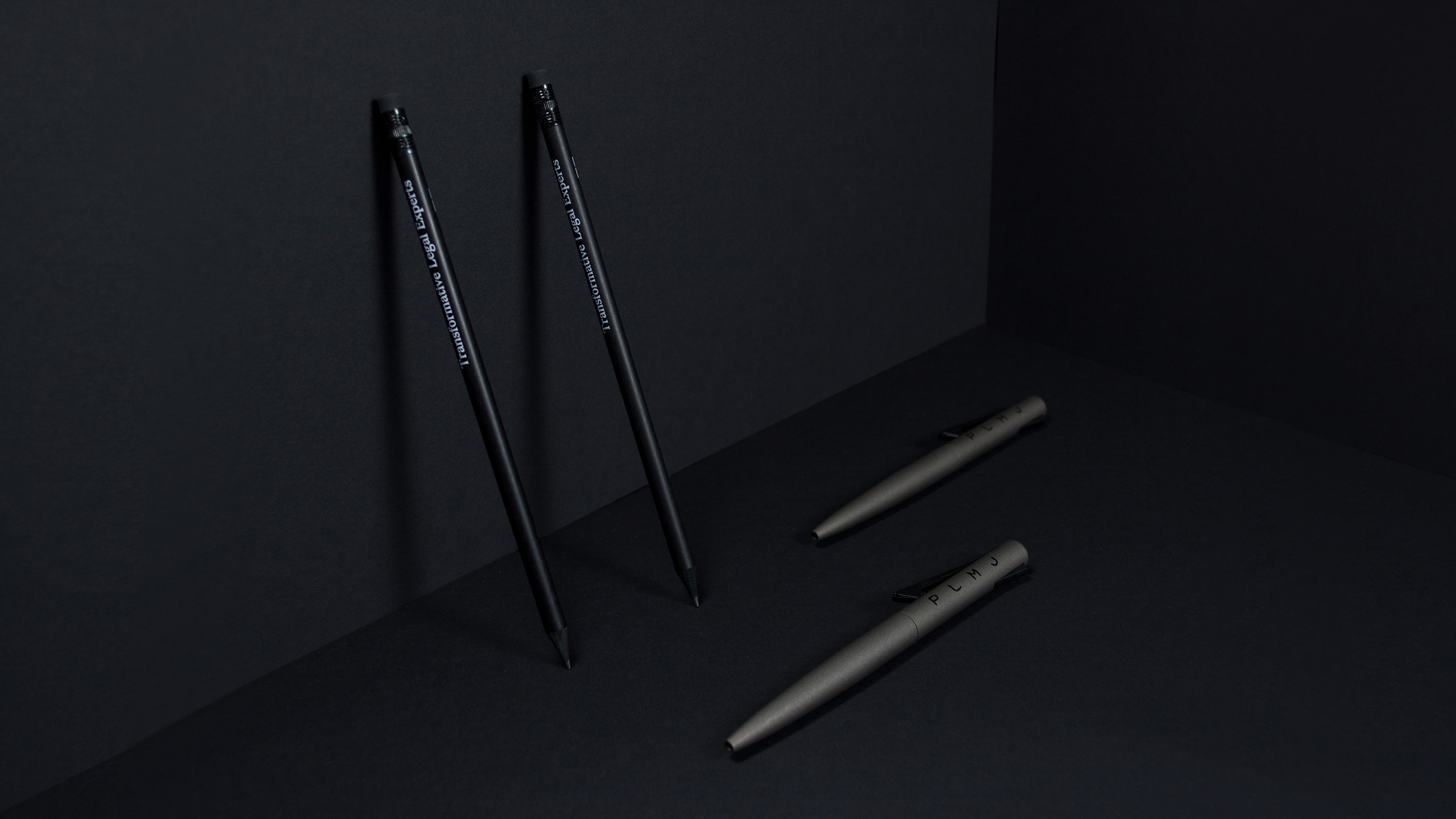
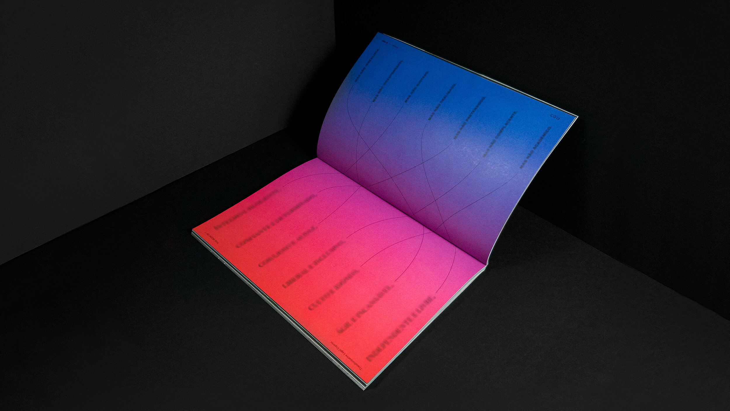
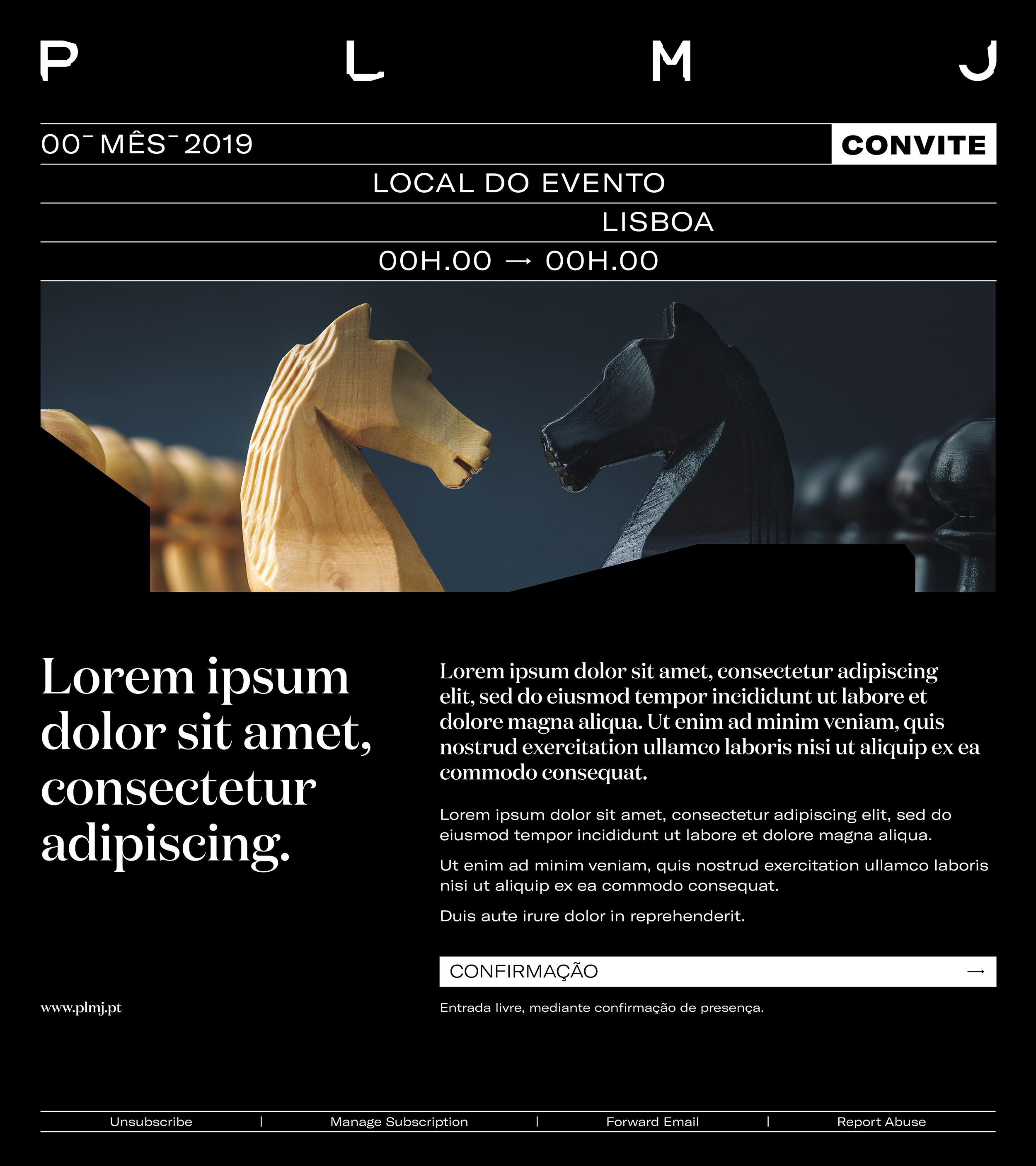
The boldness and audacity that characterize PLMJ had to be part of the colour code with which the brand manifests itself. We chose colours as fundamental as the logo itself, which reflect the firm's attitude - practical and pragmatic, but without fear of contrast. We chose Ultra Black and White Polar, colours that, in harmony, convey simplicity, clarity, pragmatism and assertiveness.
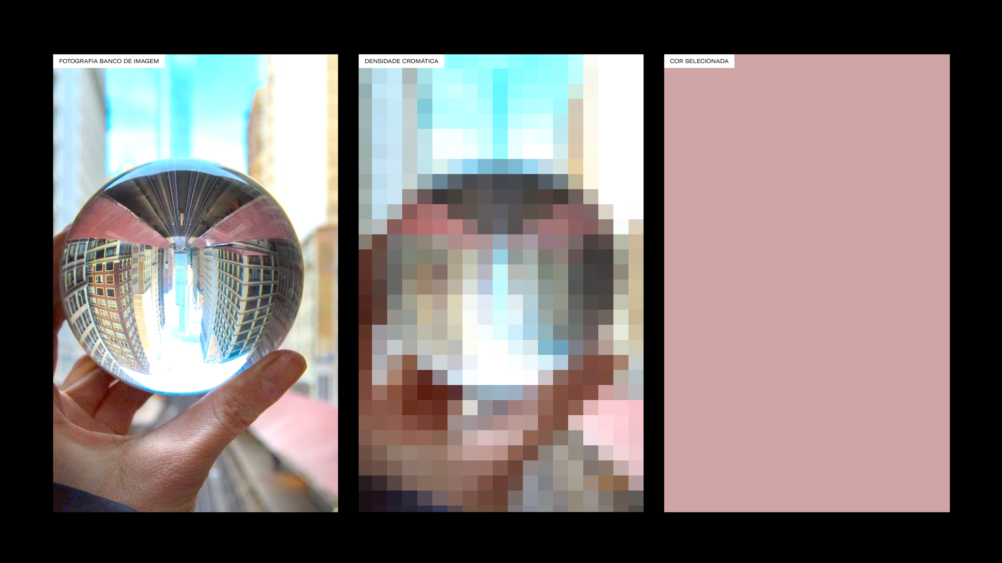
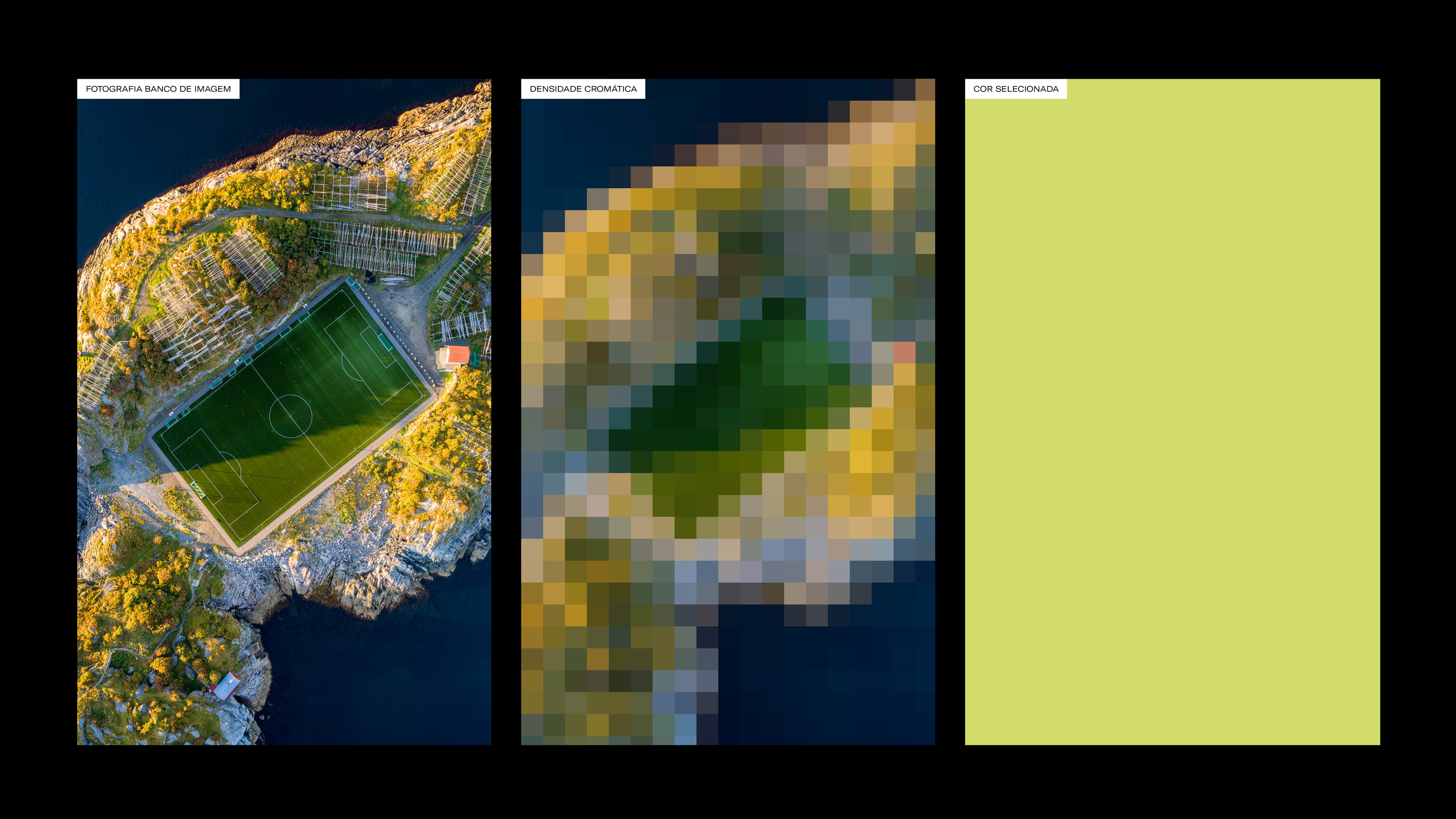
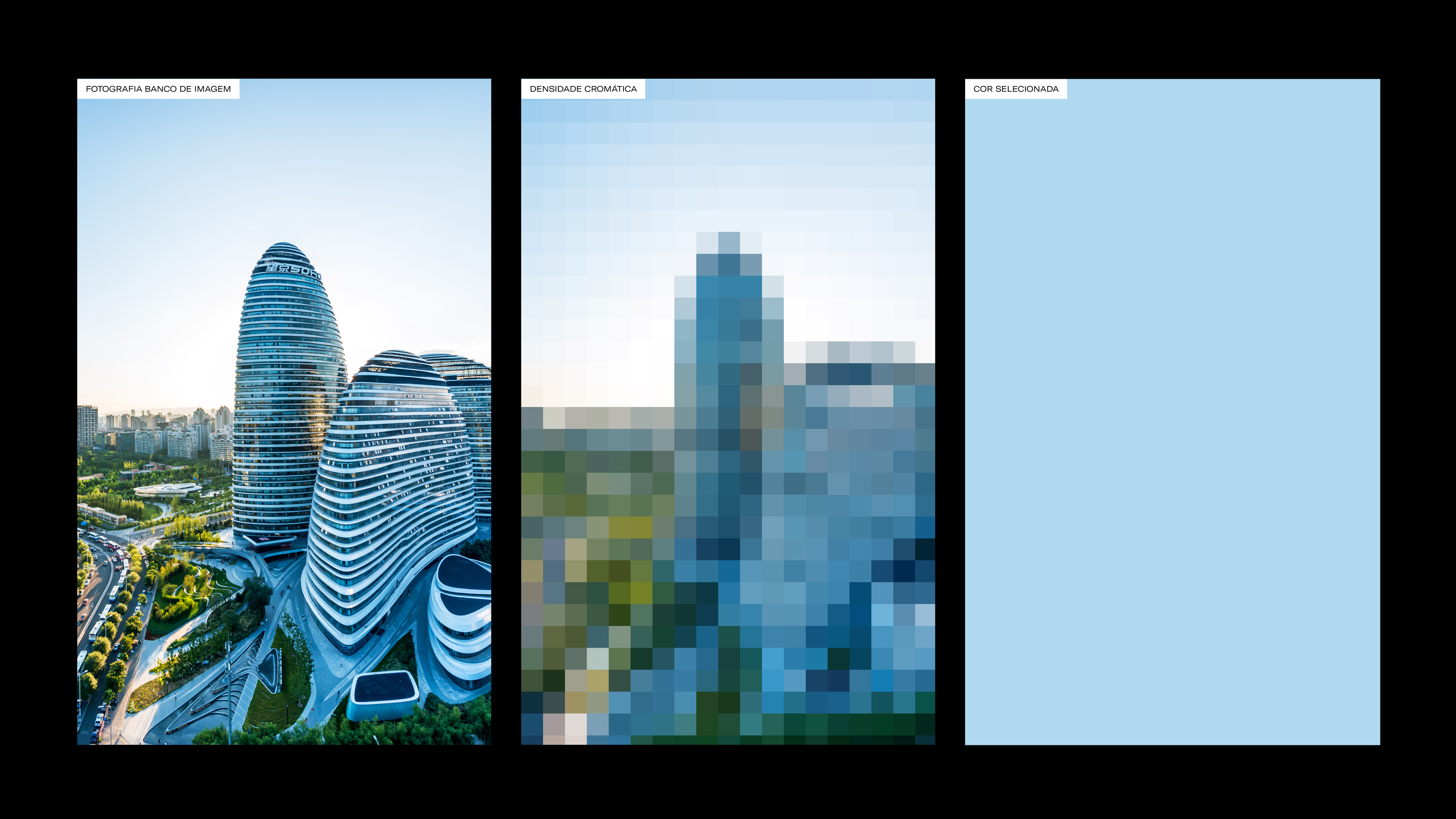
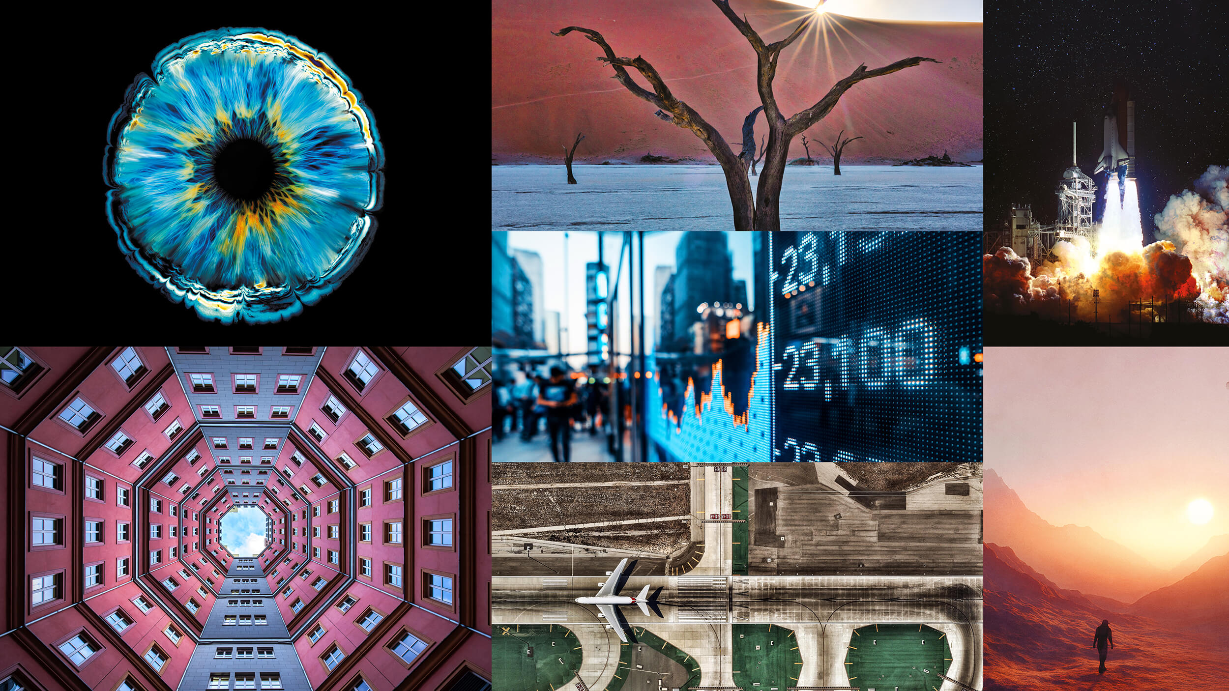
The choice of secondary colours involved a greater intention: to develop a strict criterion in curating photography and images that reflected the PLMJ spirit. From striking and dynamic models, which convey the ambition of transformation, we analyze the chromatic density and obtain a single colour that works only on the part or element for which it is intended - in a rigorous and straightforward translation of the brand posture.

In the same way that we managed to get the signature to convey the essence of PLMJ, we wanted to assure that the restlessness and the free and conquering spirit that characterizes this society was present in the dynamic manifestation of its logo. It portrays the brand's dynamism, always in reinvention, and it aims to demonstrate an energetic and alive extension of the identity.
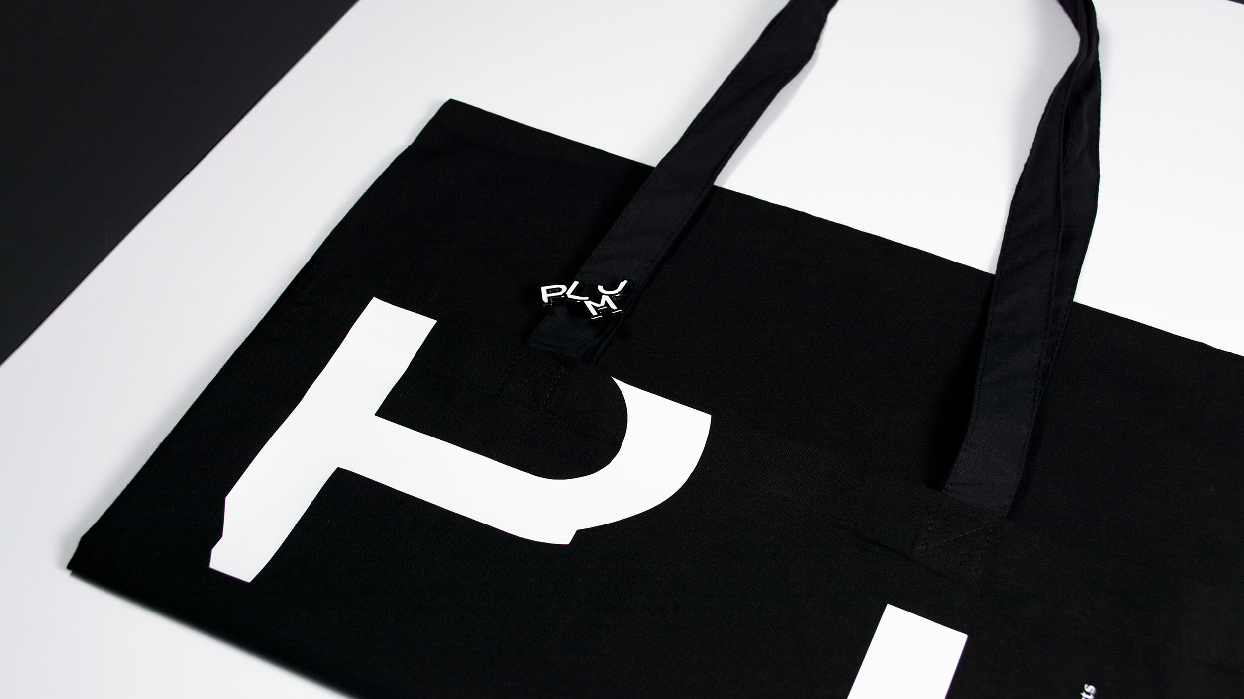
Audacious and full of attitude, unconditioned by traditional reading codes and rules of construction between letters, the dynamic logo never loses his PLMJ reading. It can be used and applied to some solid pieces such as merchandising, stationery and digital parts such as animations for websites, events, displays or screens inside the PLMJ headquarters.


The firm's Four Founders succeeded in making PLMJ a name greater than the sum of its parts. They were the official guidelines of a future to come. The particularities that guided the way they saw and practised the law led us to a new form of advocacy in Portugal.
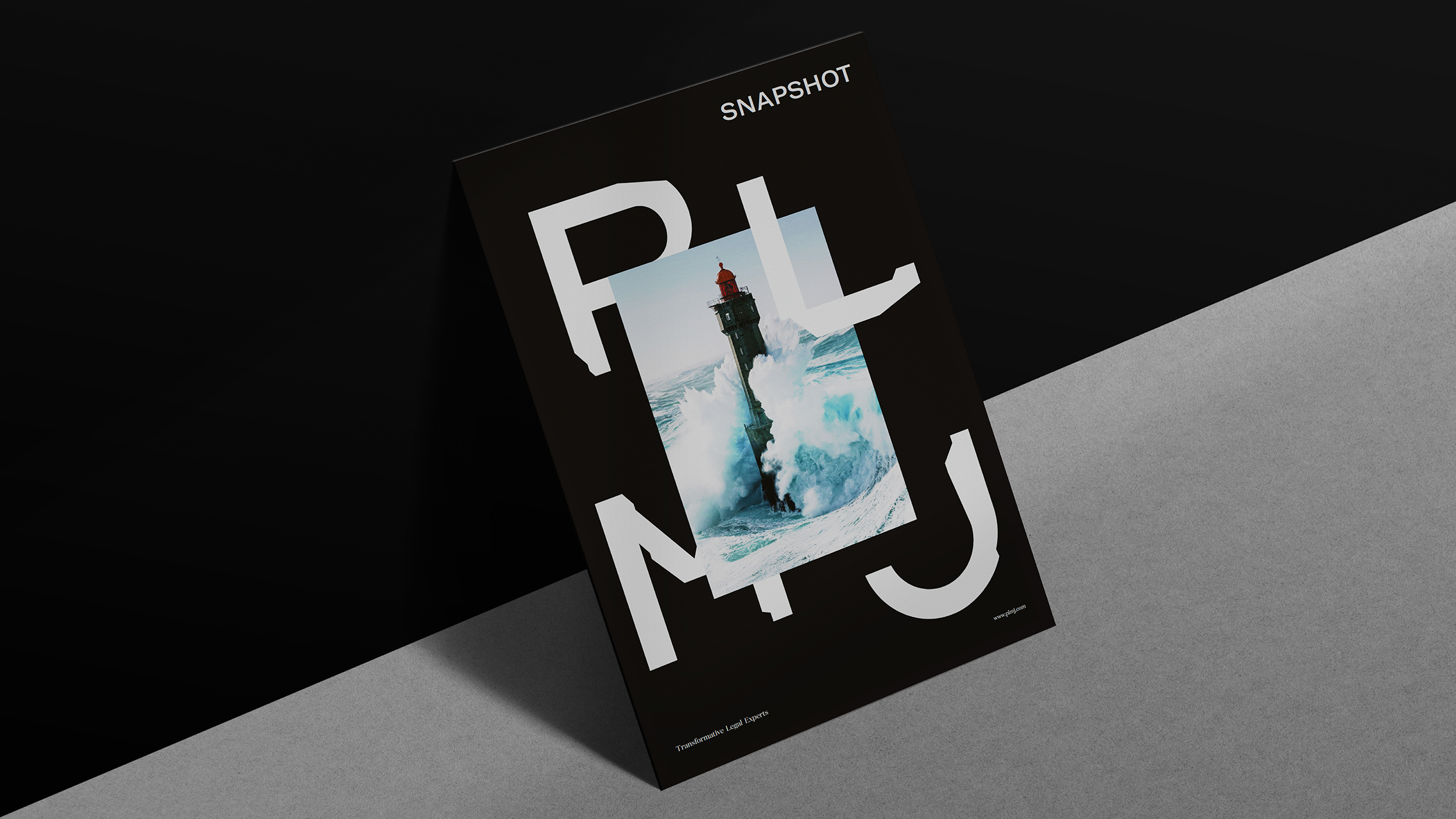
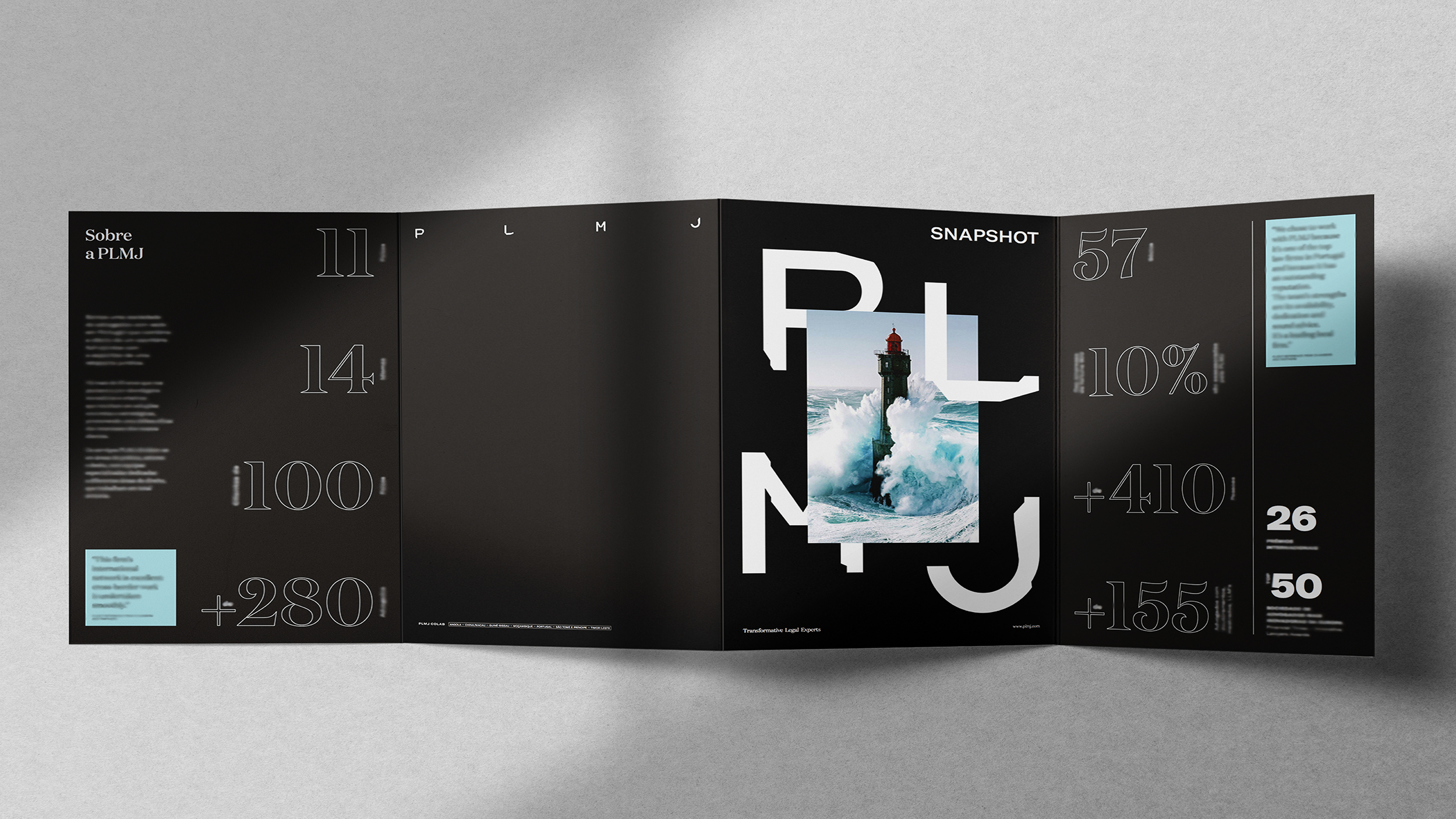
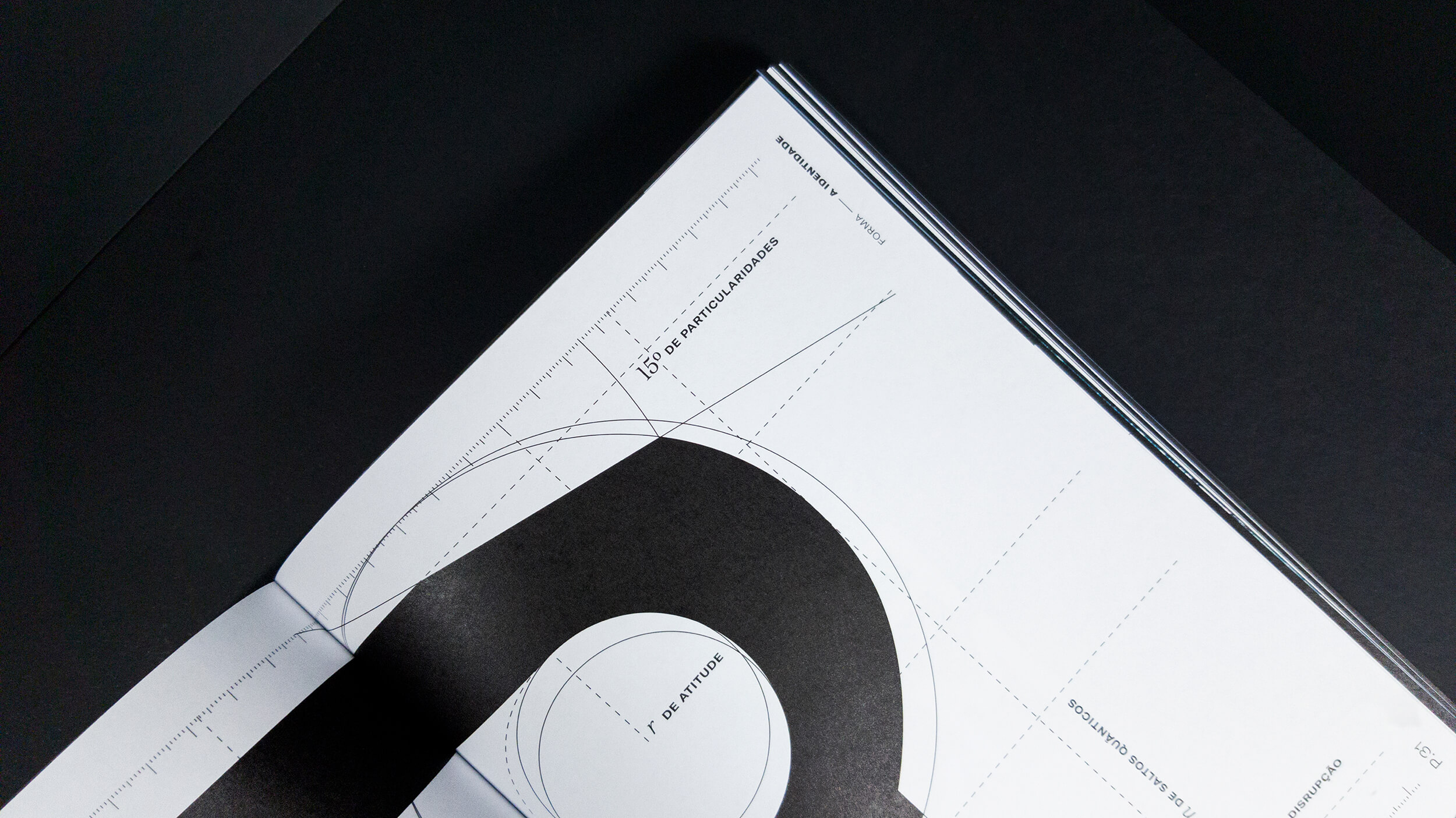
The present PLMJ identity has a unique expression, full of particularities and attitude. We created an innovative and disruptive logo, one which stood out when facing all others. The "cuts" mark a unique personality, with proportions and meticulously designed spaces for perfect optical balance. The elasticity of the square and horizontal manifestations reflects the expansive characteristic of PLMJ.
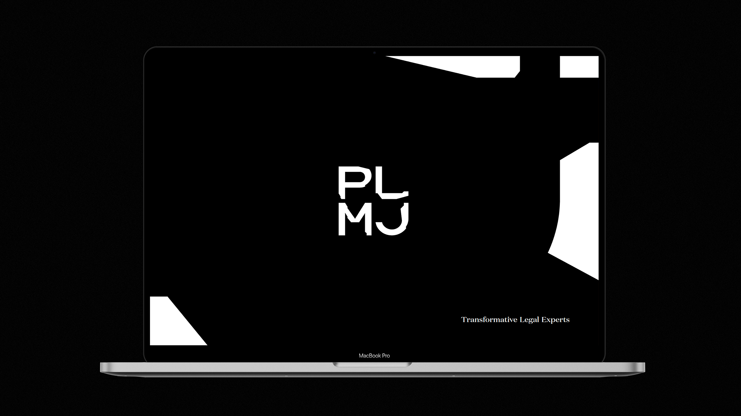
TRANSFORMATIVE LEGAL EXPERTS
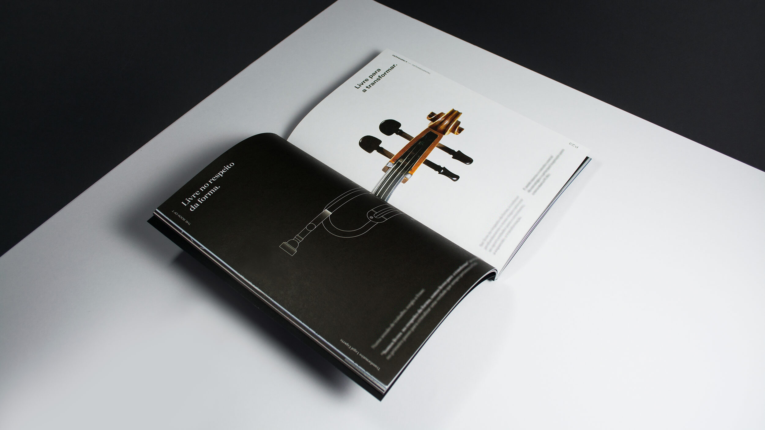
Being able to find the claim that sums up PLMJ's attitude and spirit was a team effort. The word "Transformation" was inscribed in the brand's DNA, as well as the ability to transform adverse contexts into opportunities, and that of, in the legal framework, "pushing boundaries beyond geographical, social and economic backgrounds, defending merit and the free circulation of ideas".
We decided to transmit the values of the PLMJ imaginary, the advocacy space they occupy and what they represent in the area with their attitude "Free in respect for form, free to transform it", in the constant search for new angles and new ways of solving challenges.

To give more dynamism and relevance, we thought about the brand in Motion format to display a set of animations to show the values in the digital environment. The demonstrations are institutional, intended to project an idealistic form of the manifest and the concept of transformation on which the brand rests.
Our case, created in total cooperation and partnership with PLMJ, generated the essential freedom to achieve a rebranding success. We displayed an ability to understand the brand and to let it evolve in a sustained and positive way. We were able to make a bold cut with tradition in such a conservative sector and to create an actual case of brand disruption - giving birth to a reference and a case study in the law and advocacy segment.
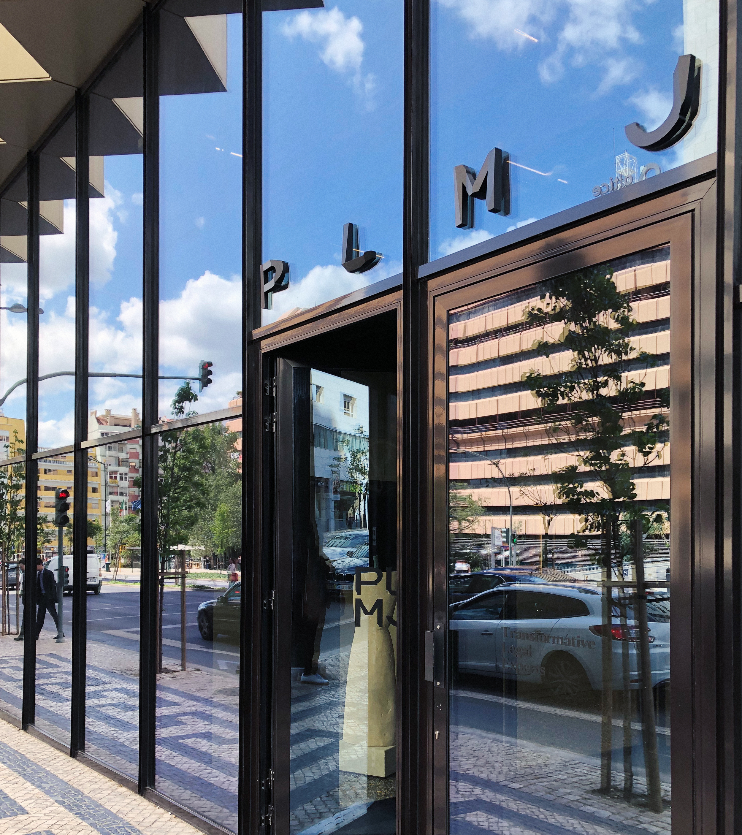
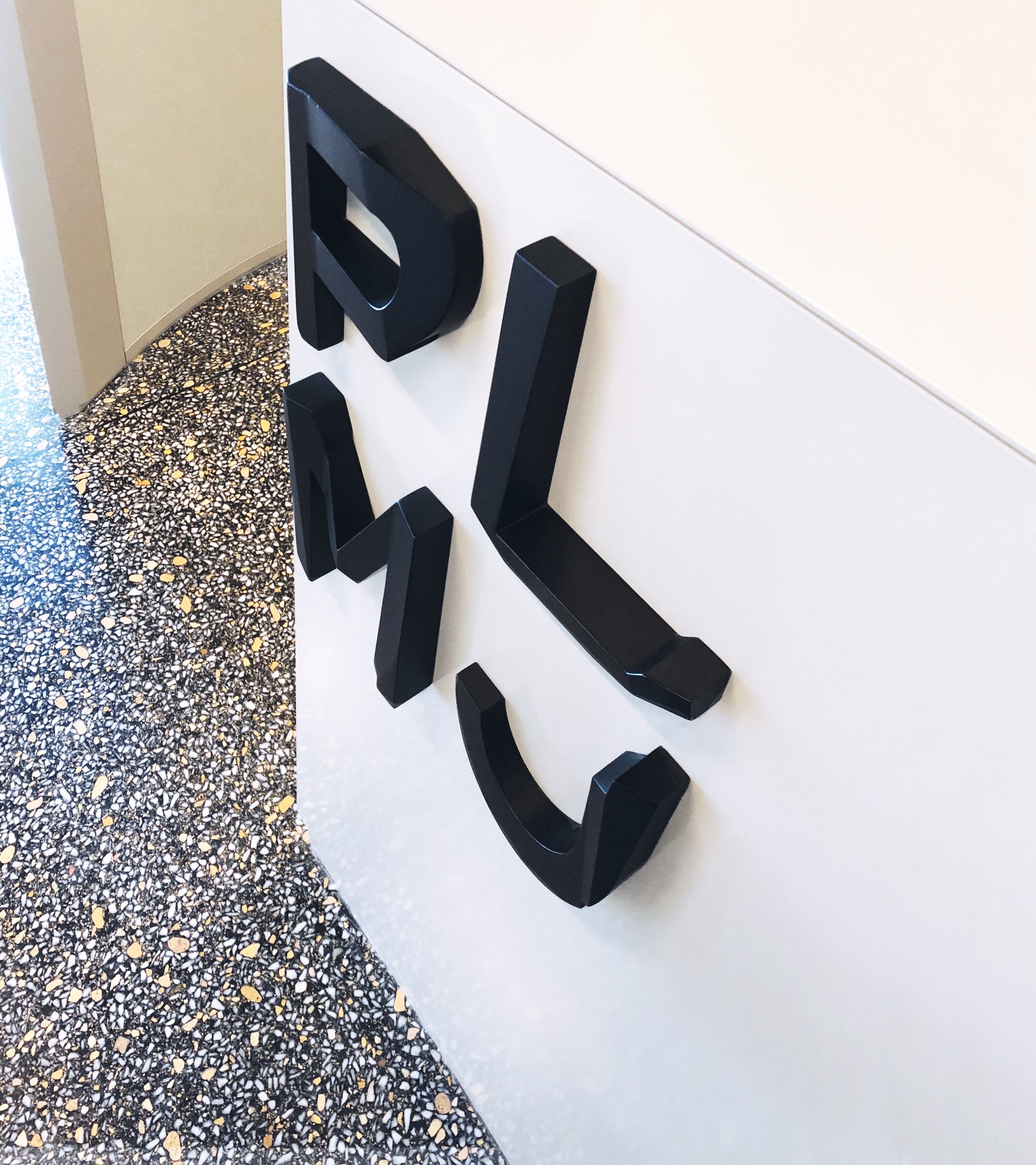
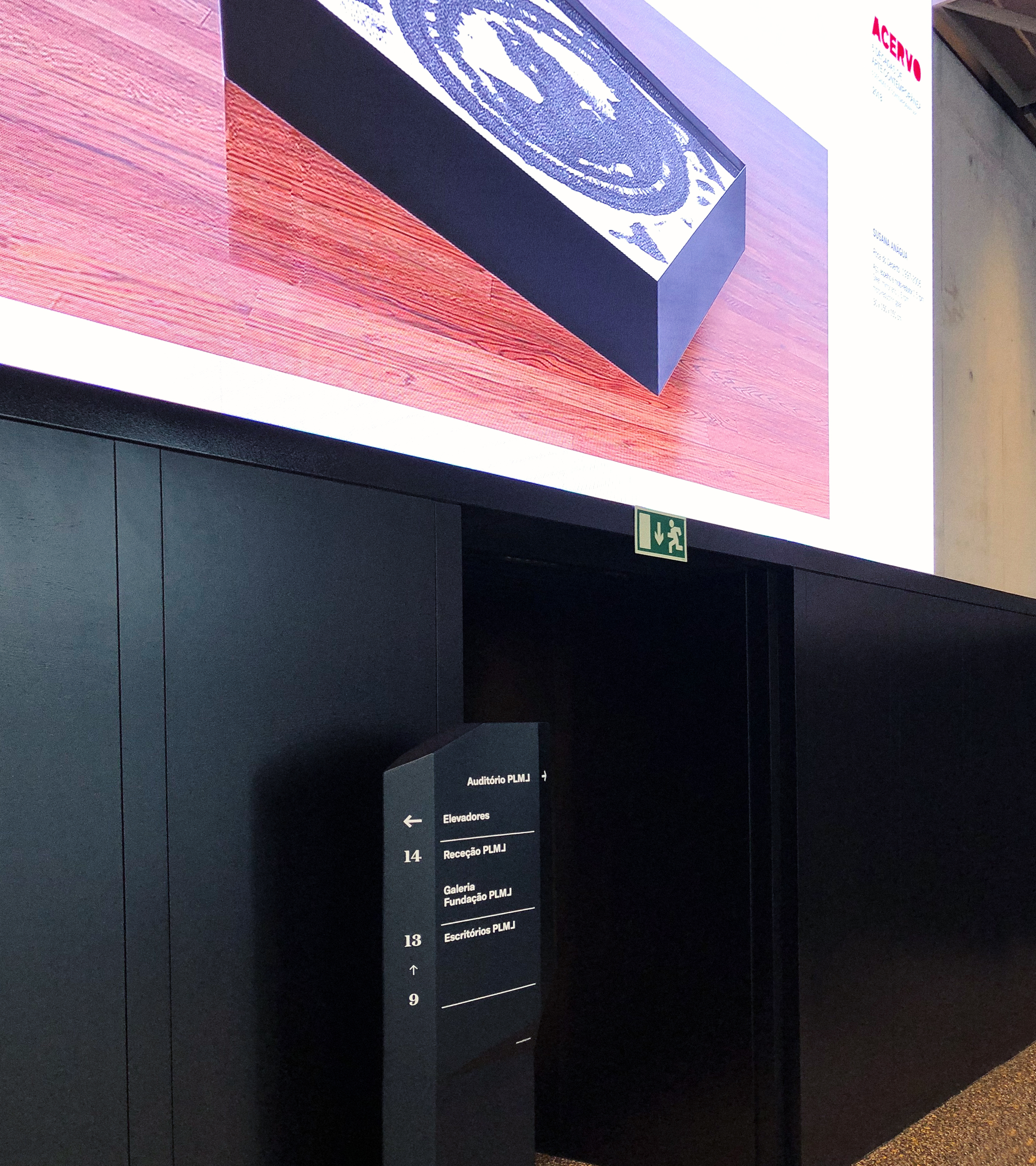
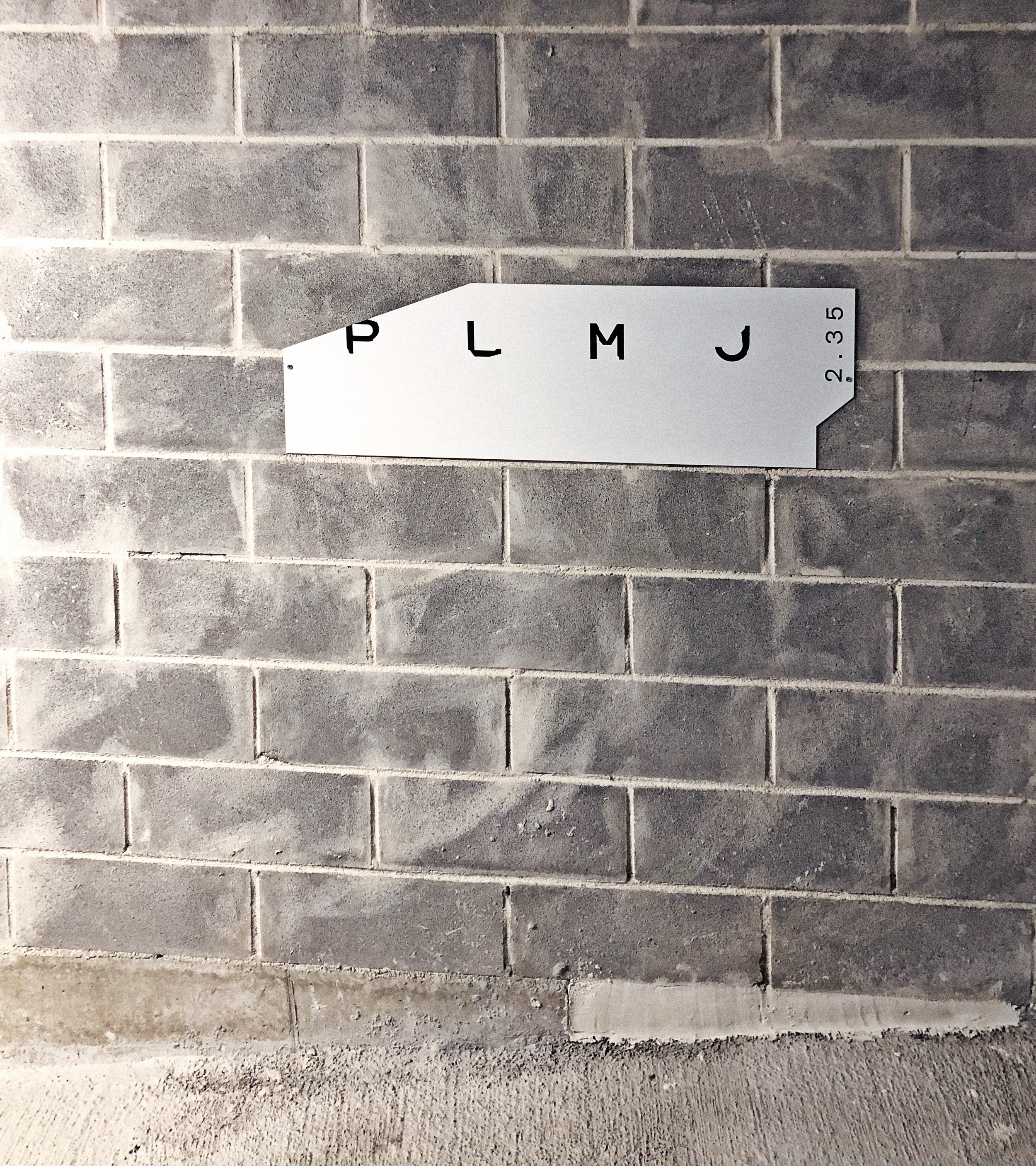
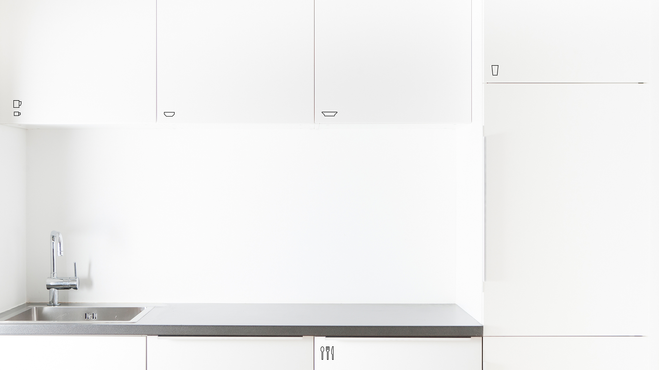
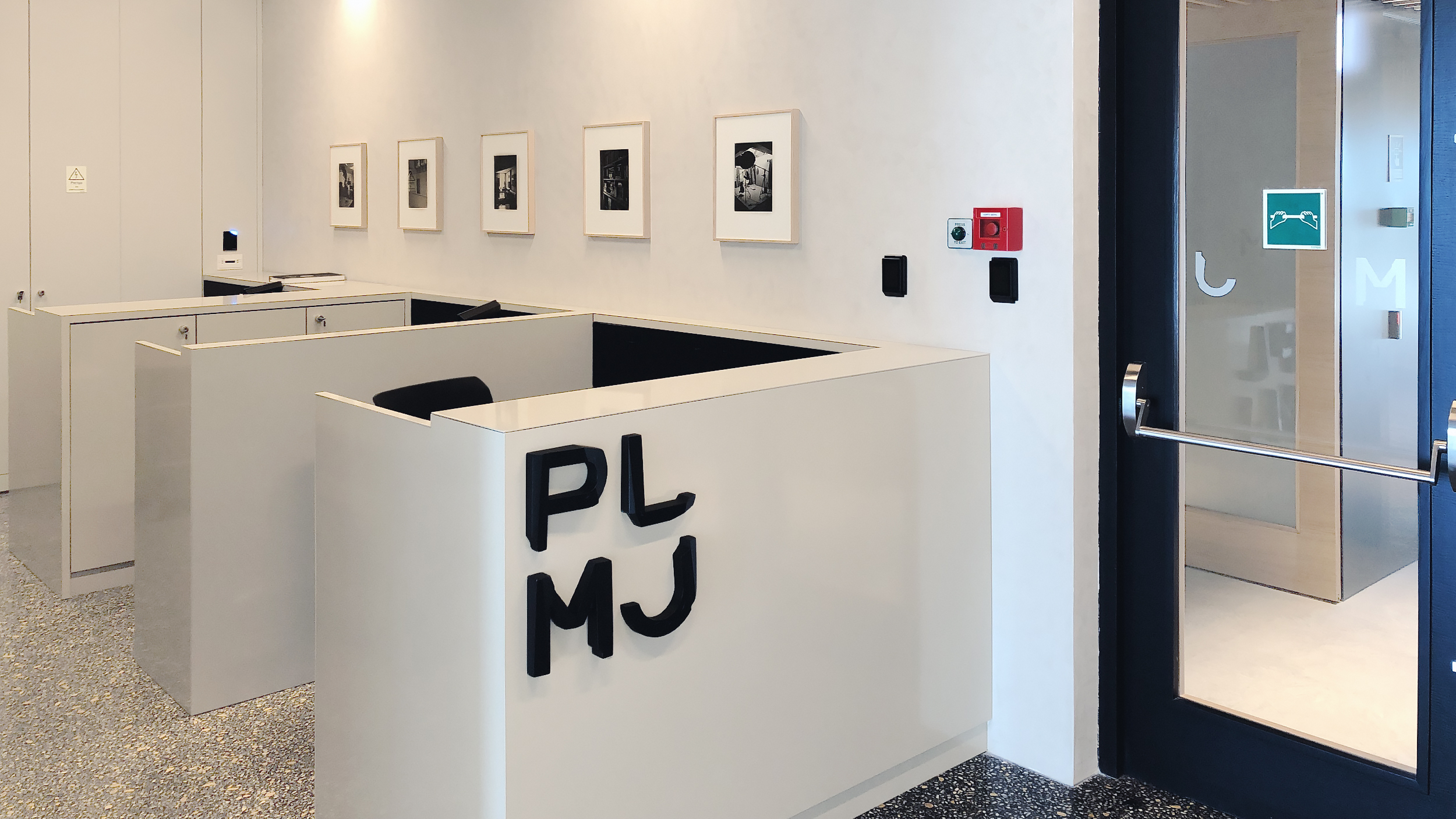
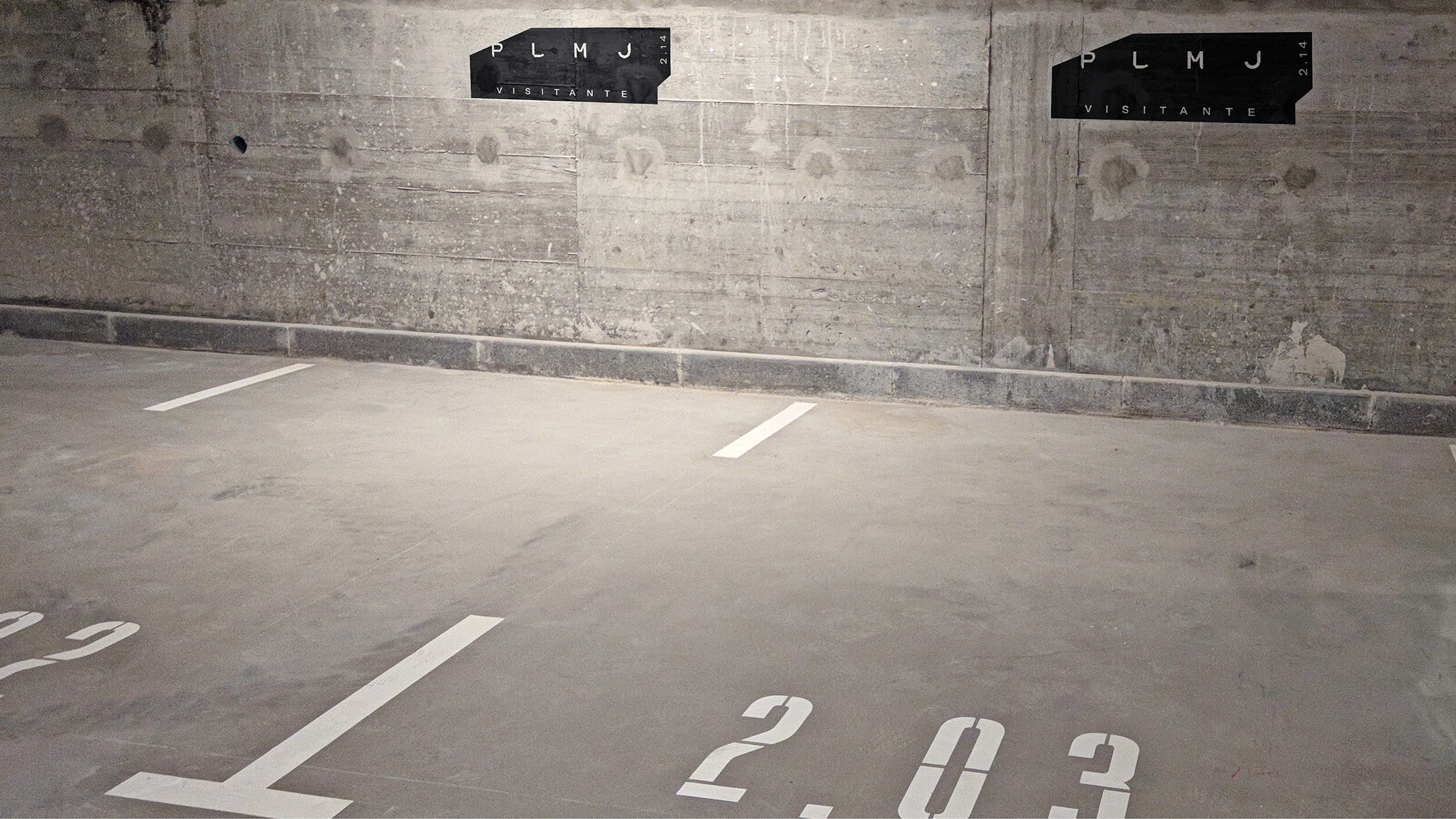
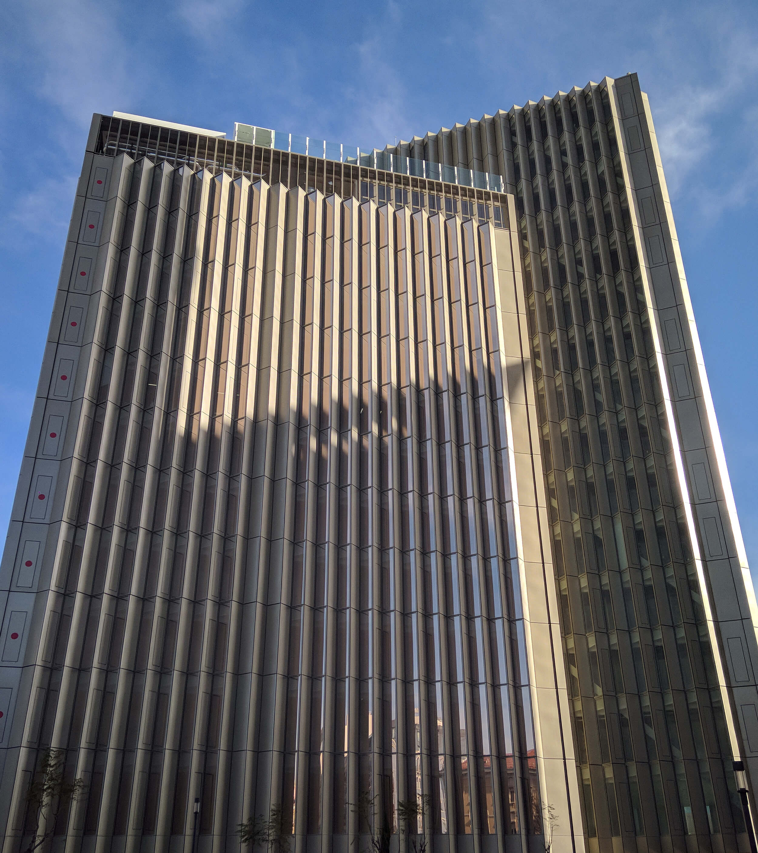
It was an area that forced us to reflect deeply: how to make PLMJ manifestations evolve from a 2D brand to 3D manifestations? We approached signage as the means of brand communication and an opportunity to interpret it, creating a challenge to the senses during the interaction.
In the signage pieces, we reinterpreted the PLMJ identity, so that it highlights the particularities of each letter, which is what defines the essence of the brand. These characteristics are the pillars for employee recruitment and integrate into the building in a discreet and minimalist, yet striking way.
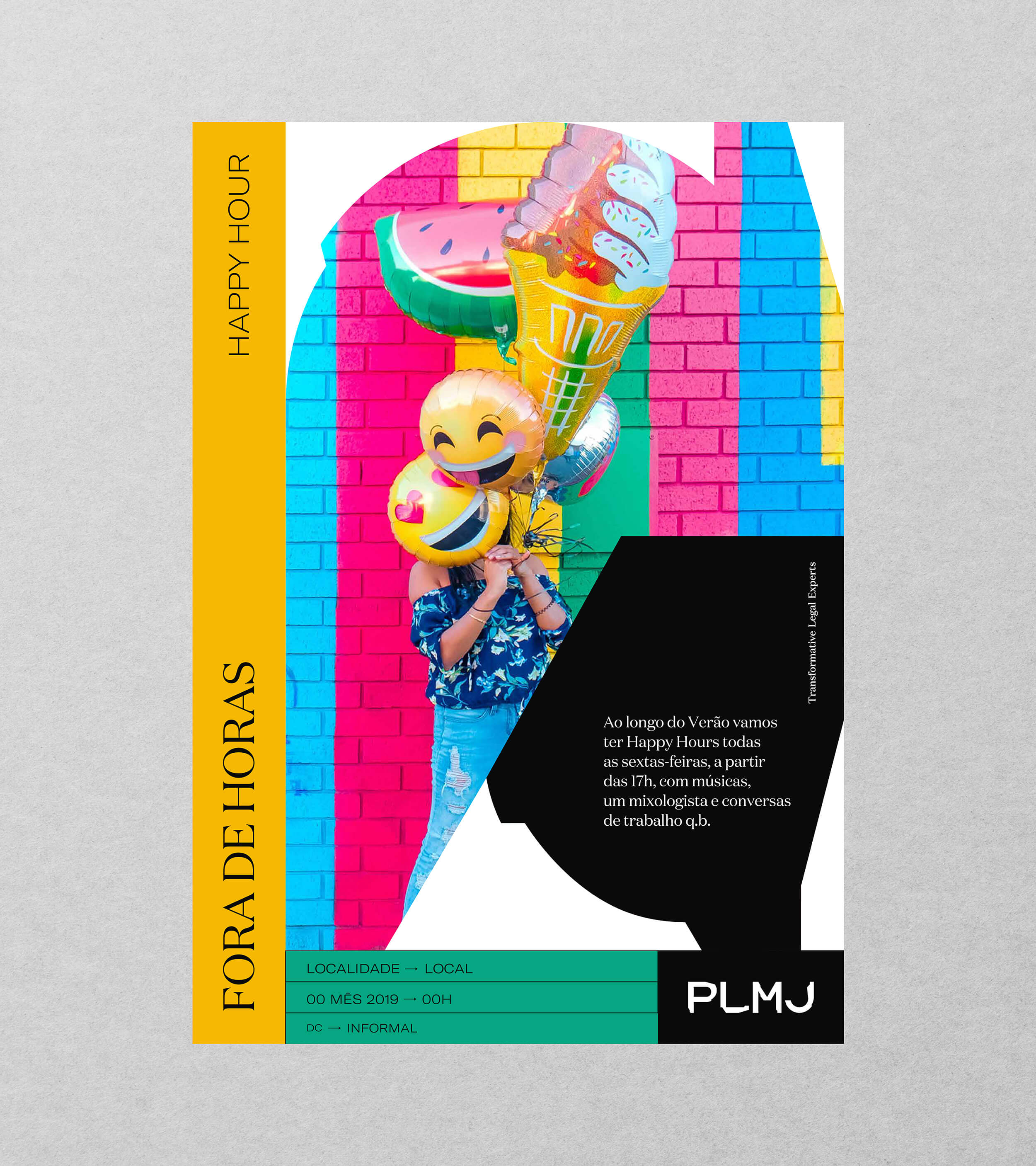
The PLMJ audience is exceptionally demanding, and the communication had to correspond to its' expectations. Thus, we developed two clear lines of communication: one more institutional and severe, with a bright, informative aspect, which guarantees the brand formality; and a more informal one, which enhances involvement and allows spill out applications more spontaneously.
We developed templates to help ensure this unity by giving freedom characteristic of the PLMJ brand and the differentiation of communication, whether this is more informal or institutional.
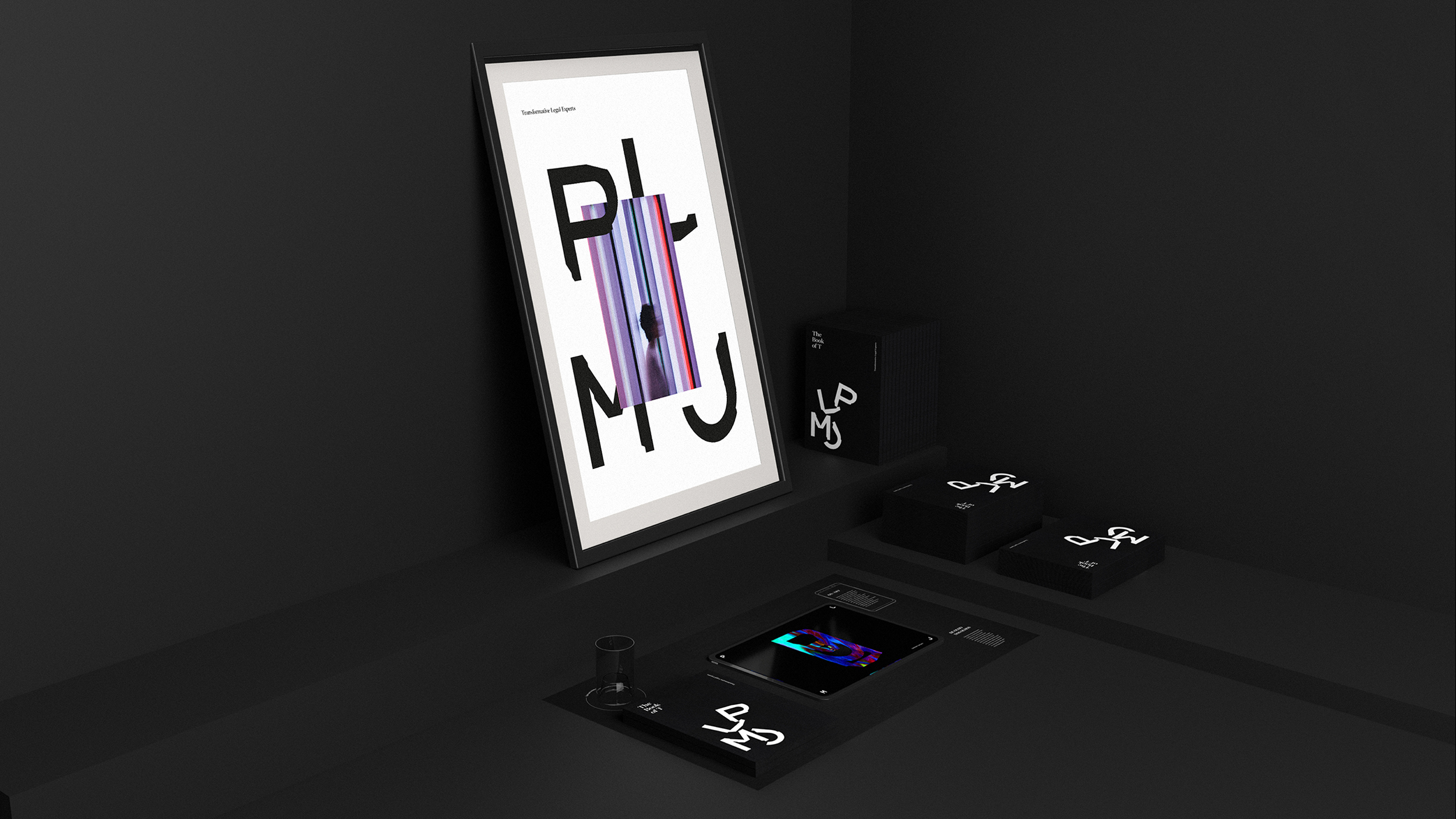
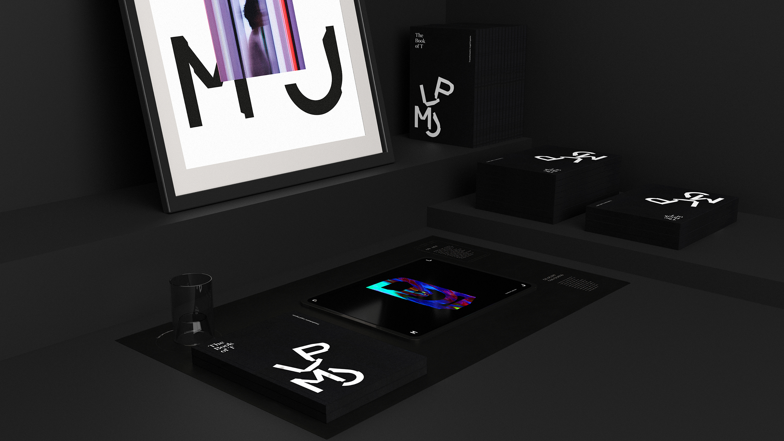
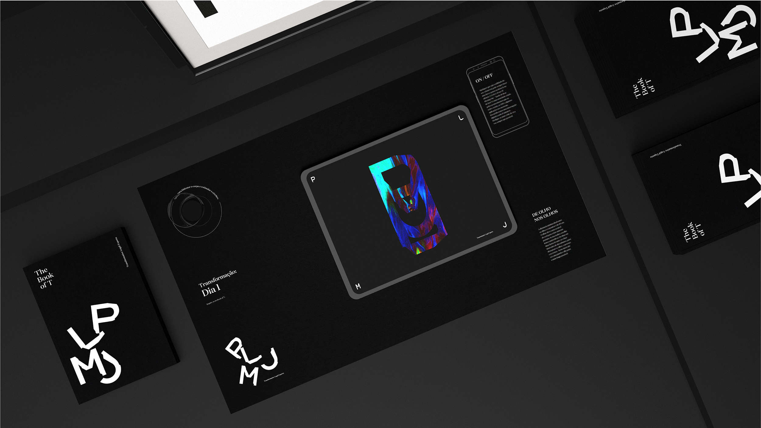
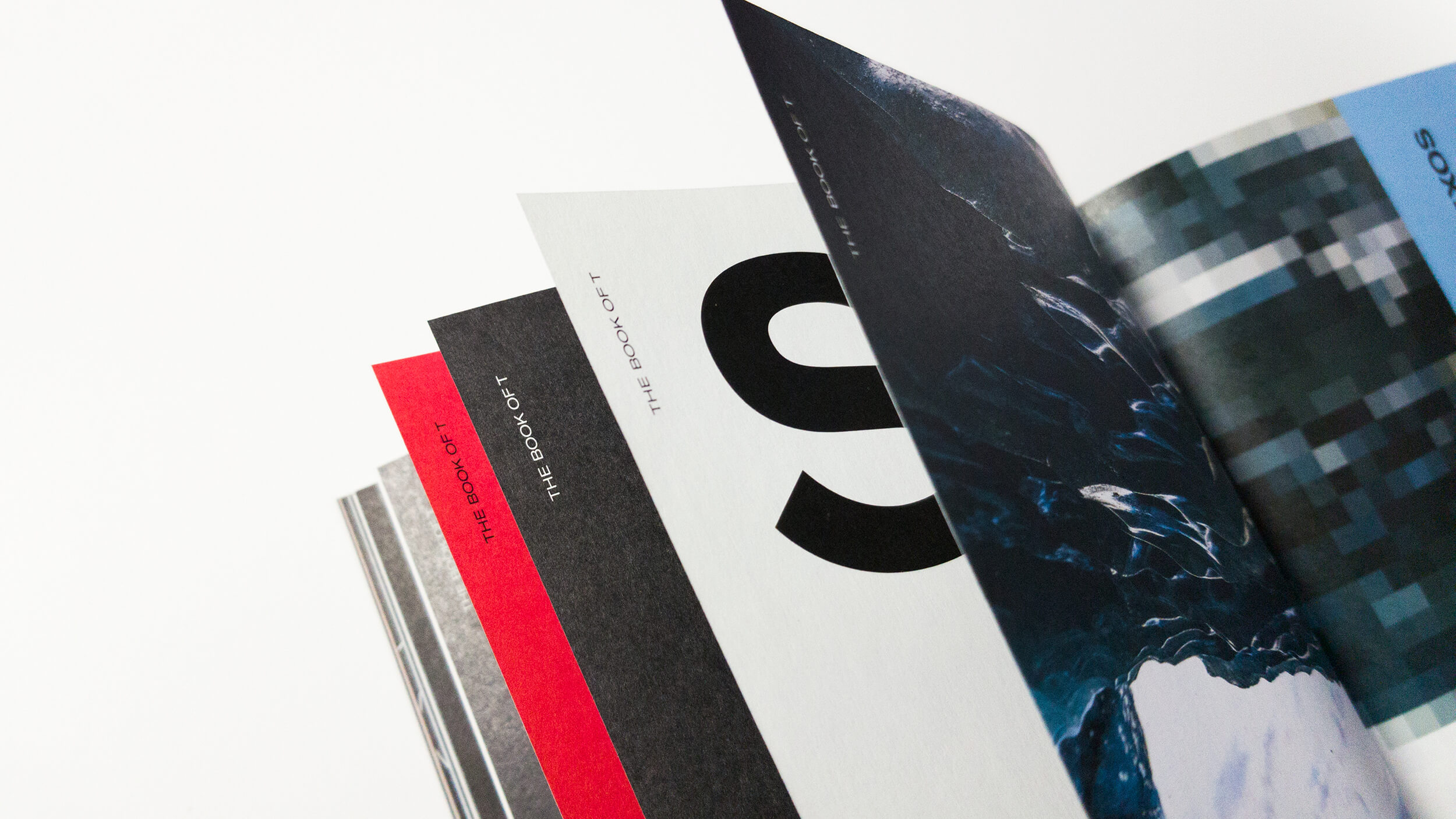
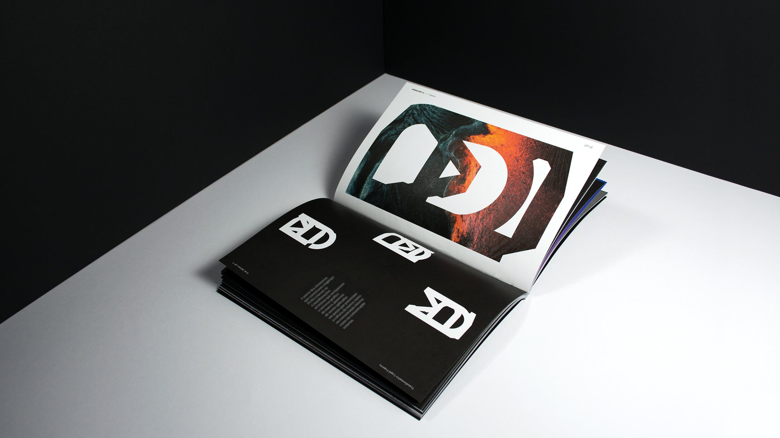
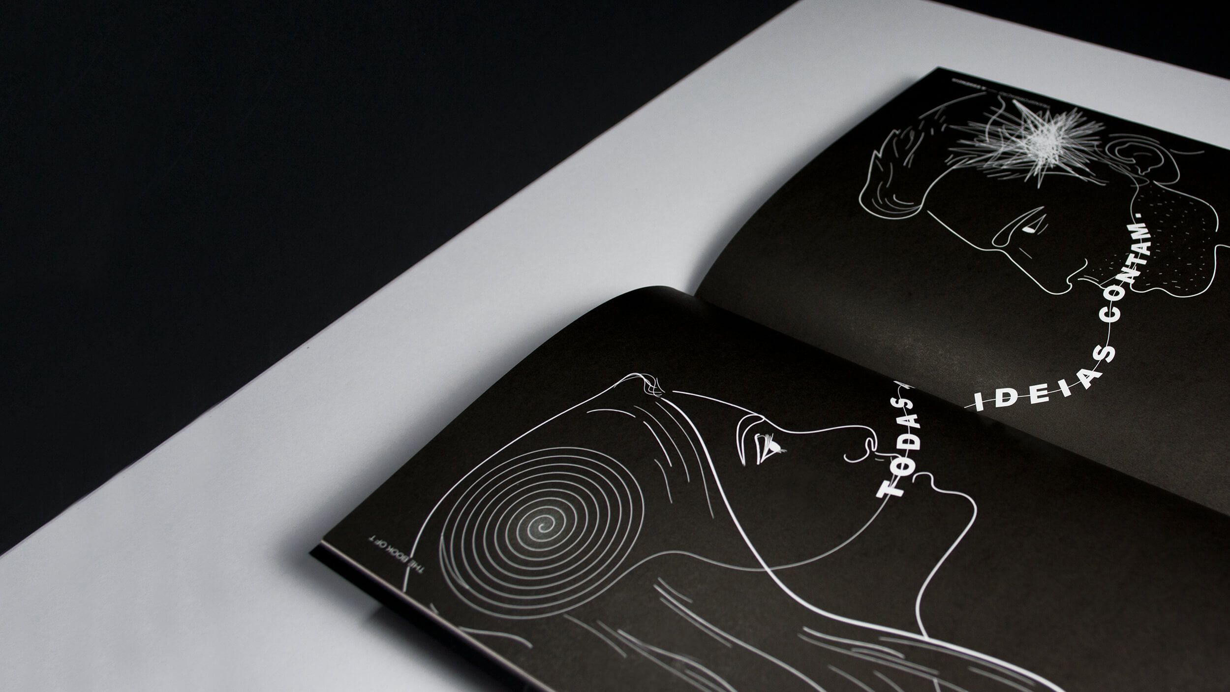
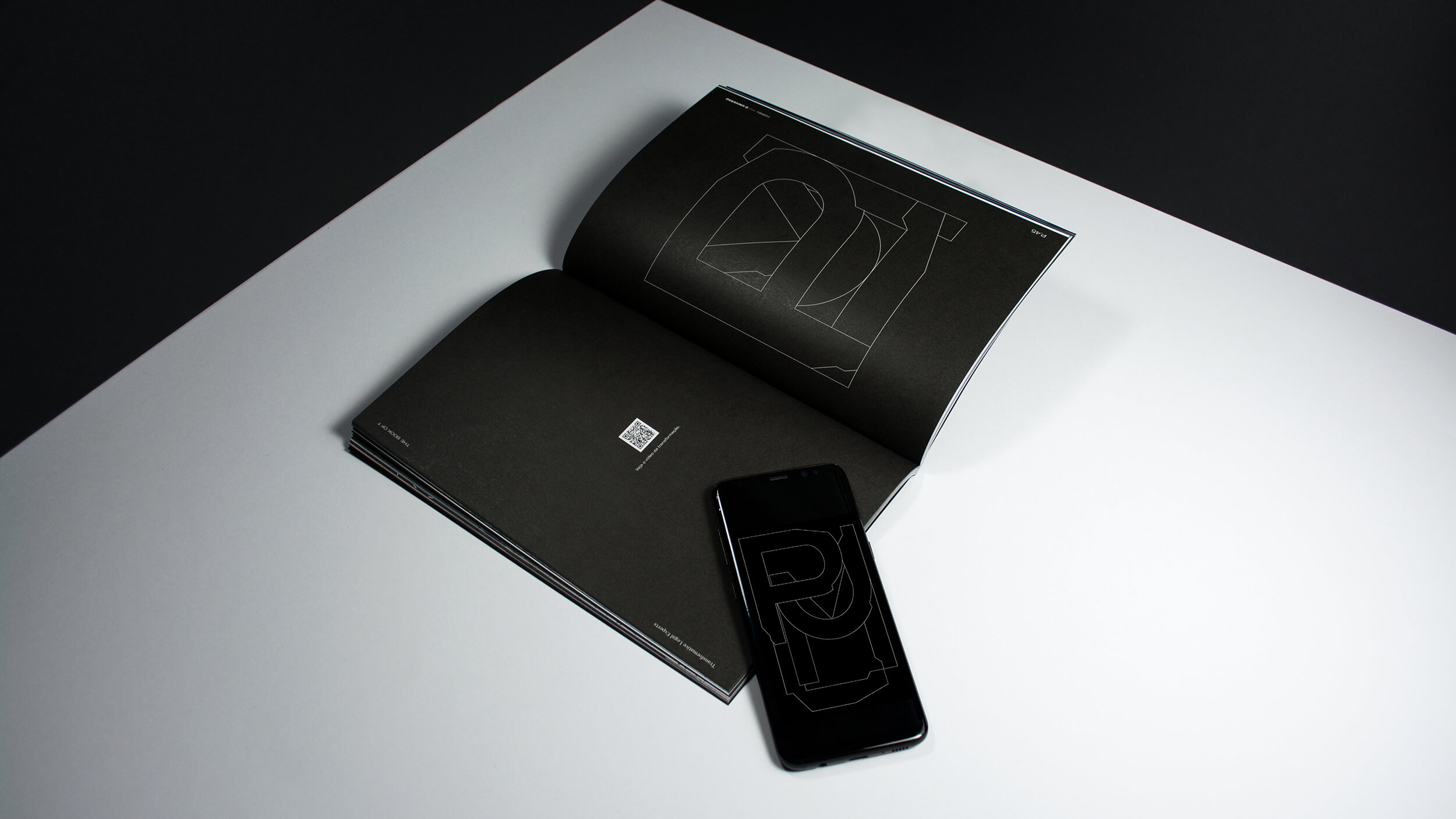
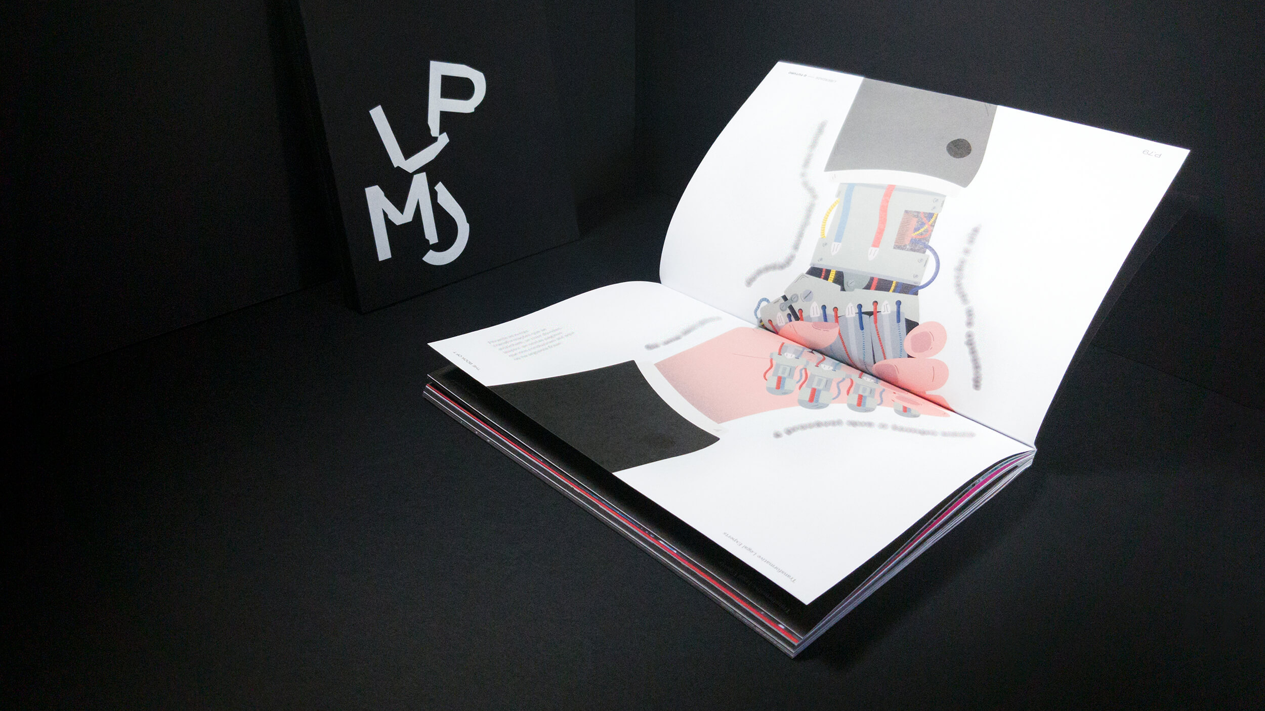
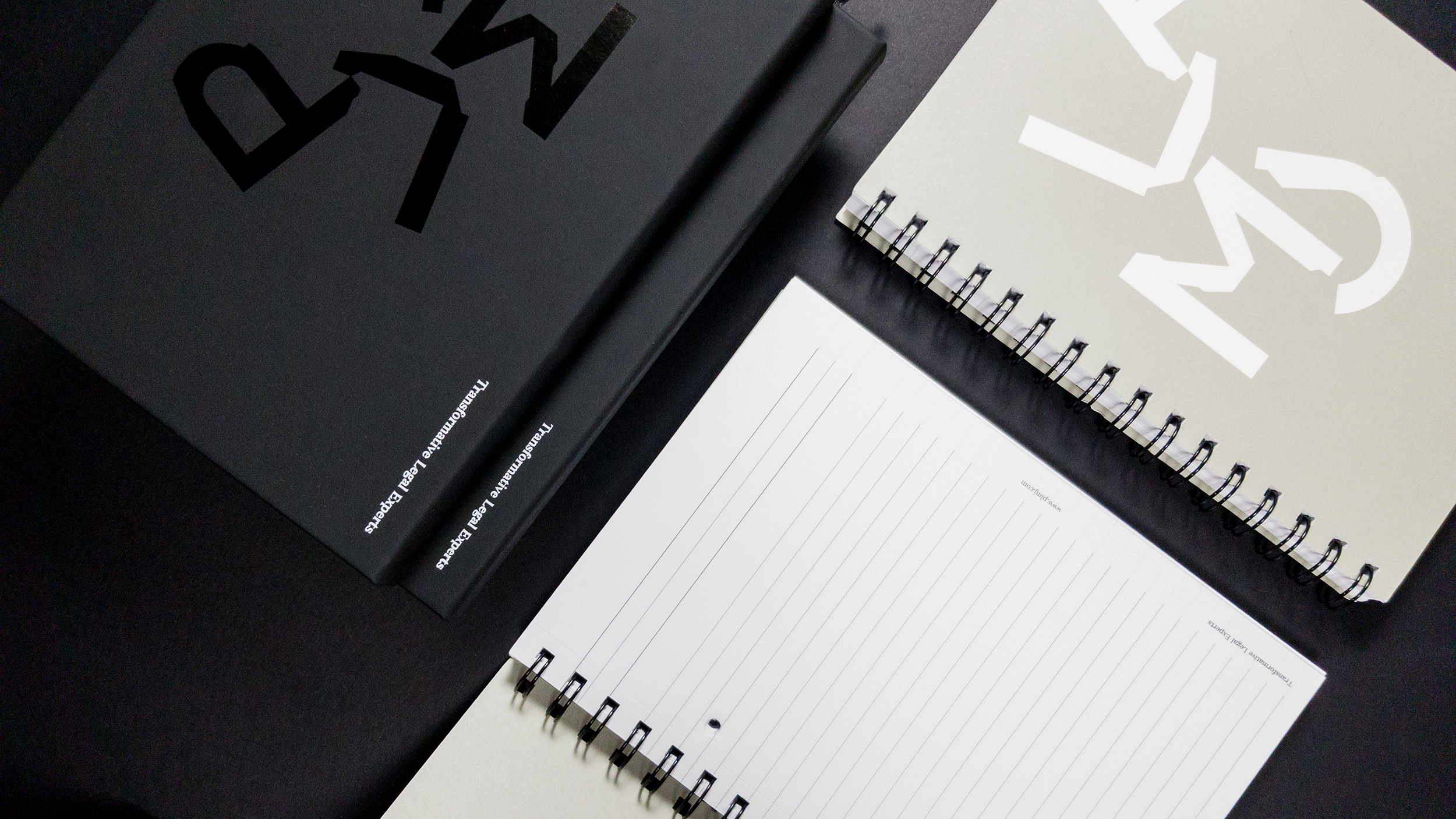
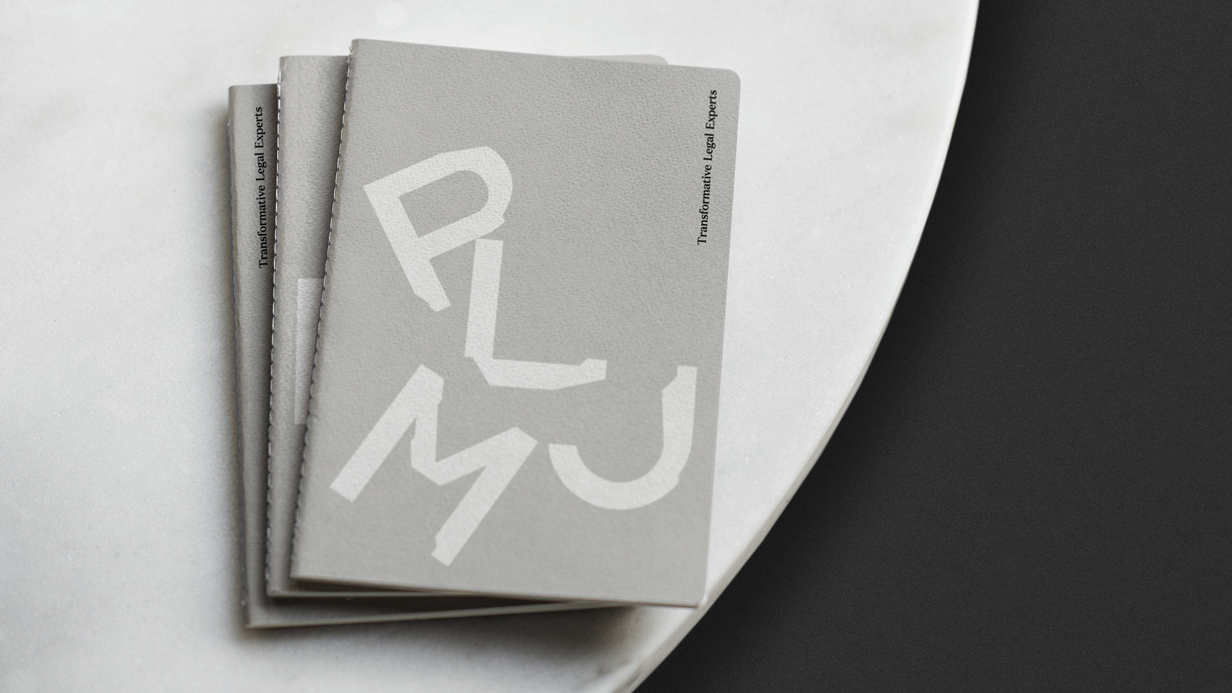
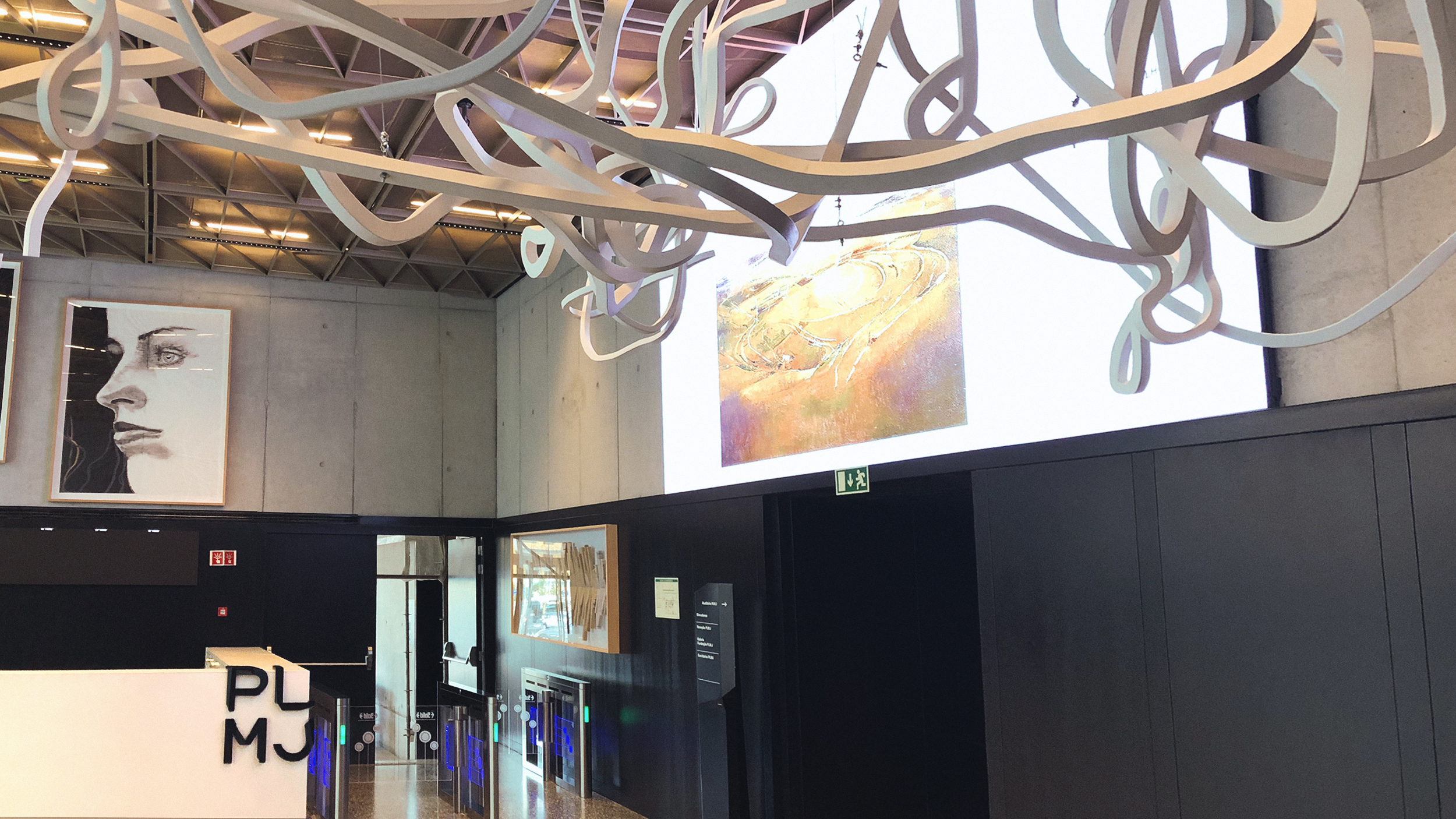
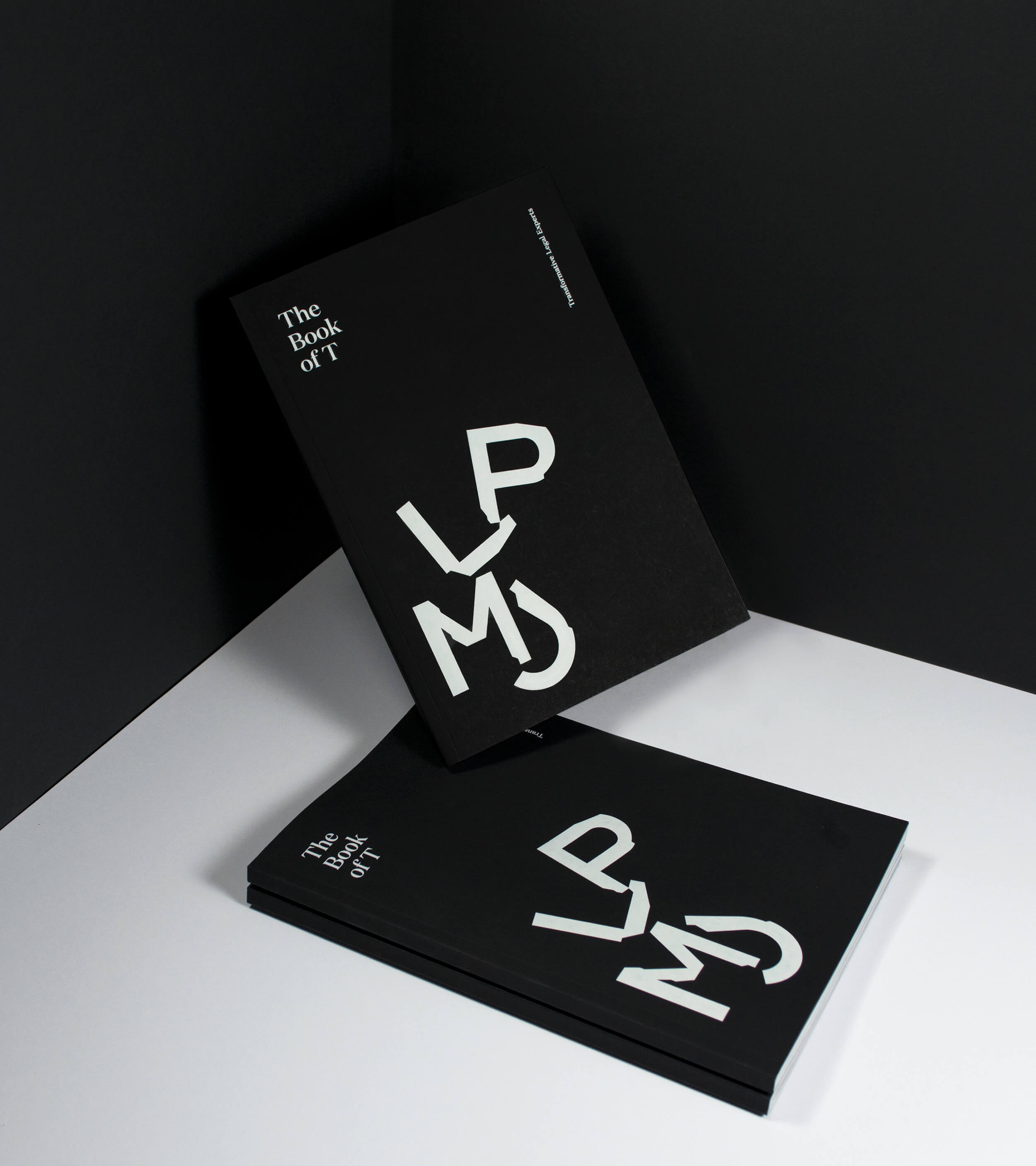
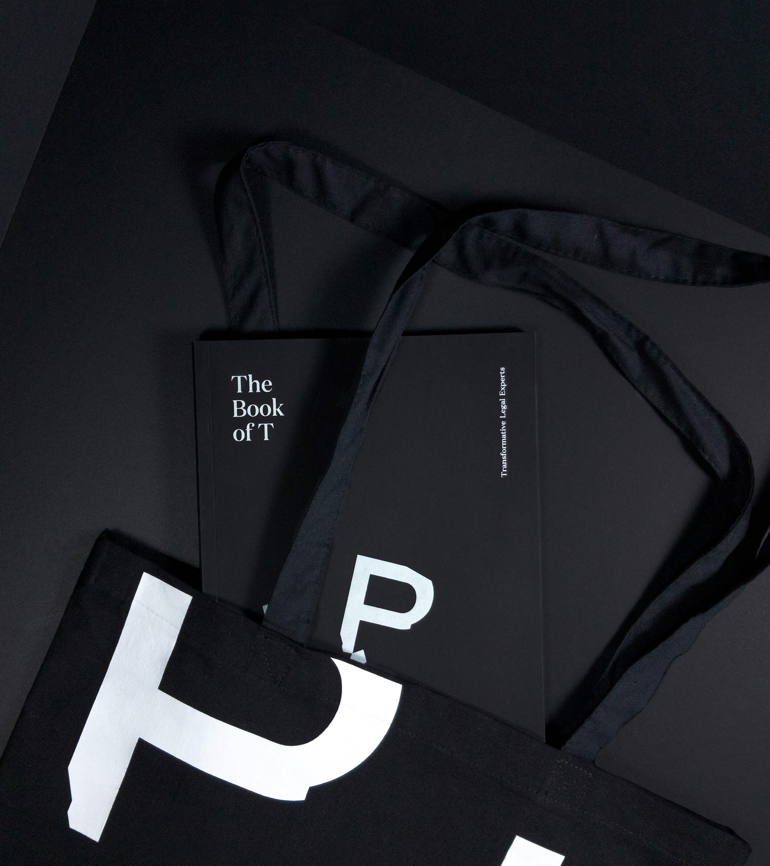
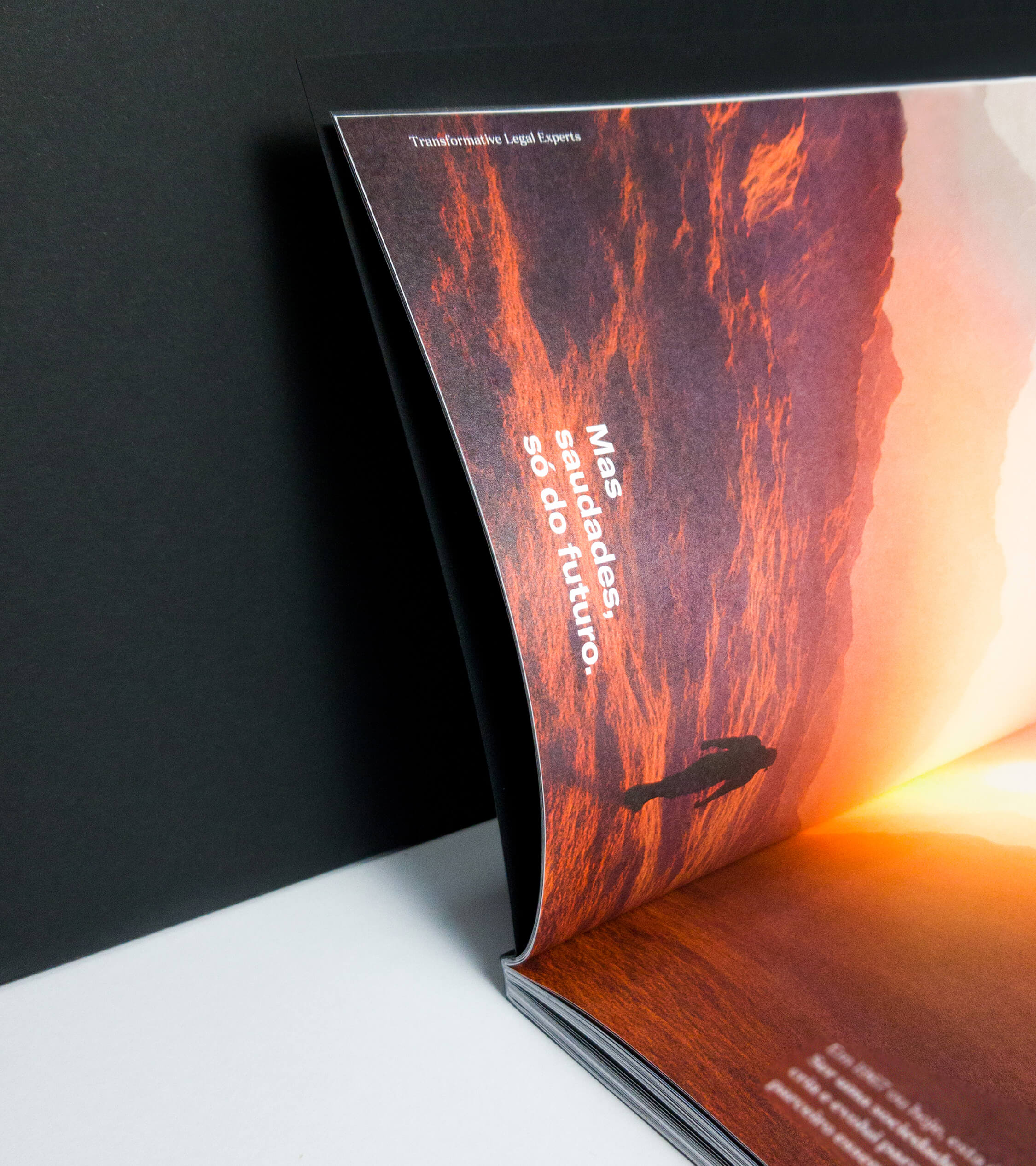
The Book of T was the piece of internal communication that allowed us to affirm and make the new PLMJ identity known to its domestic audience. It is an inspirational book based on transformation and corporate culture, telling in a disruptive and inspiring way the various episodes, details and changes of the history of PLMJ.
It was developed with originality, clearness and consistently to promote the integration and identification of all employees. The editorial line is free in the form of how its expression and manifestation. The message contextualizes the visual. Thus was born the book of transformation, a manifest imbued with attitude and ambition, which affirms values and reinforces its personality.
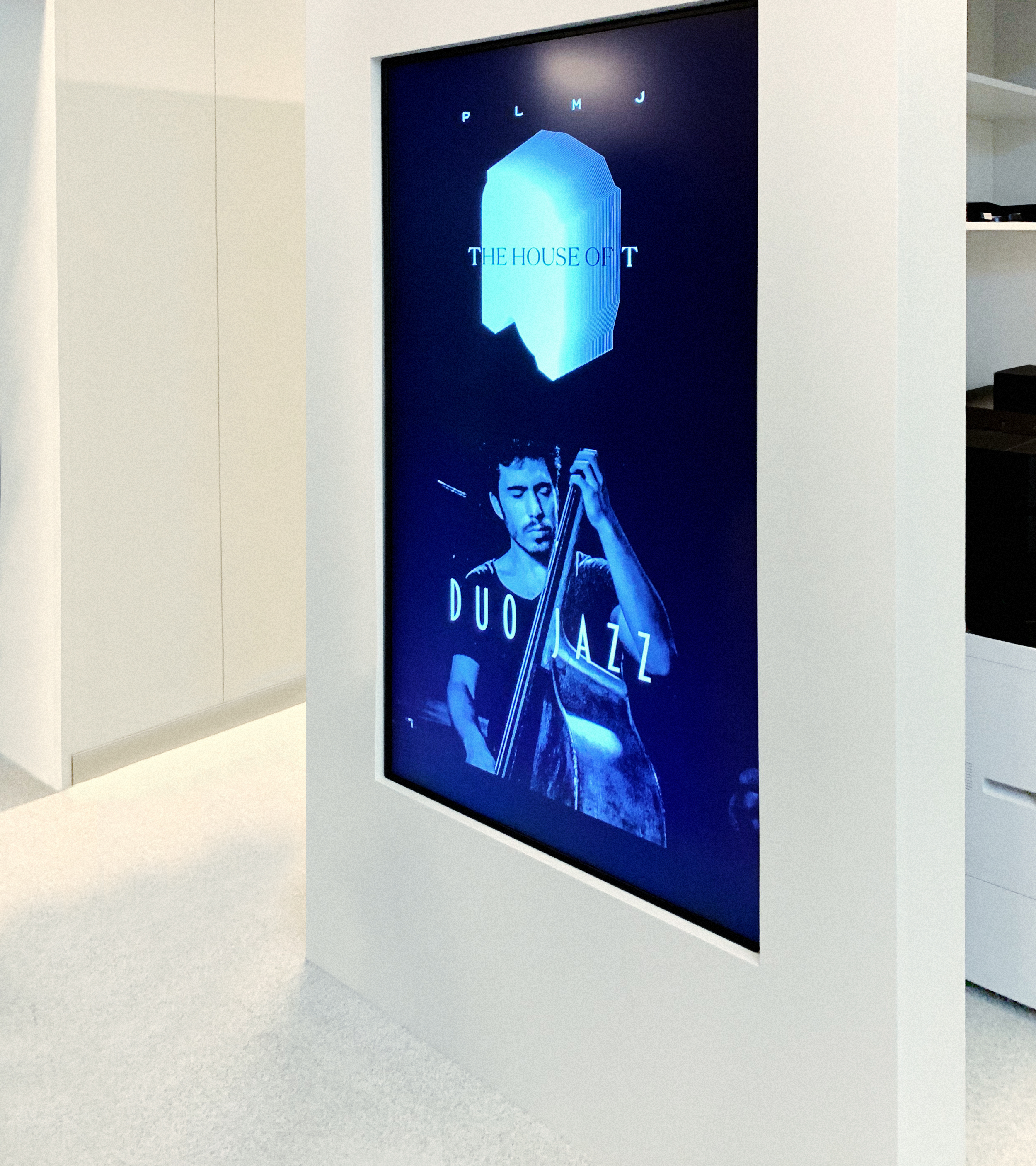
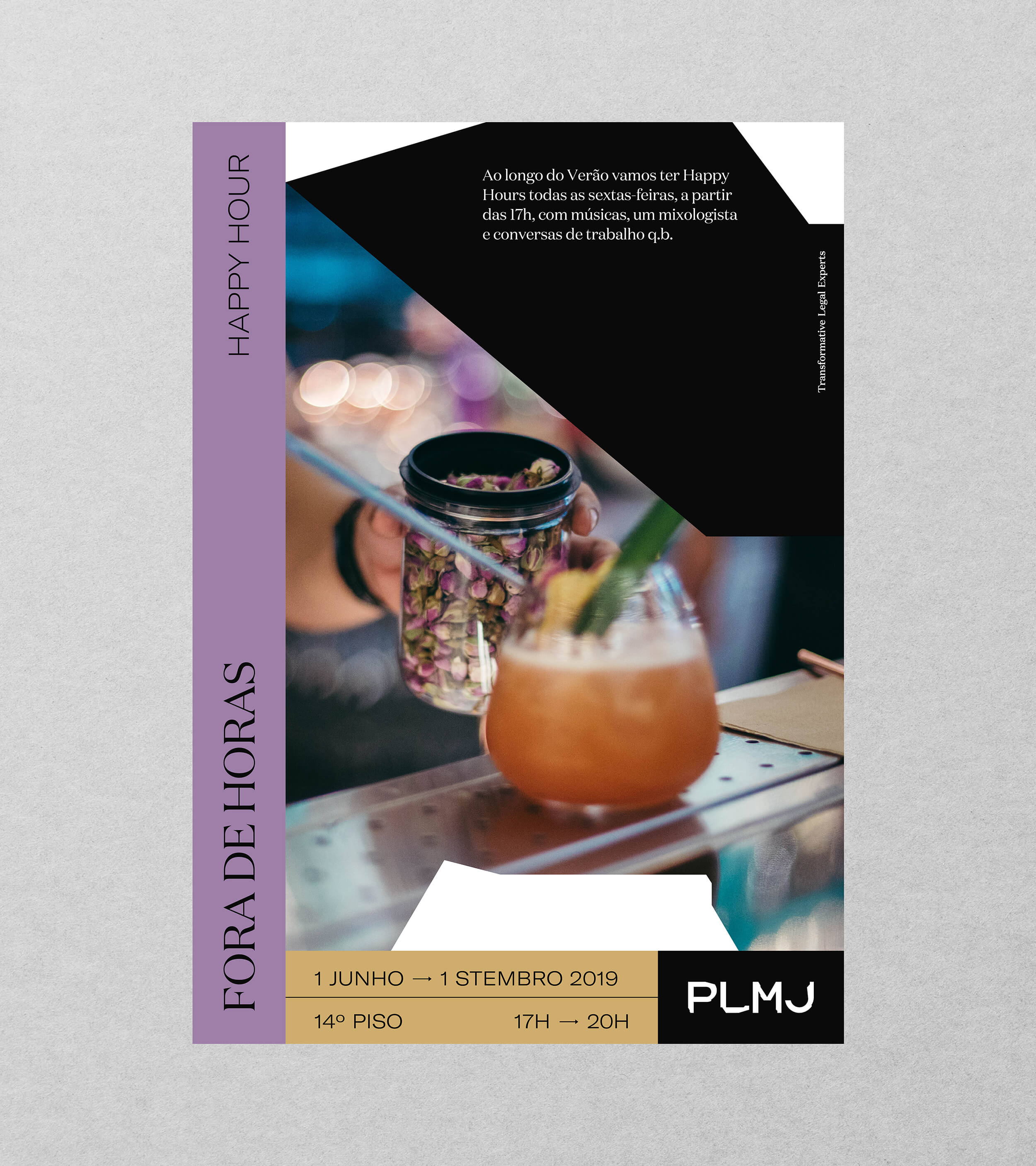
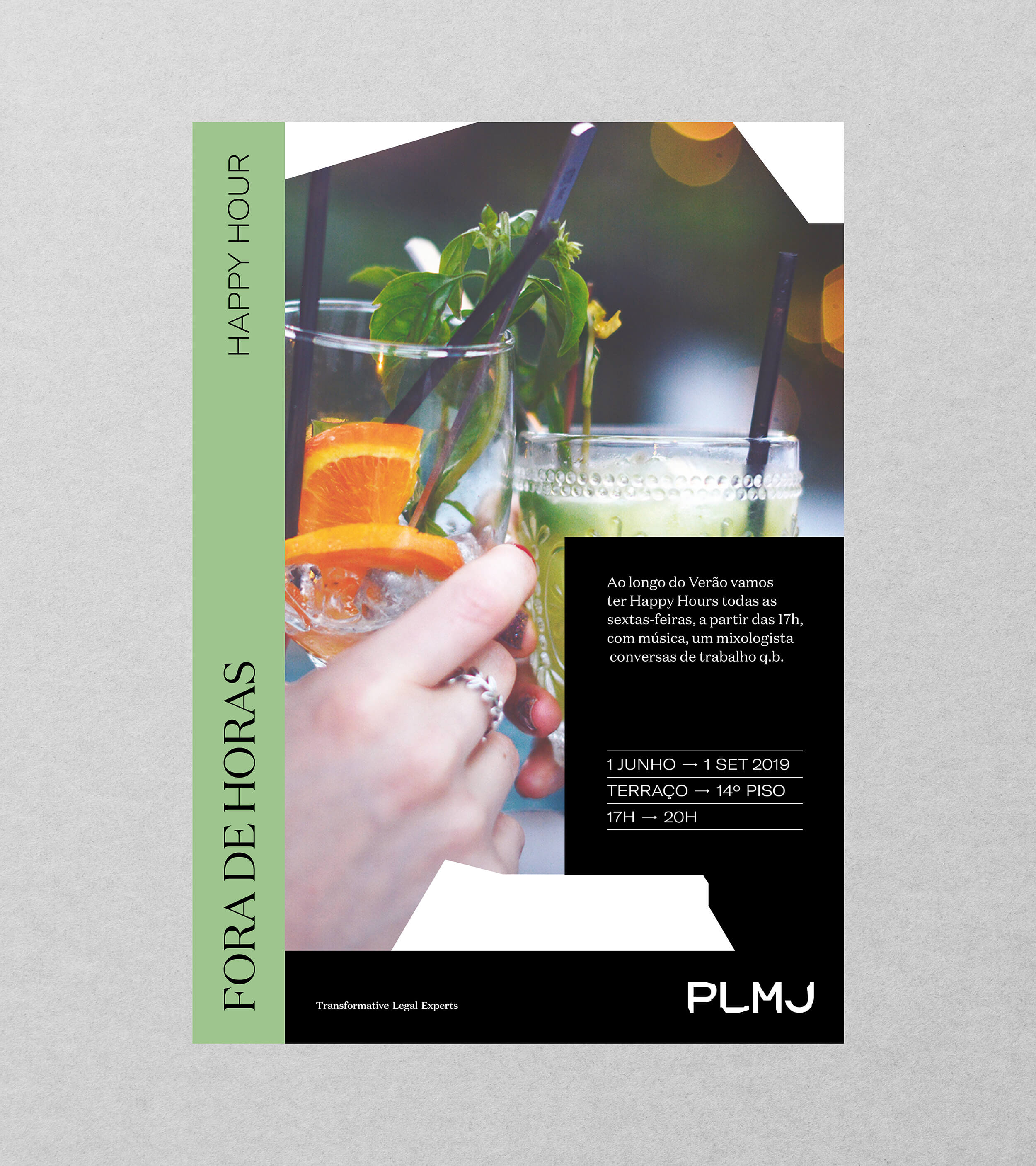
Sessions were the way we found to open PLMJ to the community and increase its influence. Through the power of Jazz and the freedom to transform the way that is the motto of PLMJ, we created these "improvised" sessions that allow creating content to share with society and elevate the culture of advocacy.
We defined a wordtag that interacts with overlap with the container, creating a plastic opening that allows exploring the potential of communication and content, simultaneously showing a more irreverent form of expression.

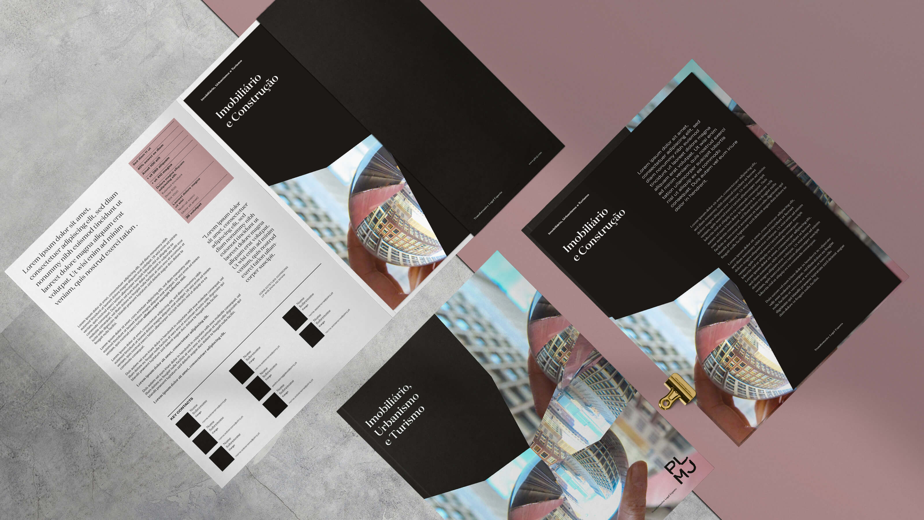
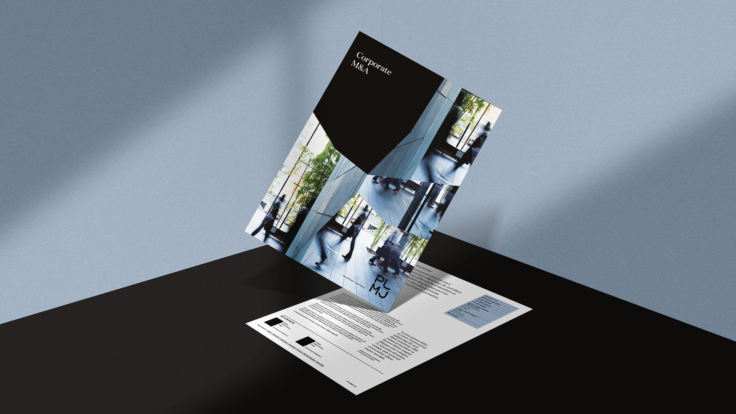
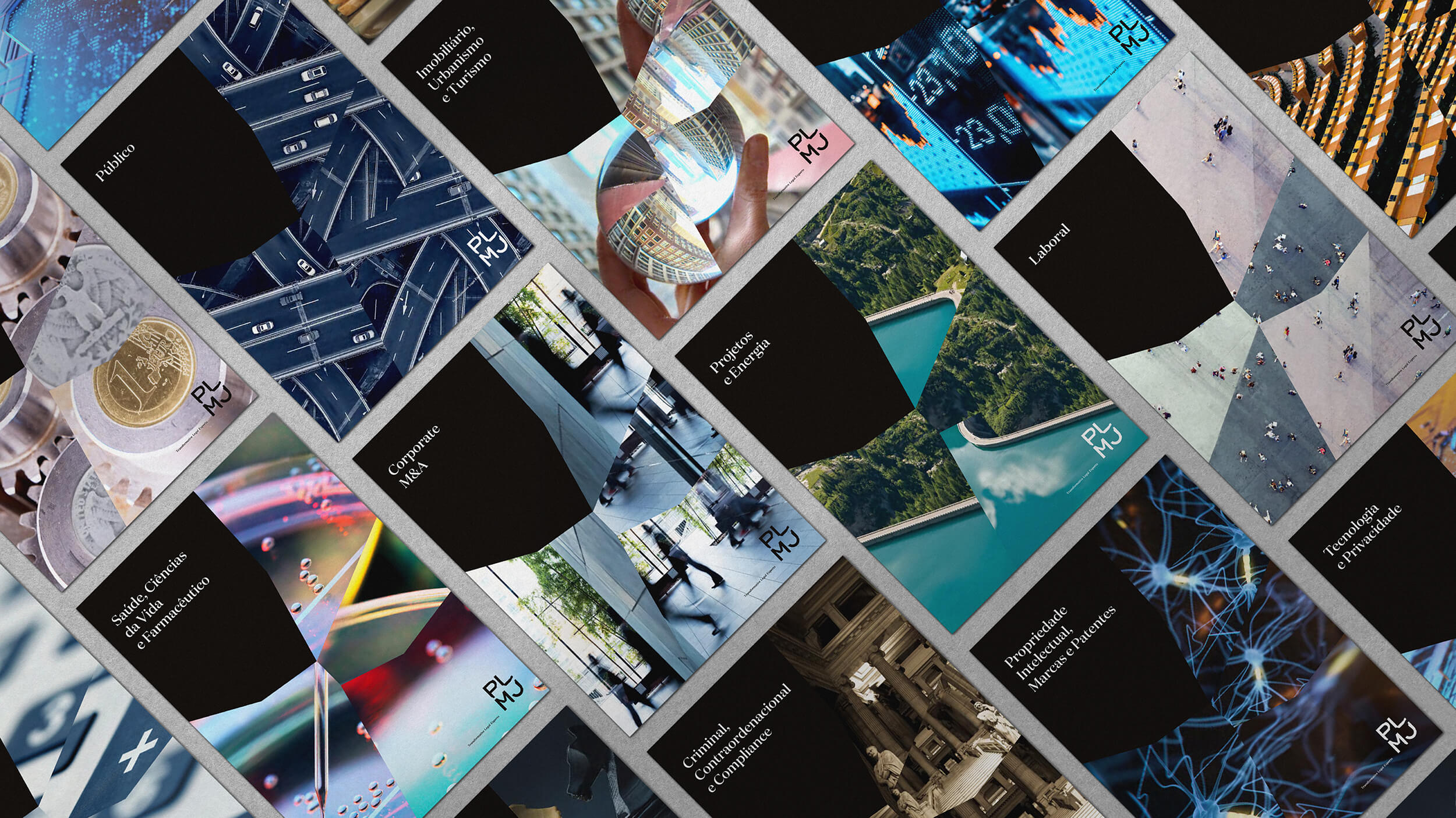
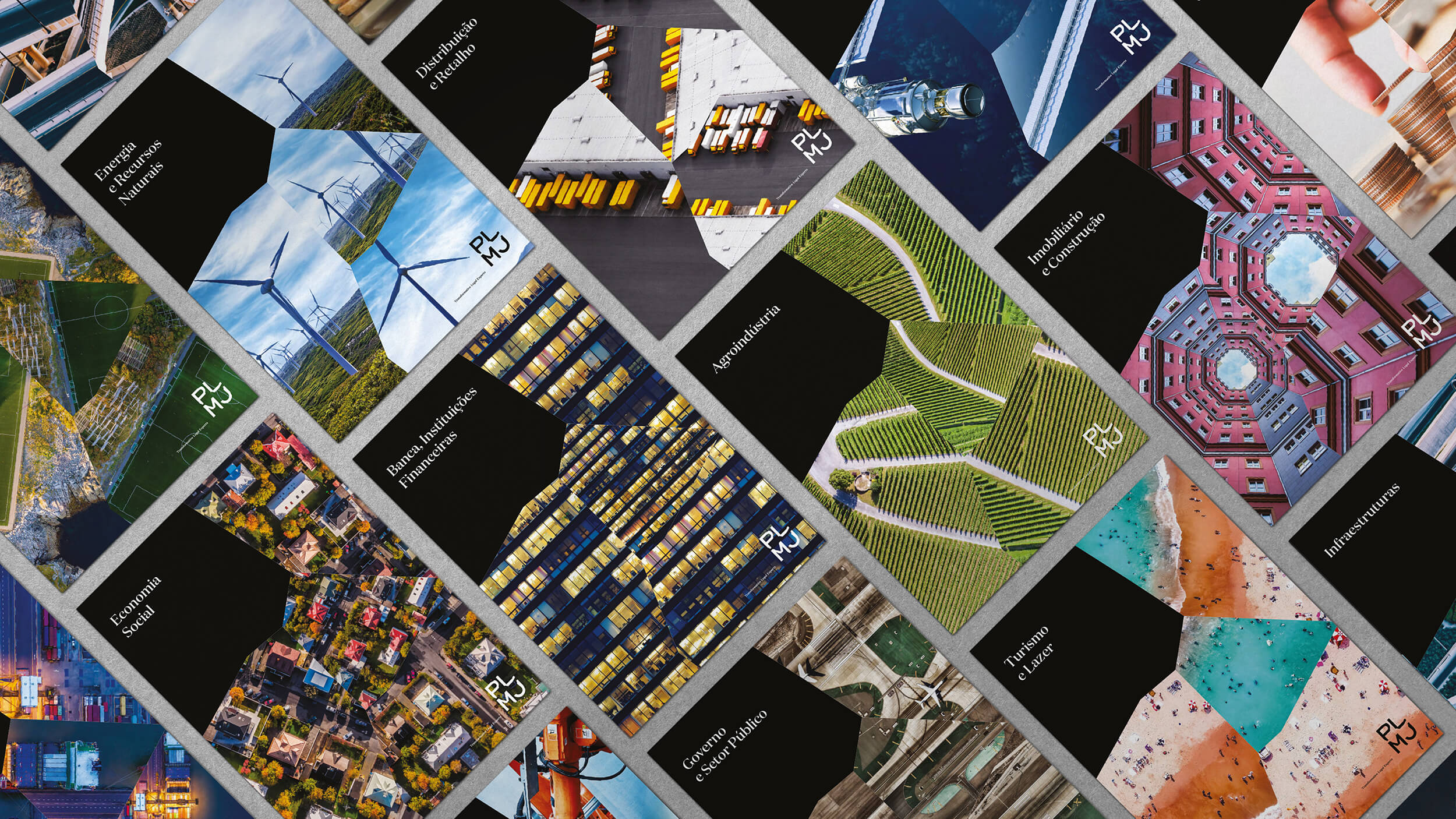
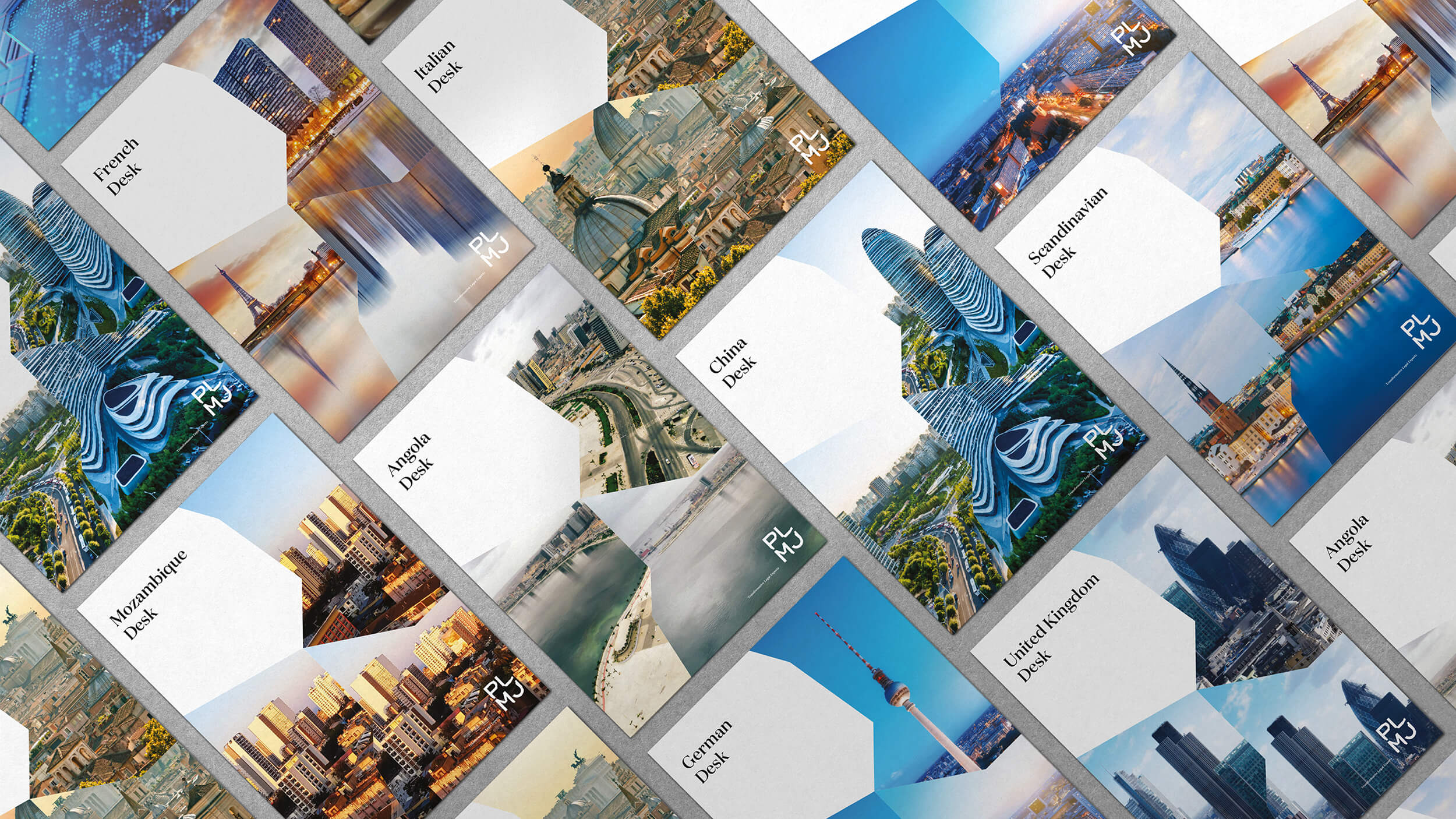
It was immediately apparent that the segmentation of PLMJ services, in the various areas of practice, should manifest itself in all communication. To create this differentiation, we use kaleidoscopes - fragmented pieces that enhance images and define the entire hierarchy of information. We managed to transfer the PLMJ personality to the pictures, which thus gain more significant disruption and distinction.
We make a difference in each theme, reinforcing the central concept of daring and wit, escaping stereotypes and presenting original and distinct images. Keeping the rules and rigour, they offer the necessary information in a new way.