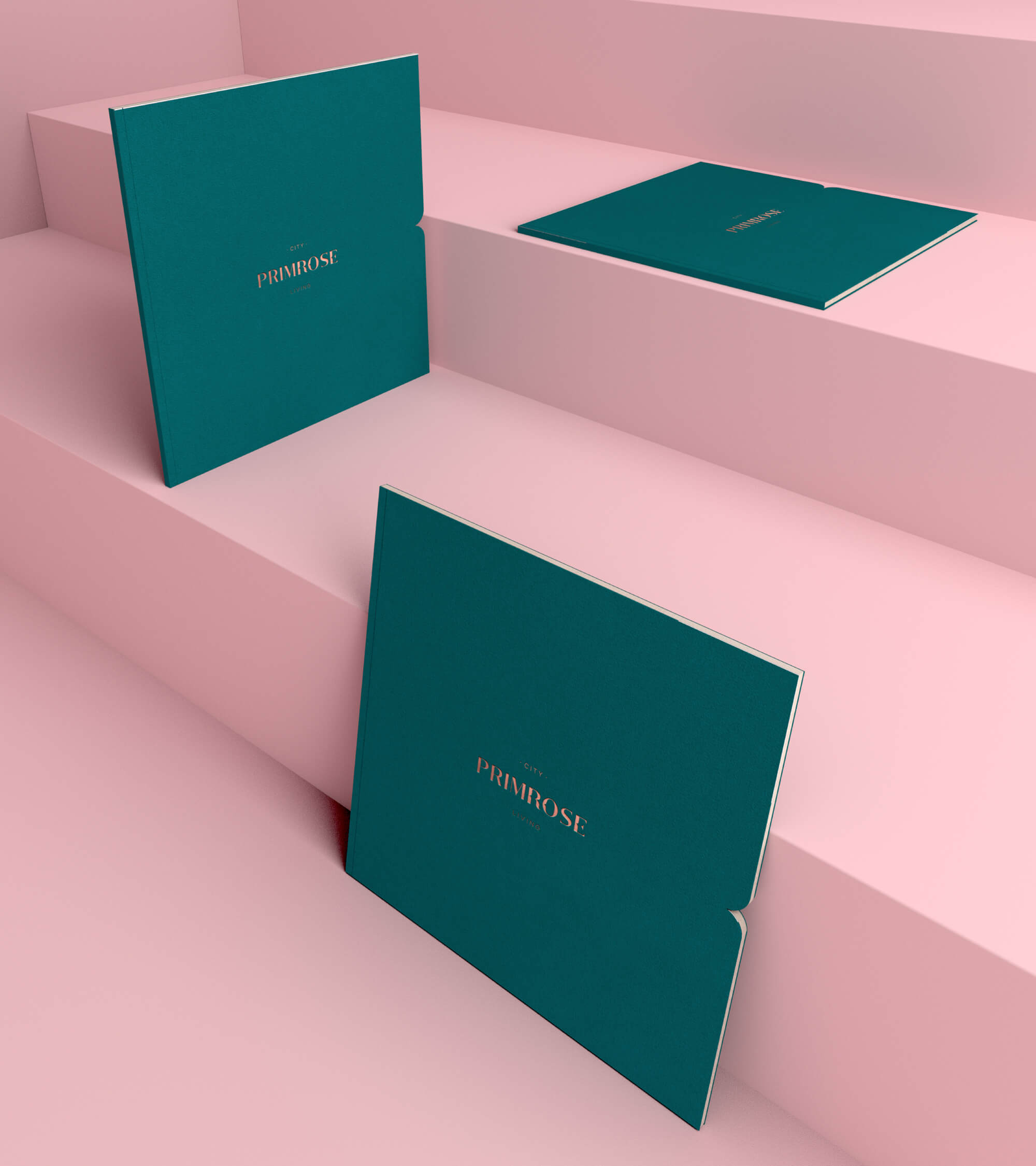
Primrose
Heinz + Costa
Brand Identity
Editorial Design
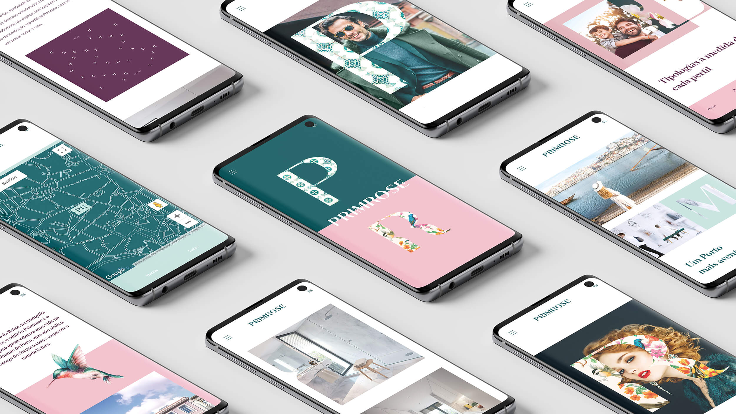
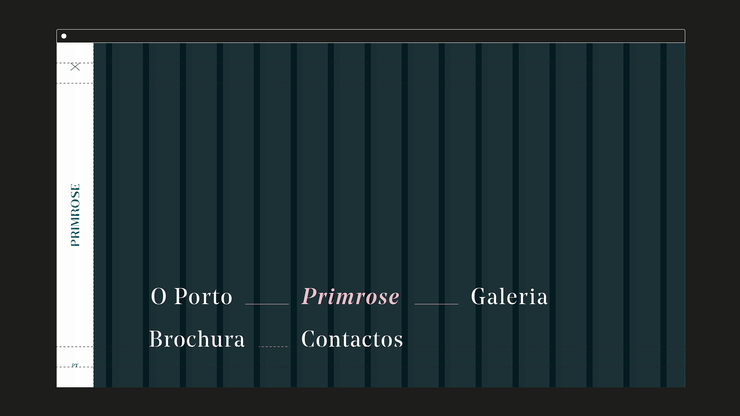
Digital
2018
At Blug, we believe every single building has its own history, it's own DNA and definitely, it's own identity. In all our estate projects, our research goes way beyond a naming and a positioning strategy. We take the time to get to know the DNA of the project, to visit and to grip the truth about the location and to find a unique perspective, one that will help us establish the core elements to communicate.
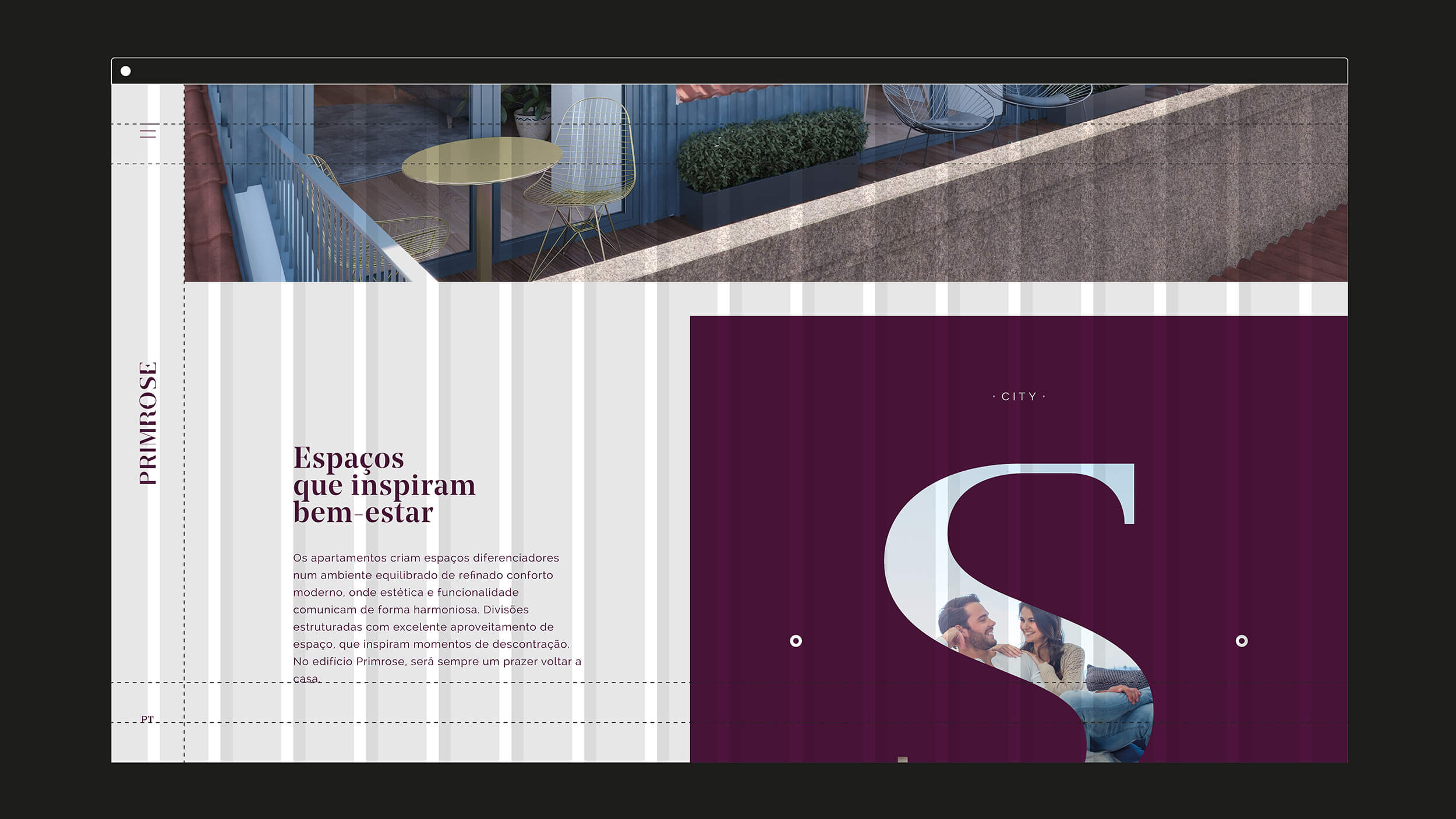
We build our own project. We set the basics: location, specifics, styles, semiotics, colours and moods. And then, we build upon it. The graphical elements are essential, as well as ornamental. No detail is left behind.
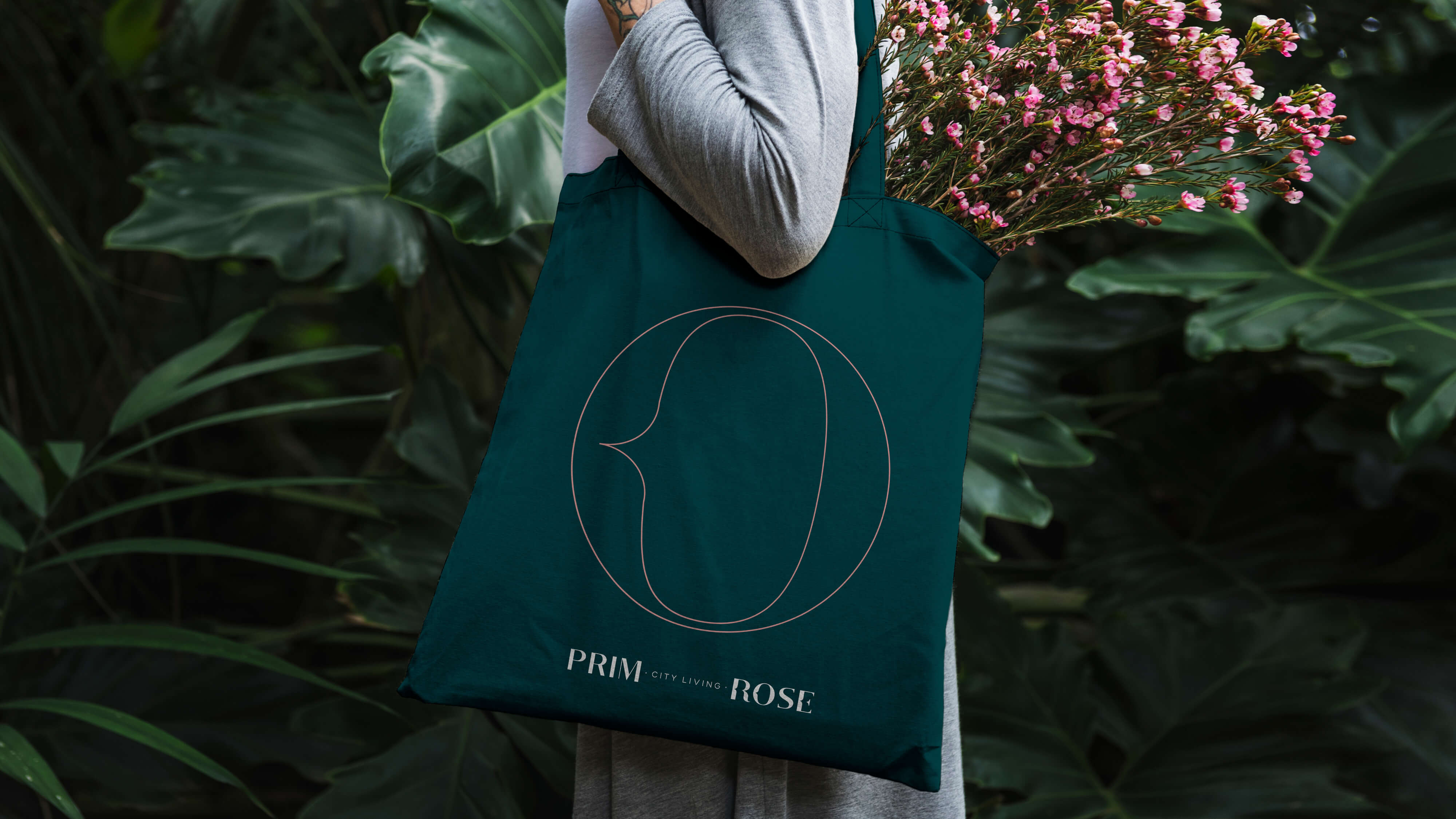
Our colours translate this duality: Shaded Spruce is modern, and deep, evoking comfort and calm. A dark shadow that grows in a calm, sophisticated way. Ancient Rose creates a historical and emotional connection — to the building's façade and to the nature's identity. It represents prosperity, future and happiness.
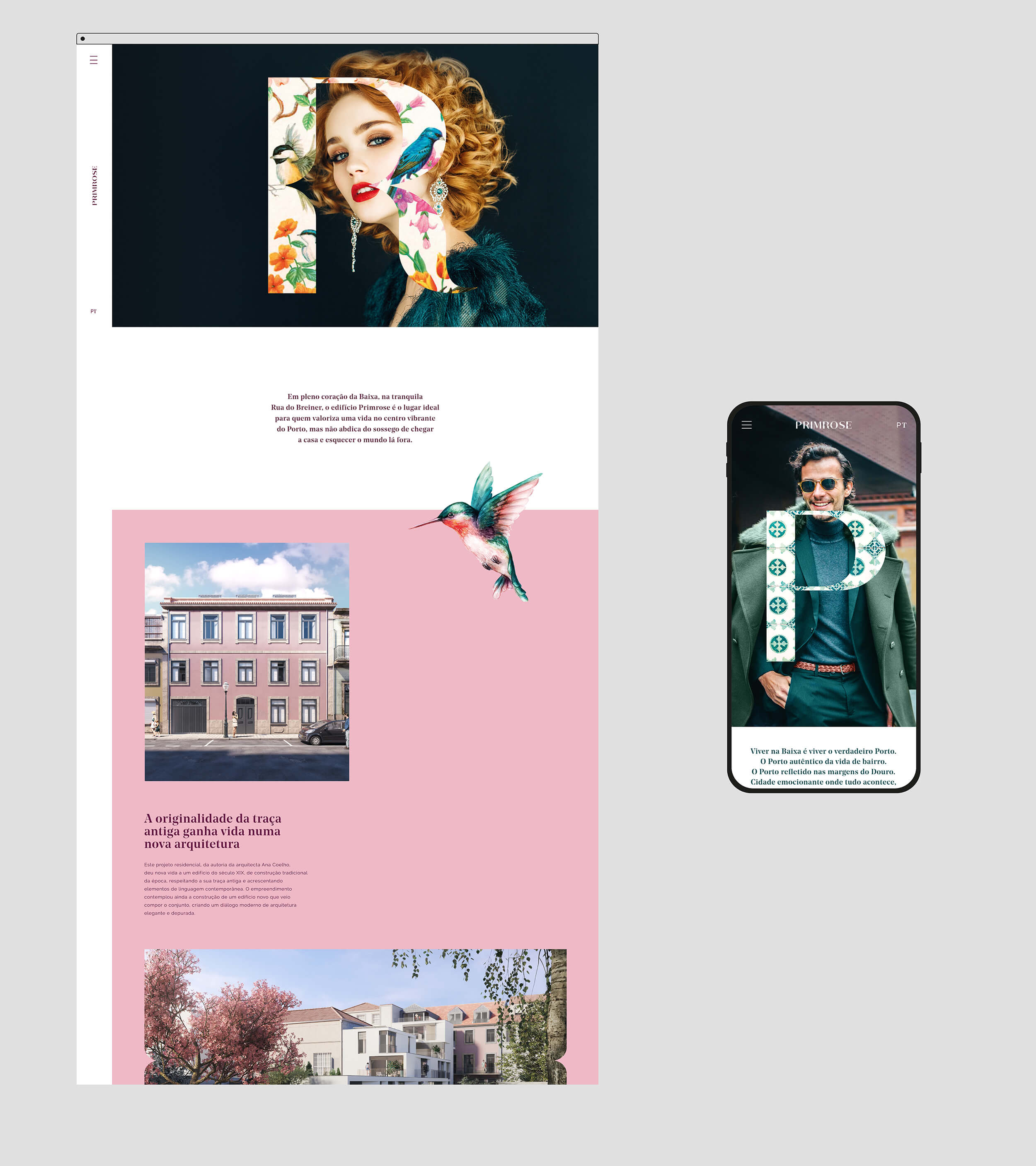
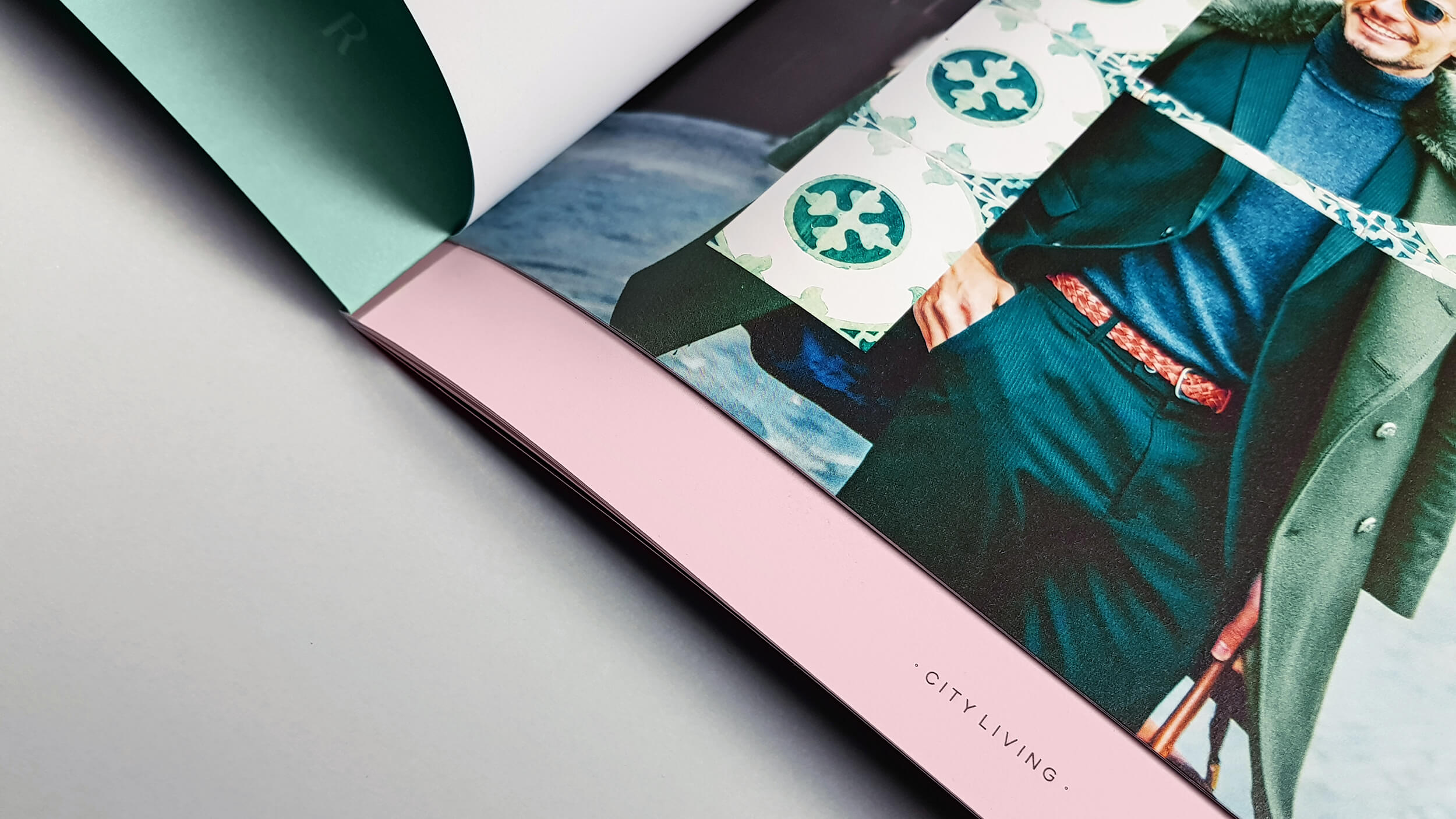
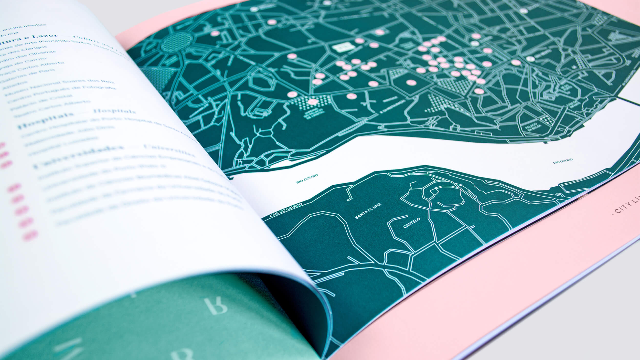
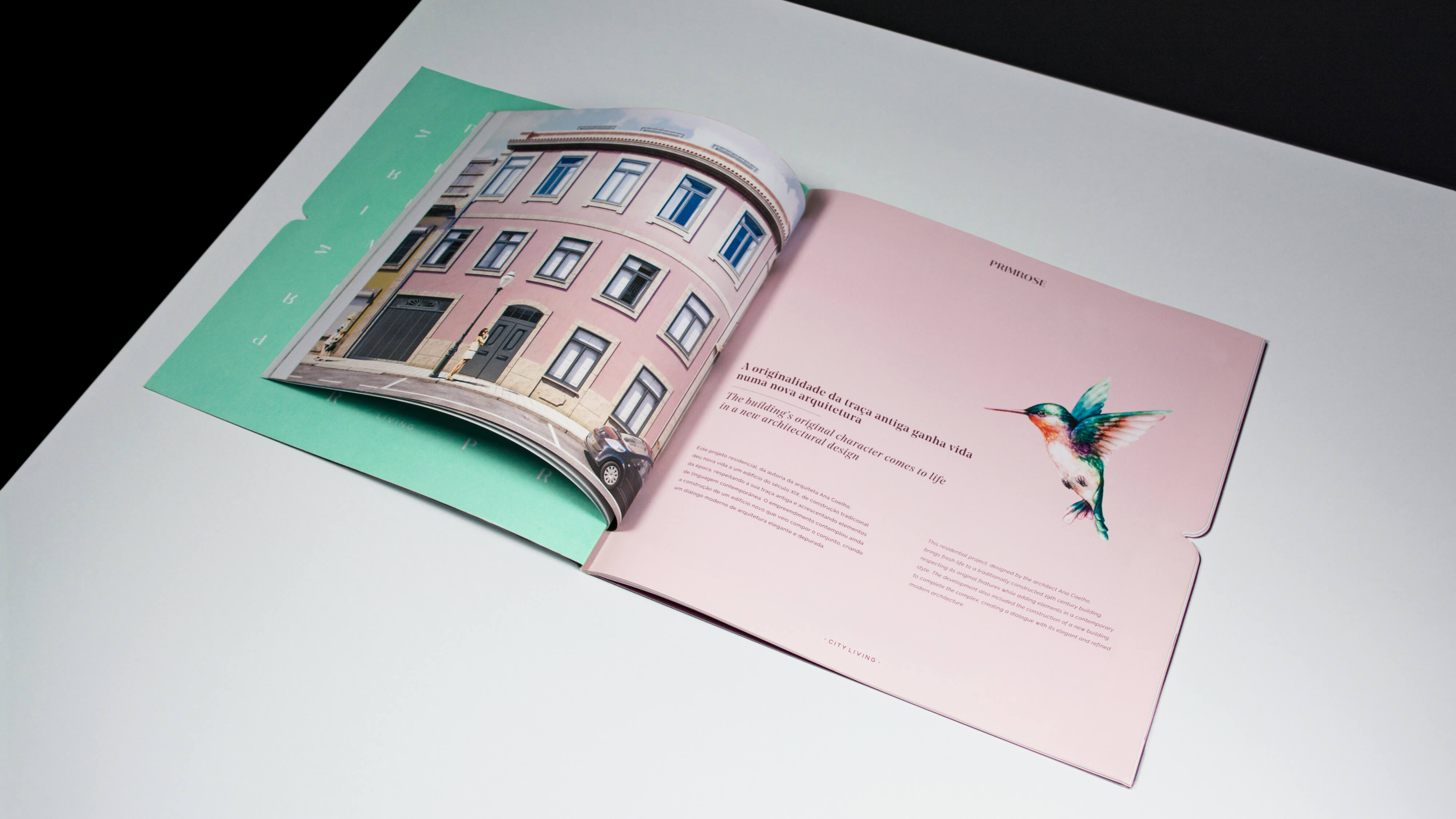
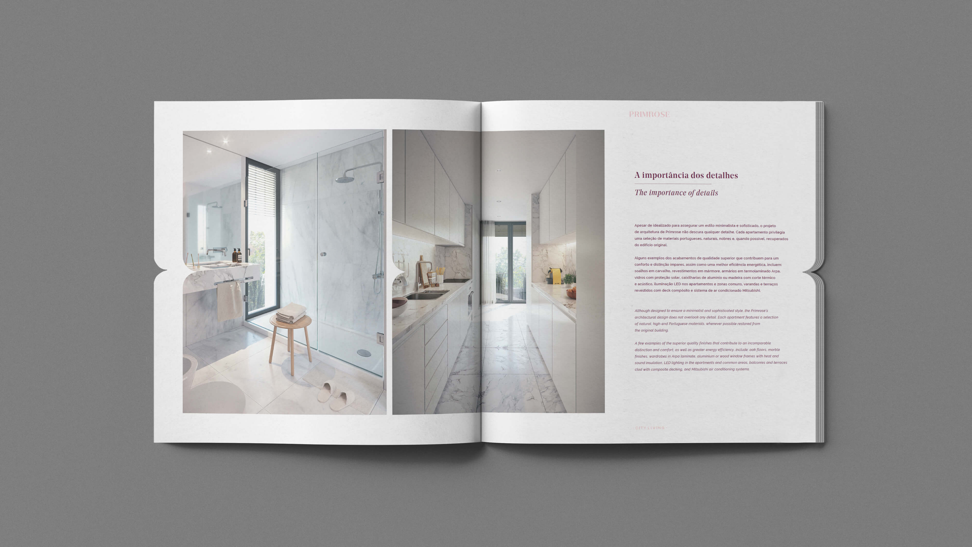
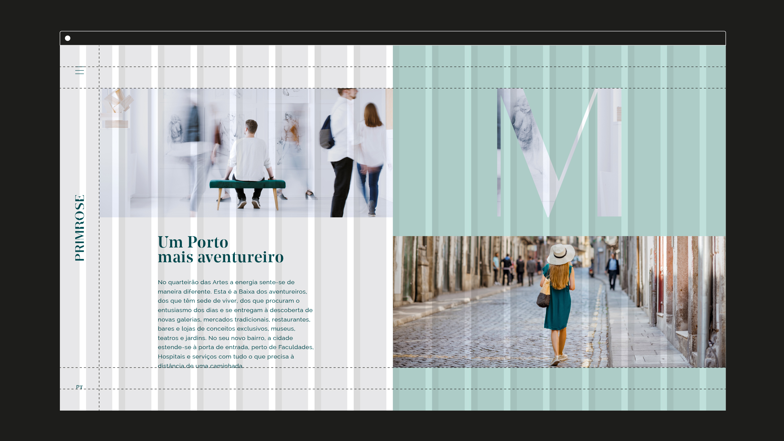
This duality was transported to the brochure, where the inner booklet represents the city - Porto, while the outer notebook is an essential narrative across the whole project, hidden in some layers and clear in others. One that makes us really proud and where the knowledge is definitely noticeable in every single detail.

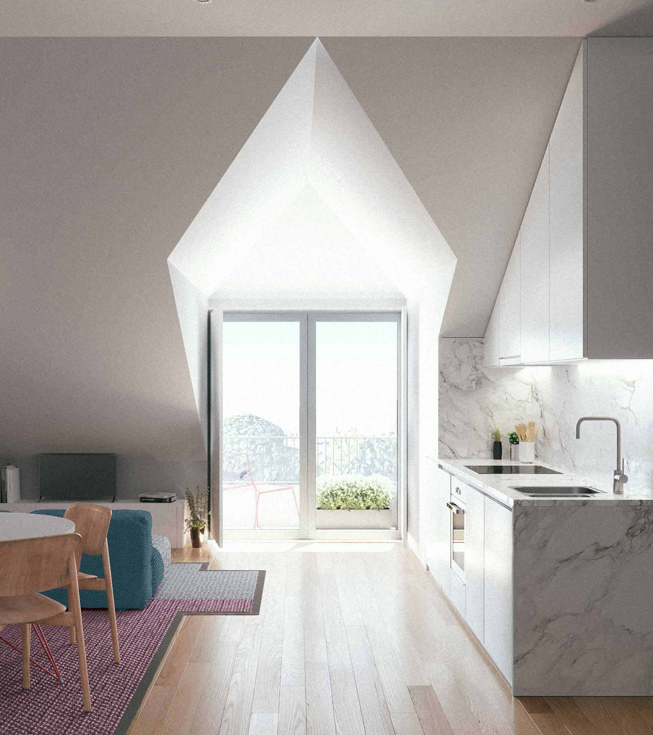
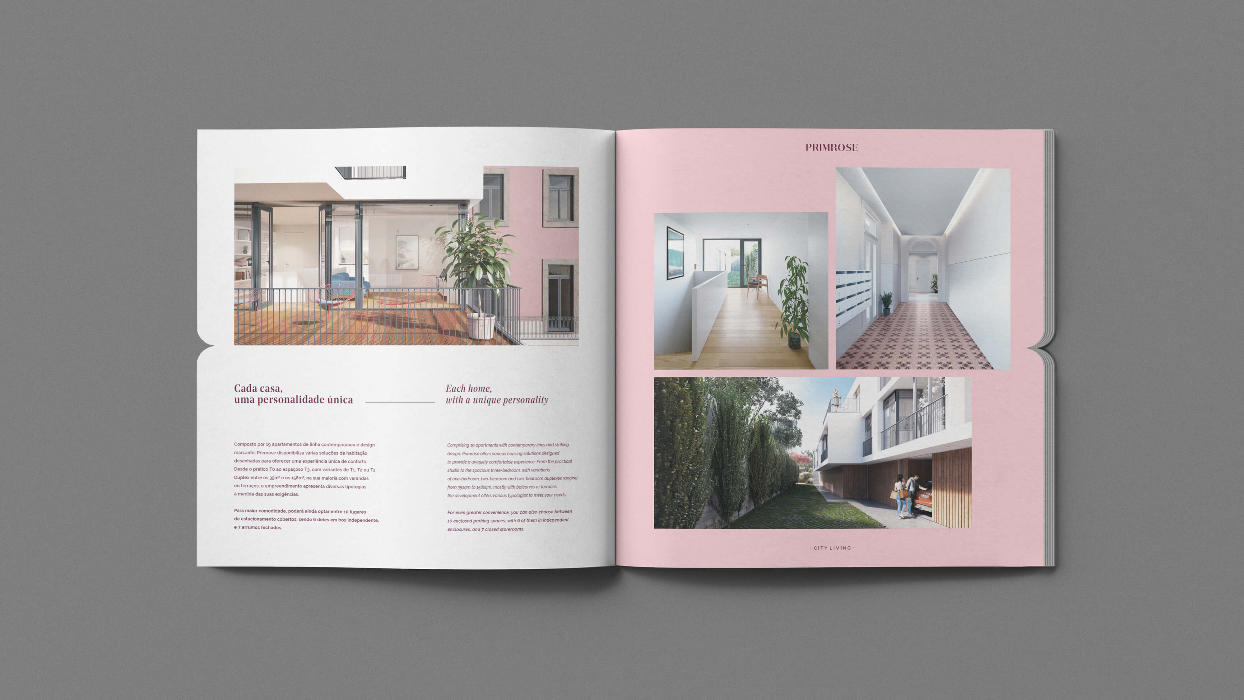
Is this case, we have a historical building on Downtown Porto that has been rehabilitated and also contains a modern area, in an eclectic, culturally diverse neighbourhood. With a huge garden area, we decided to ask the developer and the landscape architects to include a tree or a flower in the project, in order to create a better sense of distinction. A private, secluded oasis to enjoy, in the middle of the bustling city life.
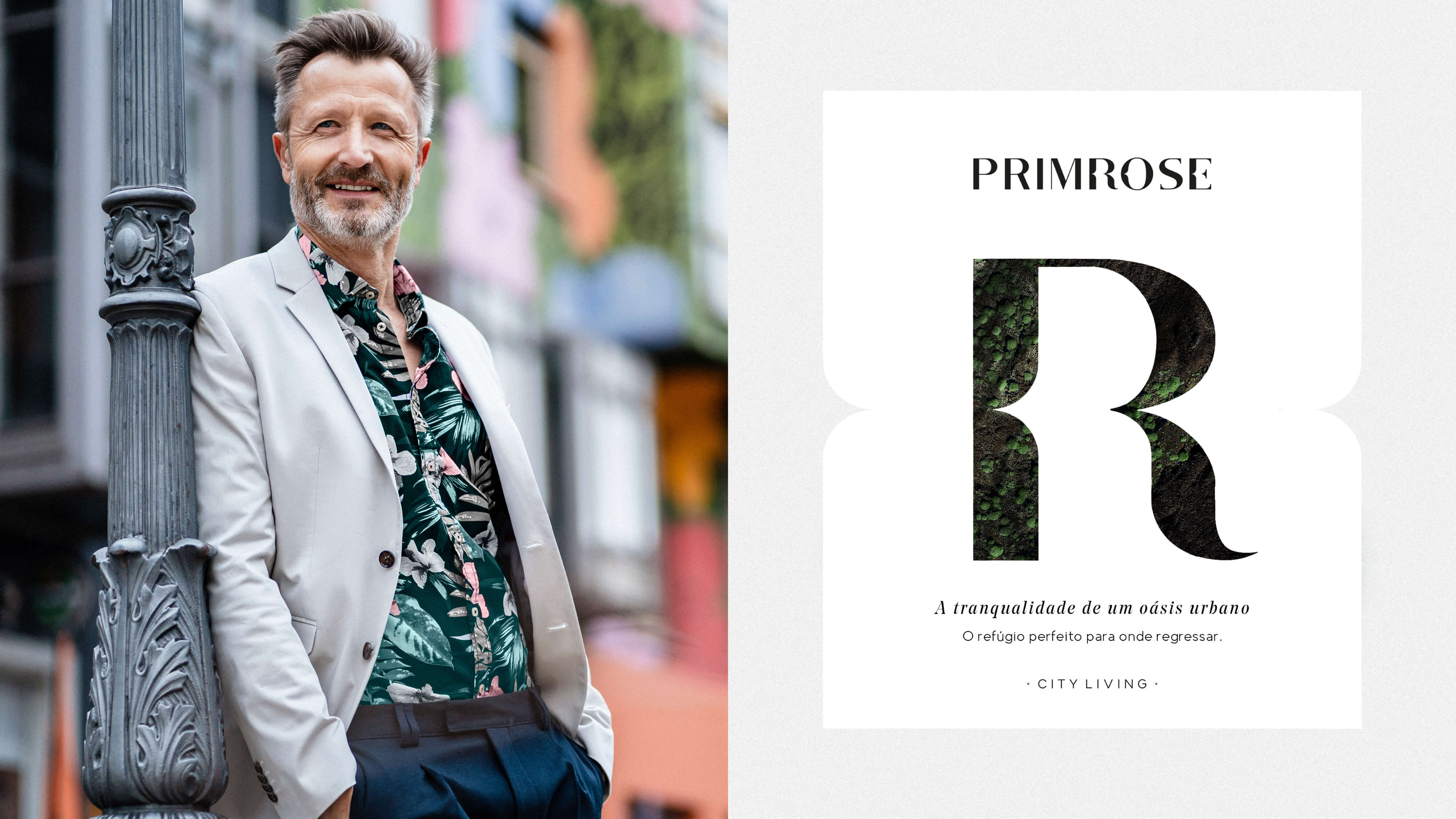
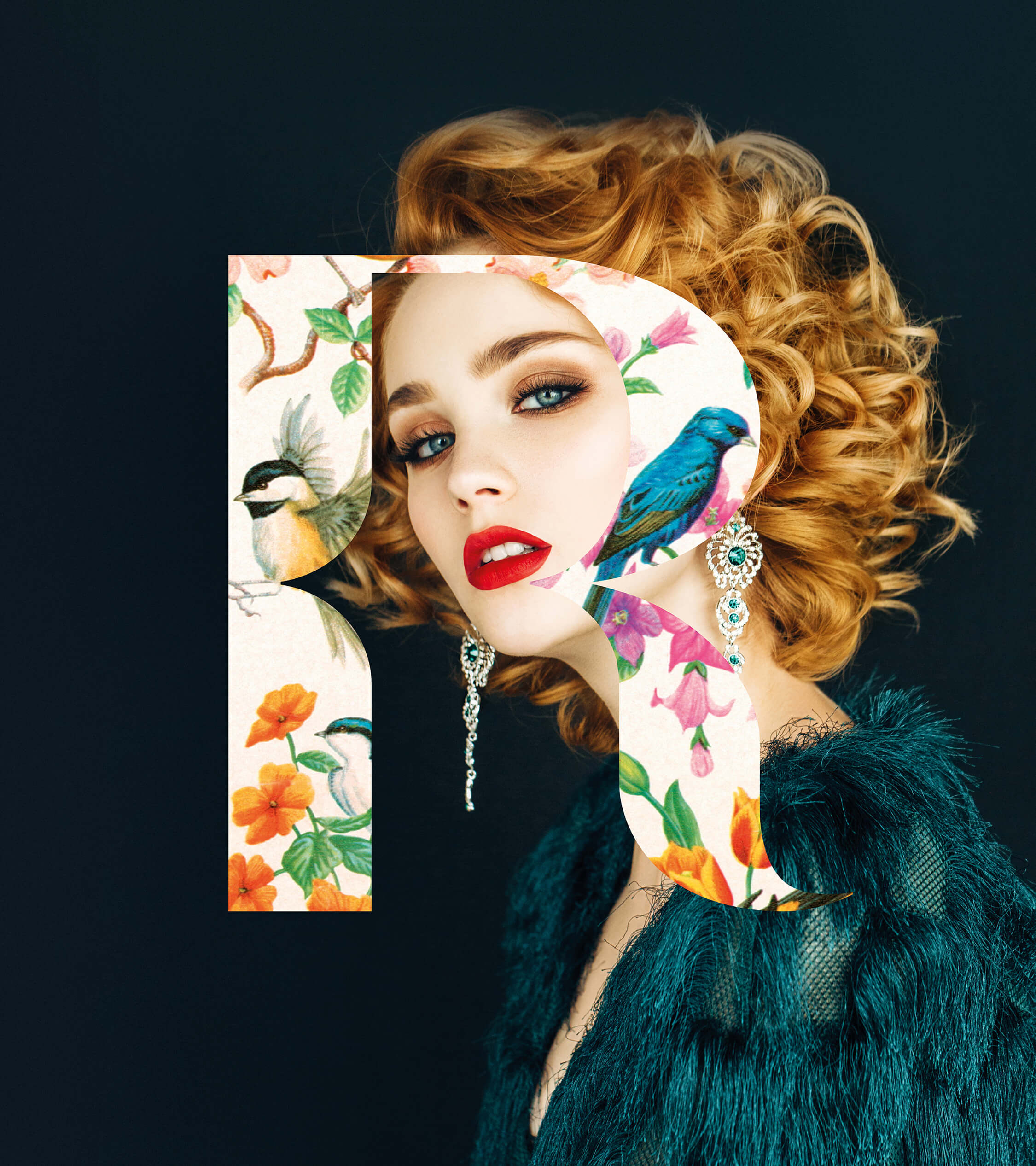
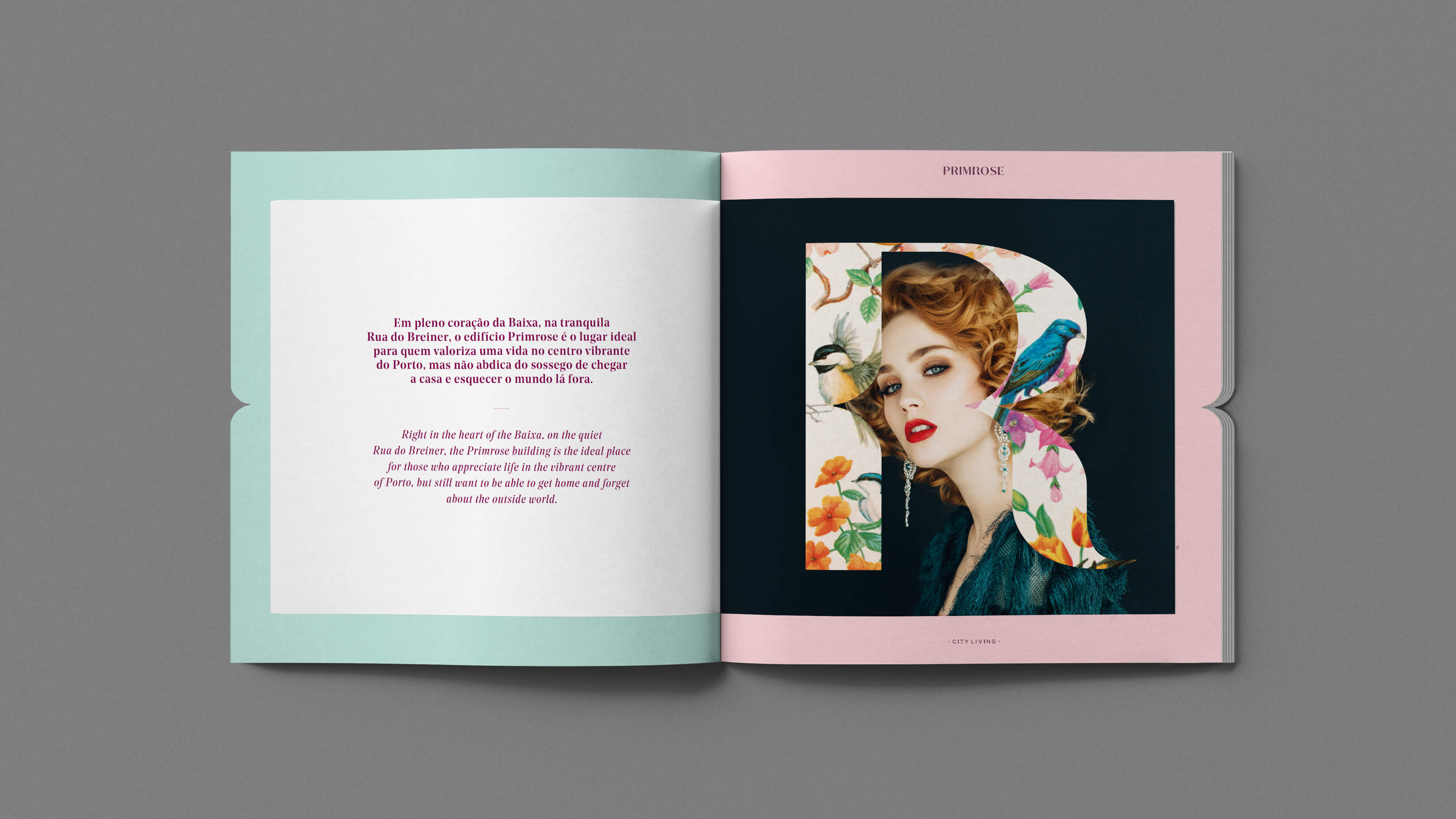
The primrose is the first rose of Spring. It represents youth, happiness and friendship and represents the environment where you would like to live in. It is elegant, delicate and positive. It had to be the way we presented ourselves to our target: with the values it gave the utmost importance to. We also chose a simple descriptor signature — City Living — to create a contrast with the name's delicacy and to add a layer of urban, contemporary experience.
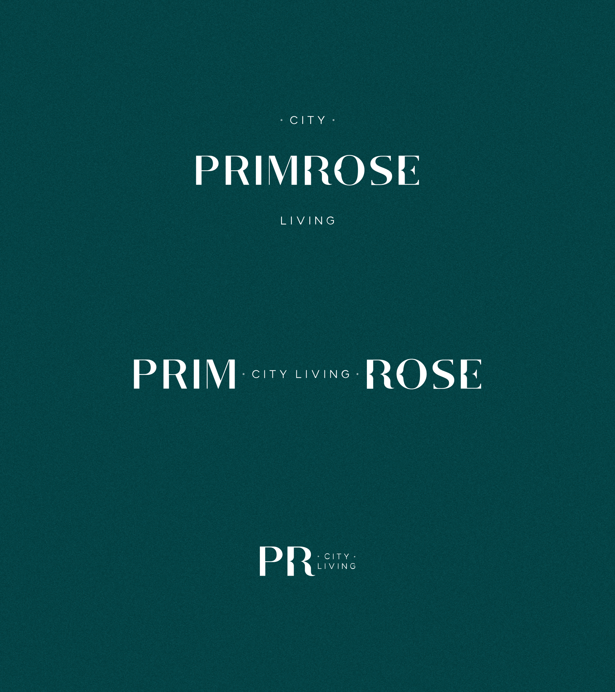
Just like the building, our brand has two distinct sides:
The word PRIM reflects the contemporary architecture, a clean, urban style and the city lines and organization. The word ROSE contains nature's organic origin, the delicacy of the petals and flowers, the organic geometrical elements. The existing contrasts represent the building's duality, the perfect balance between nature-privileged urban life.