Essenza
Lucios
Brand Identity
Graphic Design
Editorial Design
2017
Blug never declines a challenge, especially when it comes with a 10-year-delay. It's an attitude and also a way to keep ourselves on the toes of our strategic and creative minds. When long- awaited, delayed authorial architecture projects come up, the temptation to start everything from, well, from the start, is almost overwhelming. However, that may not be the best strategic option.
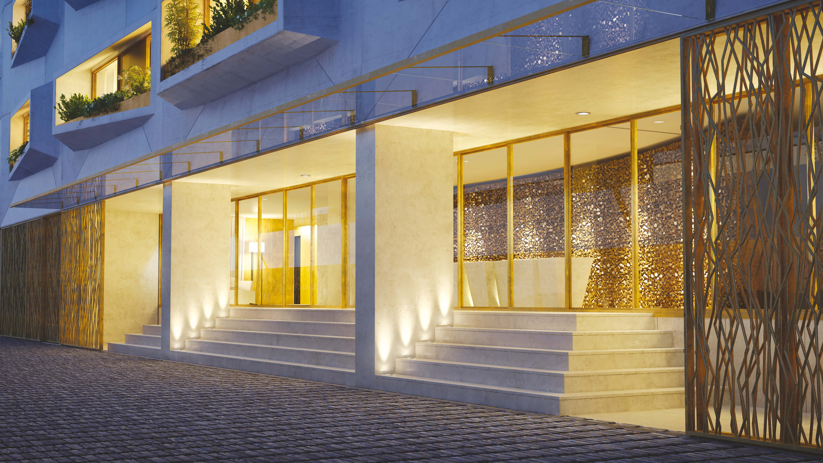
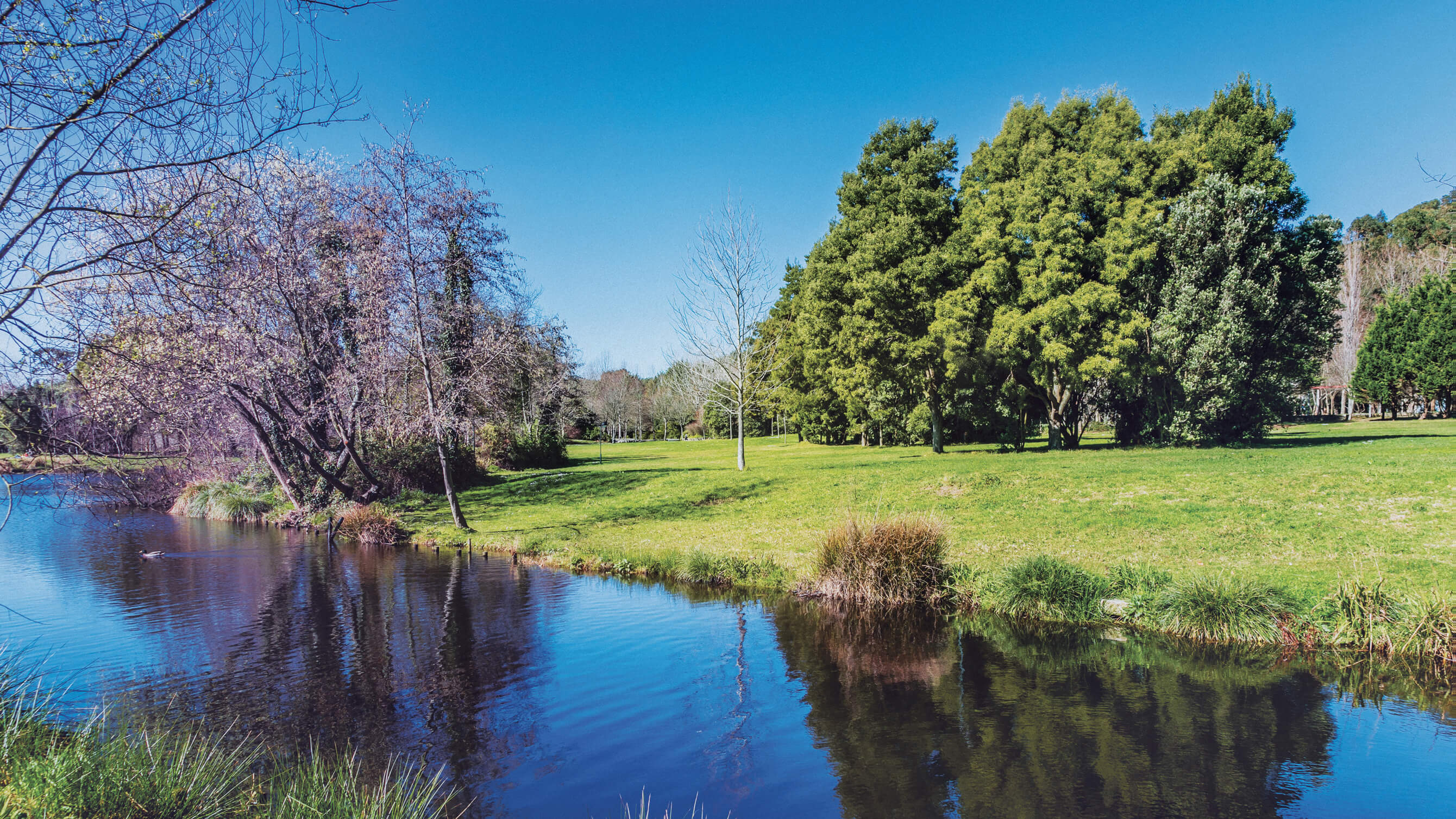
So, with Essenza, a high-end, top quality, author-born estate project, a unique building suspended by Porto's biggest nature park (Parque da Cidade do Porto); we took several seats back and began by creating a perspective.
"ON EARTH THERE IS NO HEAVEN, BUT THERE ARE PIECES OF IT."
Jules Renard
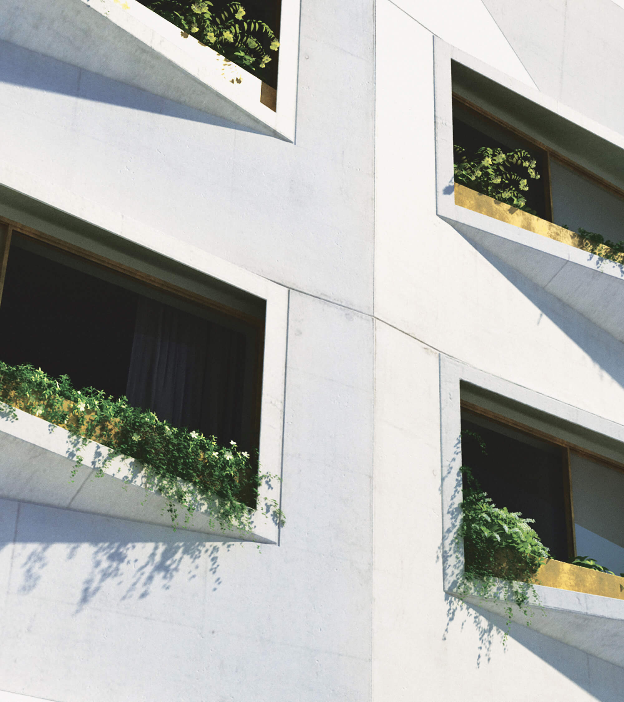
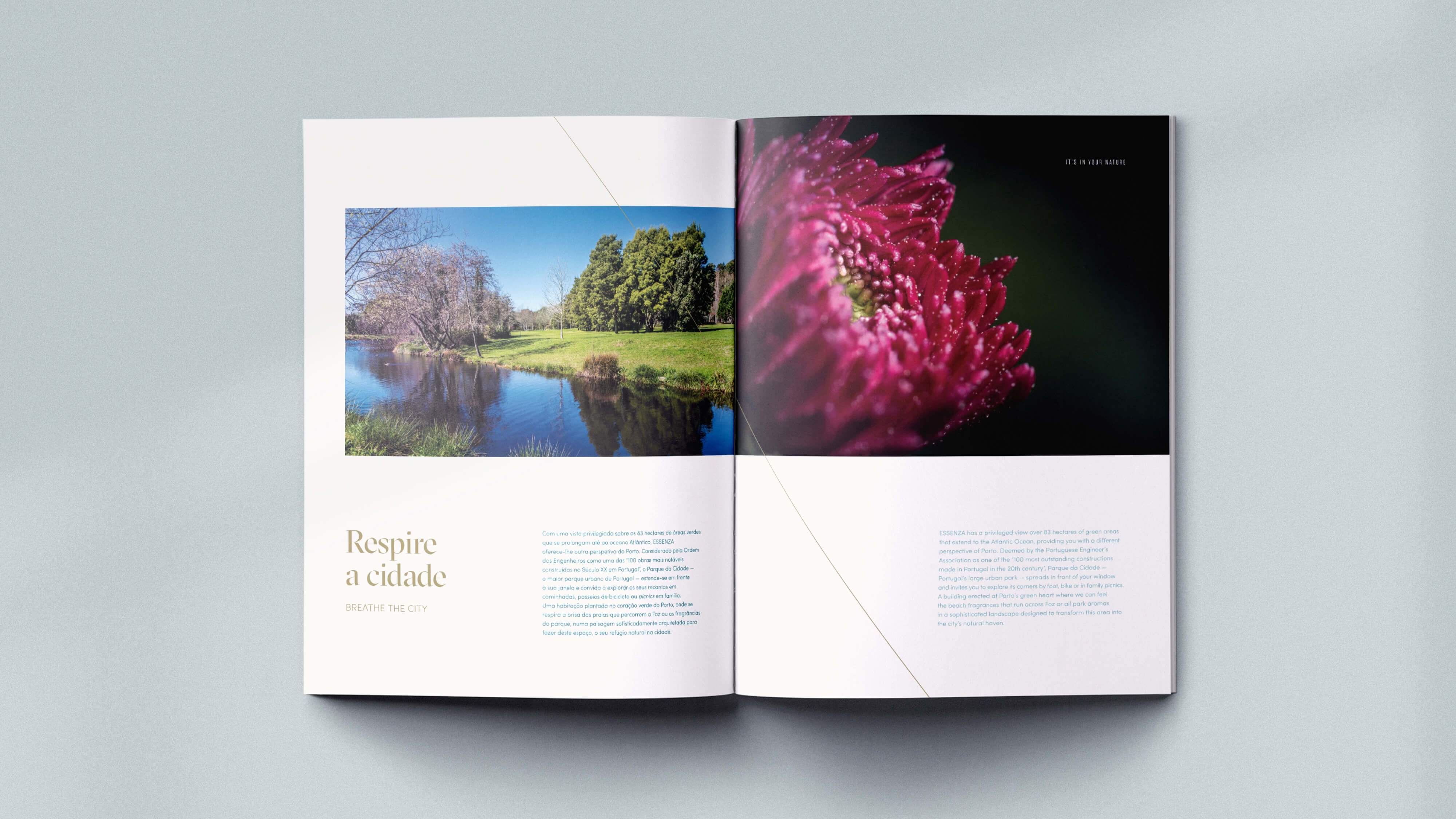
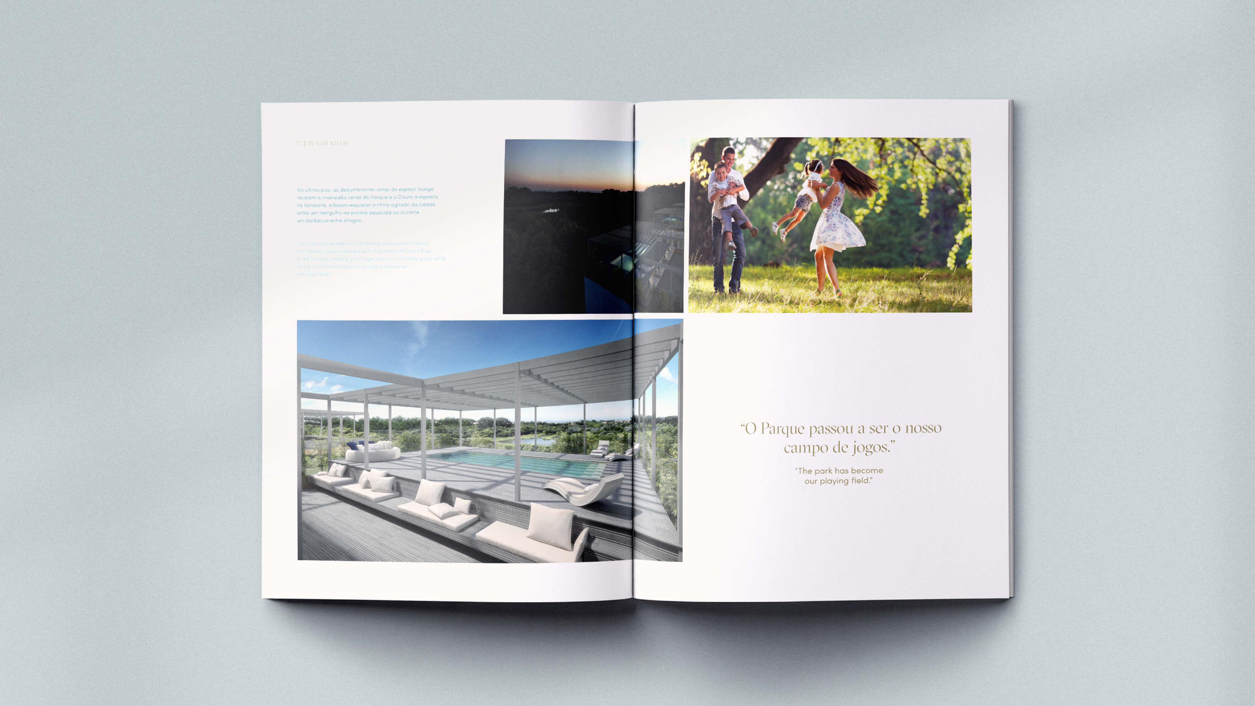
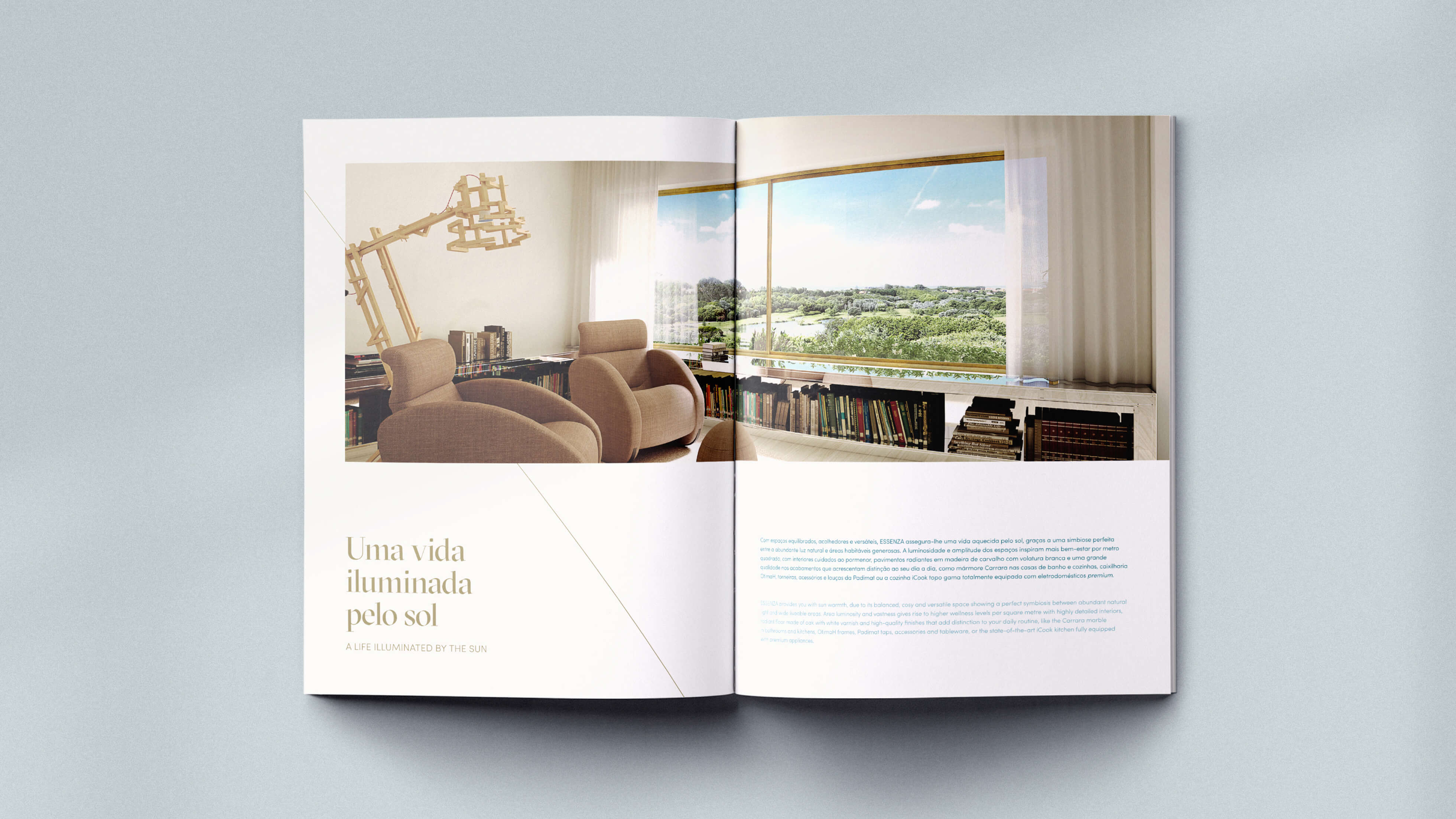
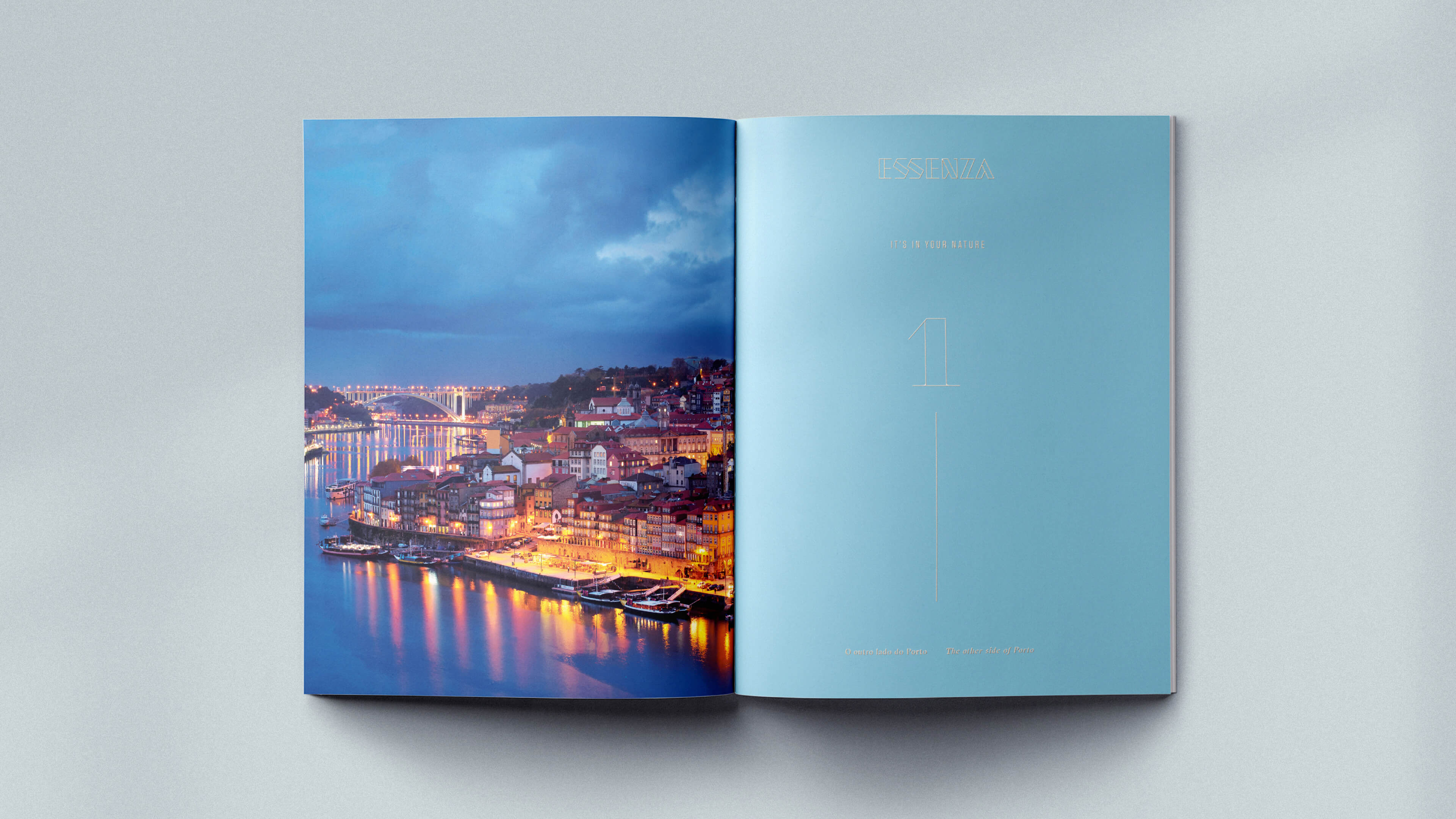
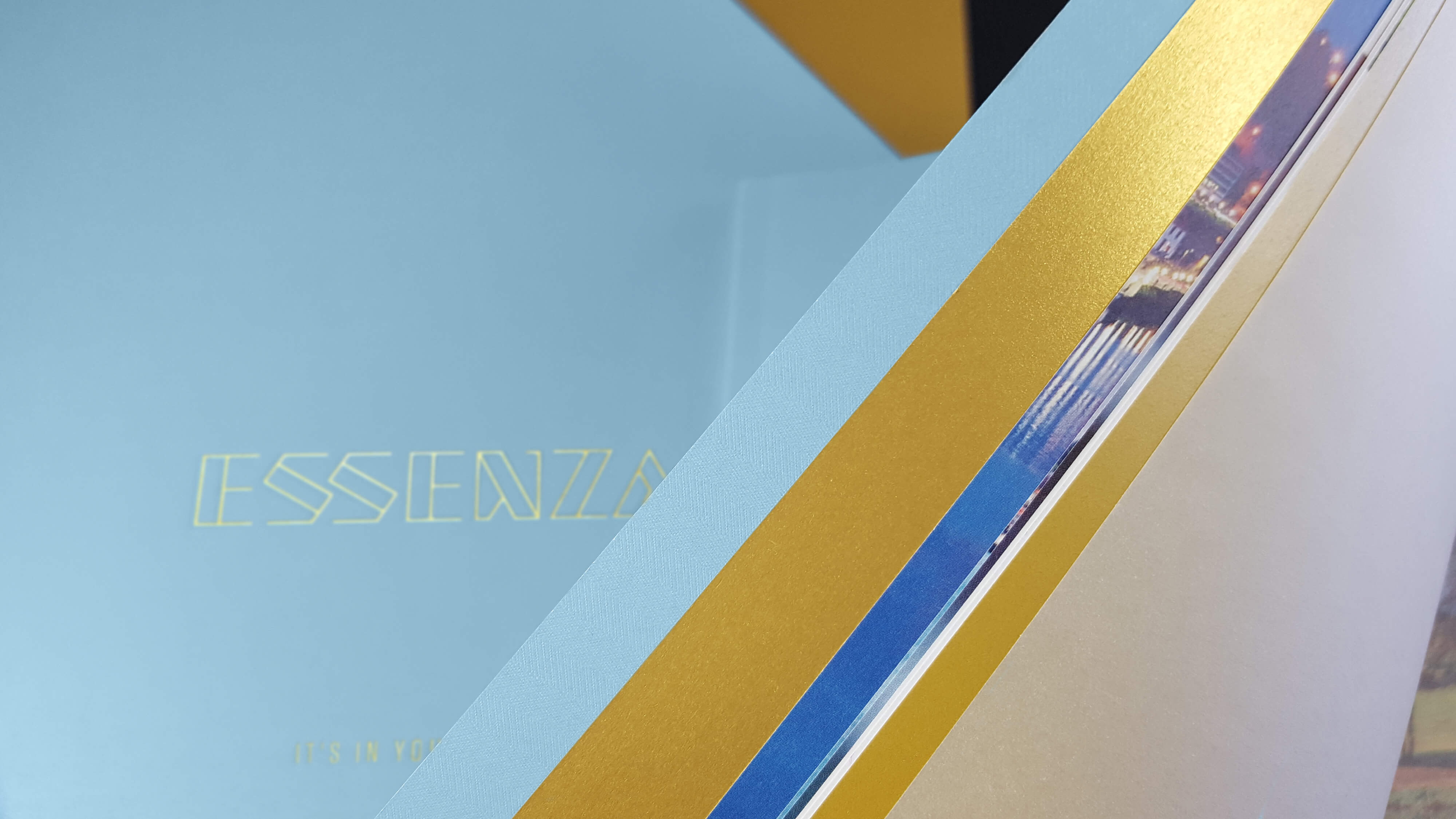
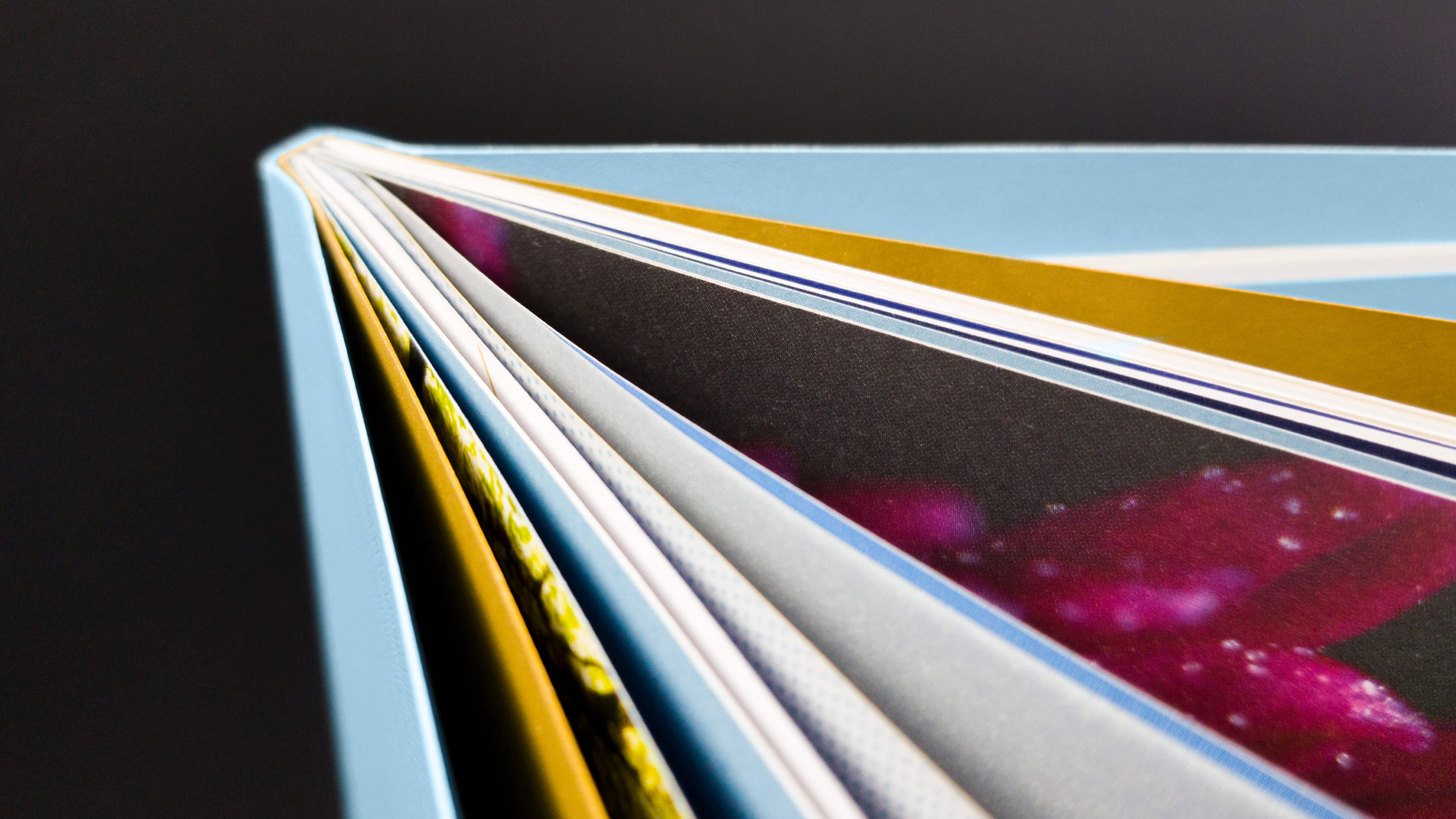
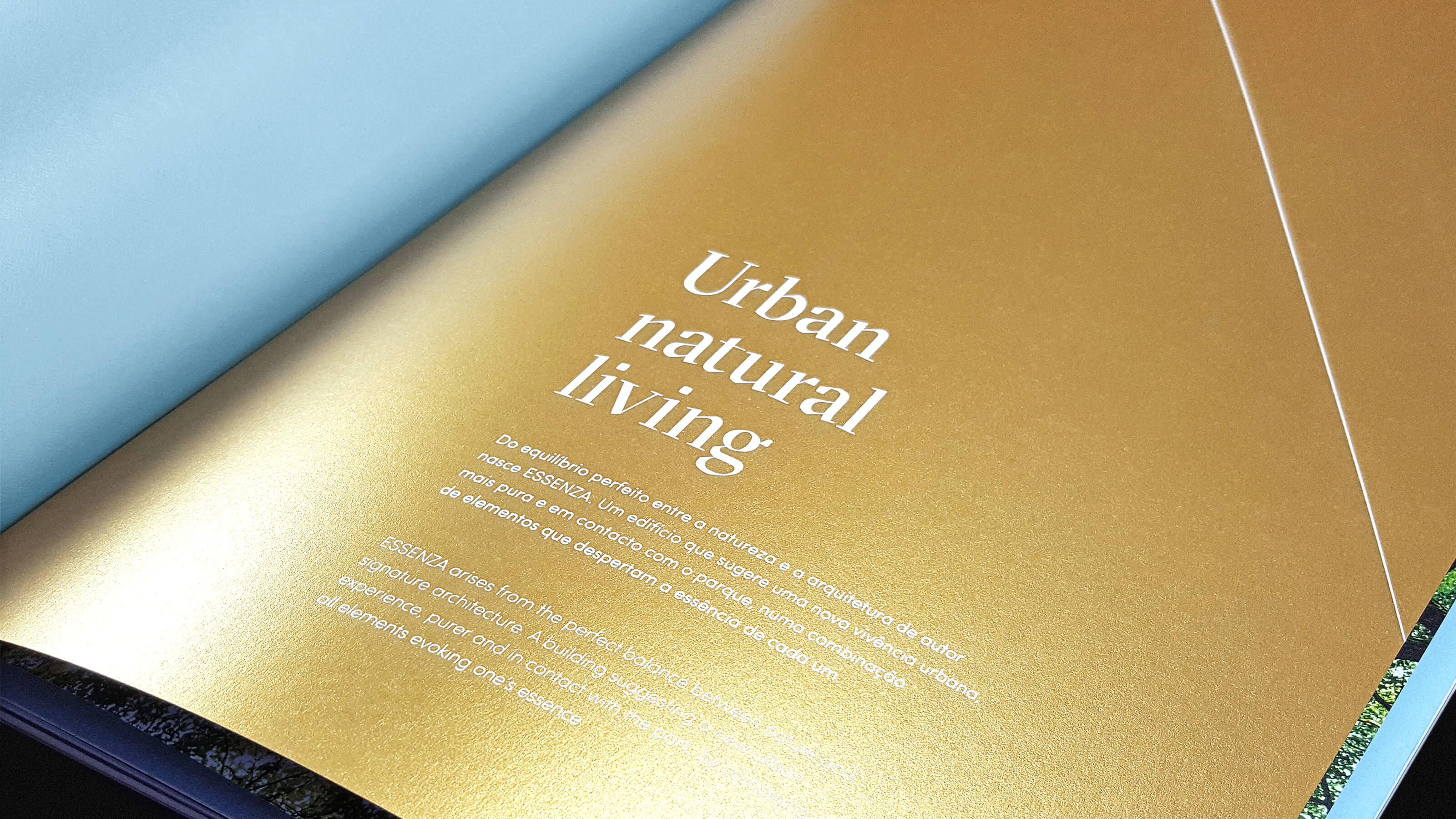
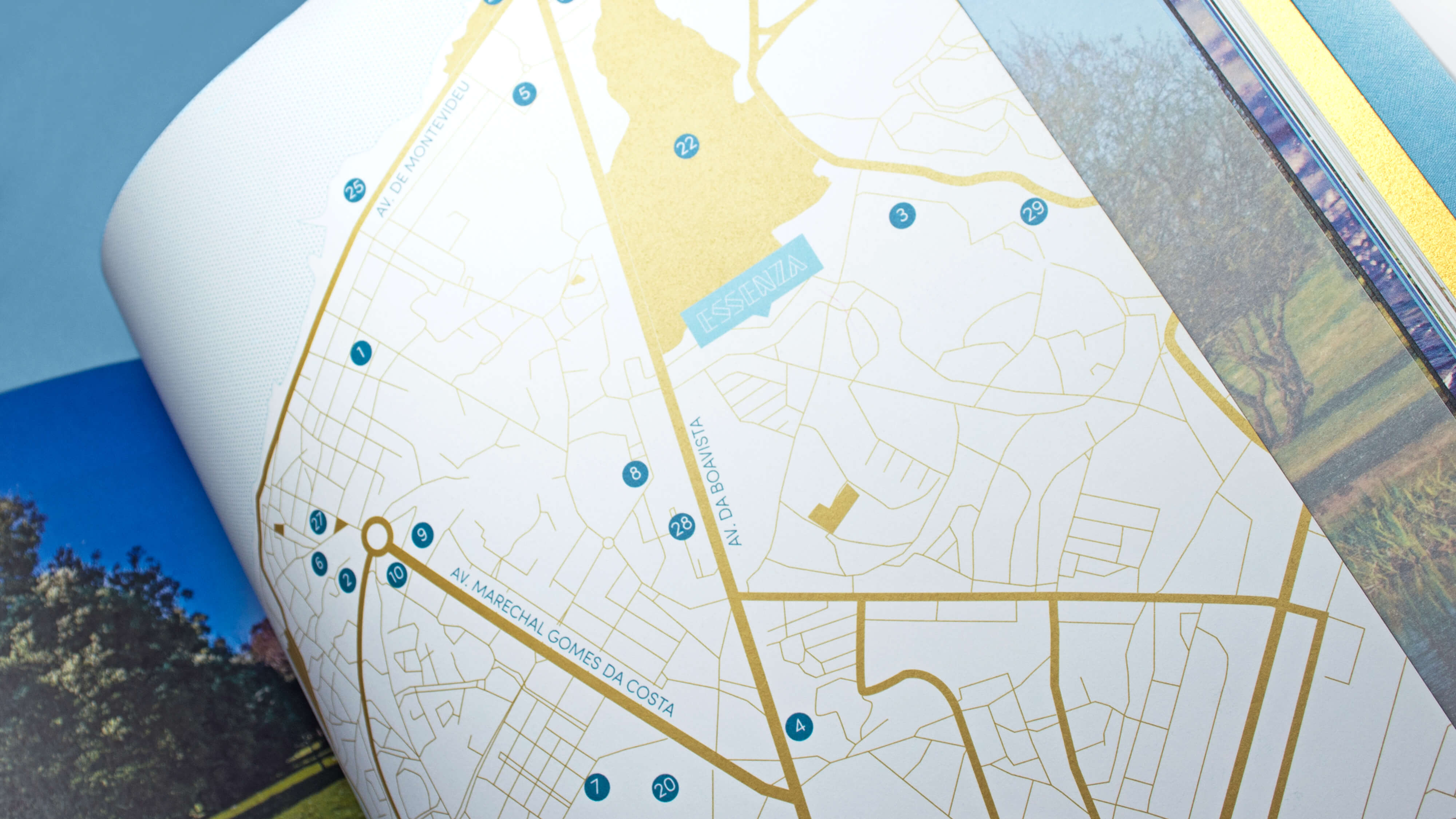
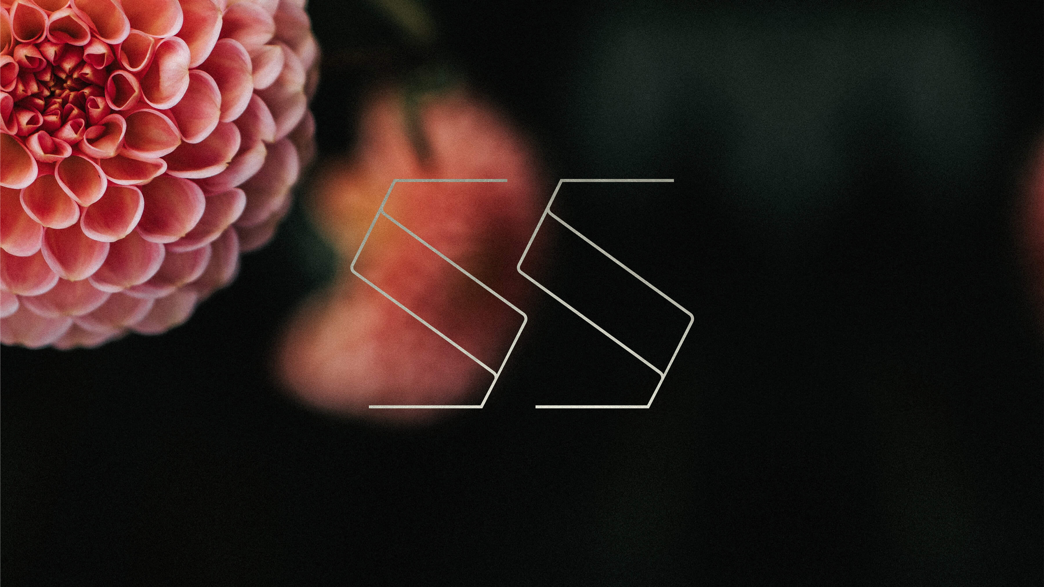
Perspective was our keyword for the whole project. We felt the need to create a stylised window to reflect the uniqueness of this project. So we made it also an iconographical element in all the communication: an open window to the park, as well as to an urban lifestyle, allowing all future residents to enjoy their own essential perspective. These windows reflected the most valued elements while enabling subtlety and delicacy for private sensibility. An essential way to enjoy Porto.
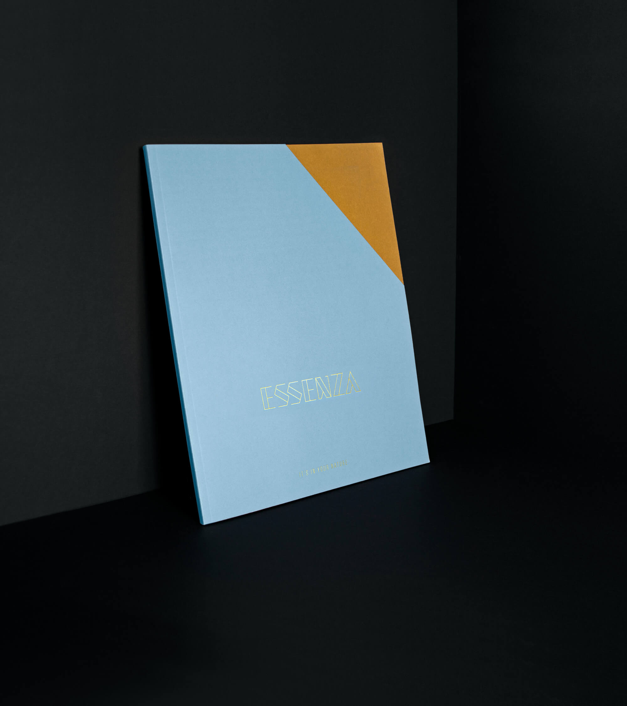
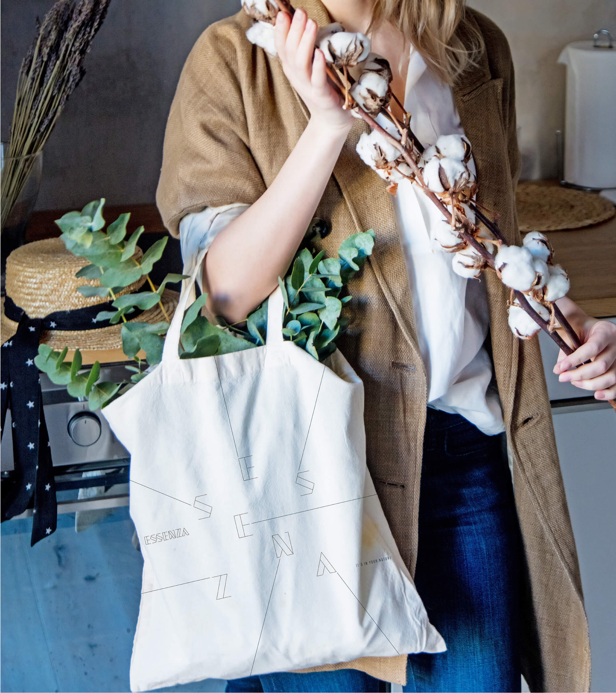
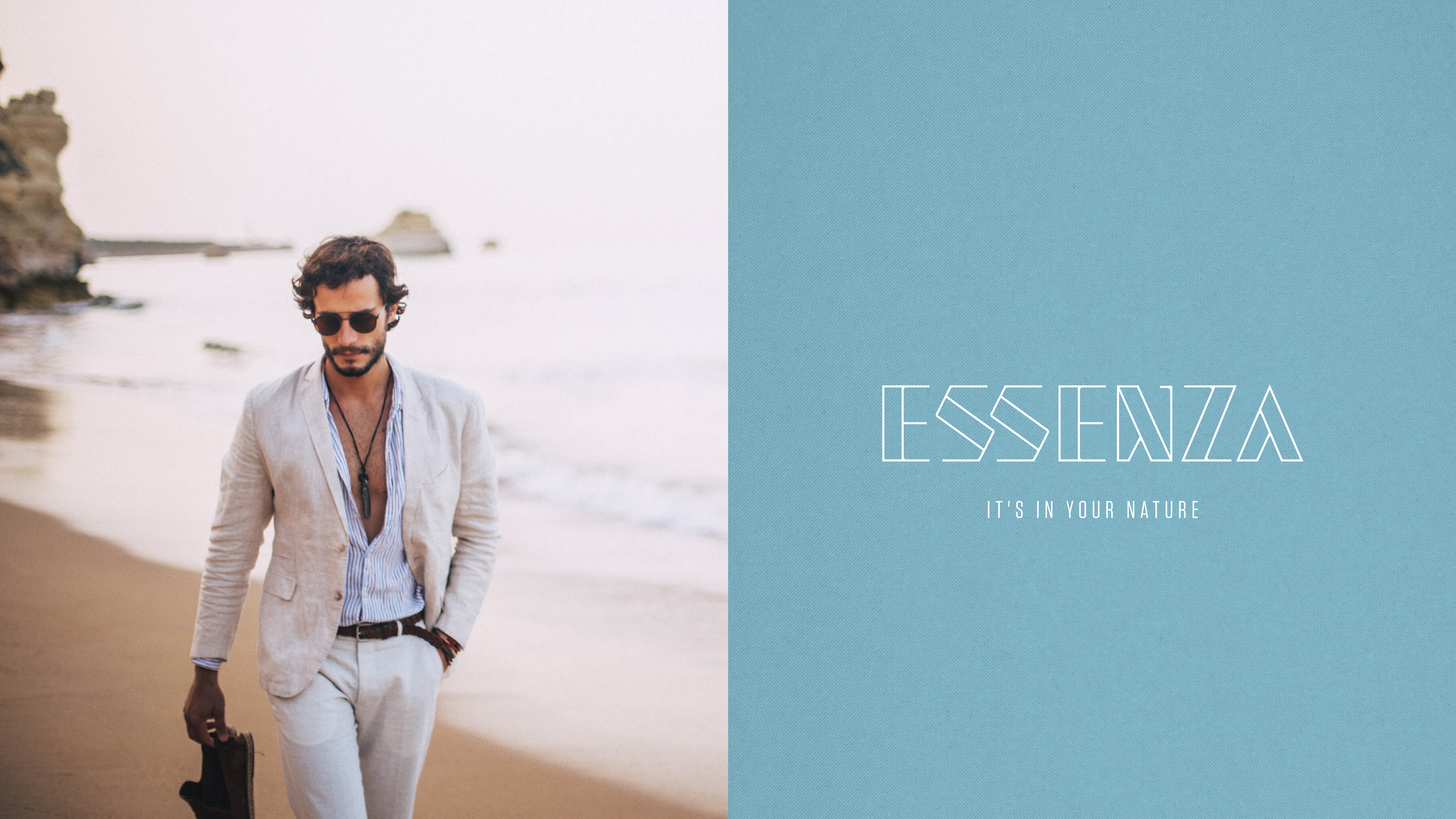
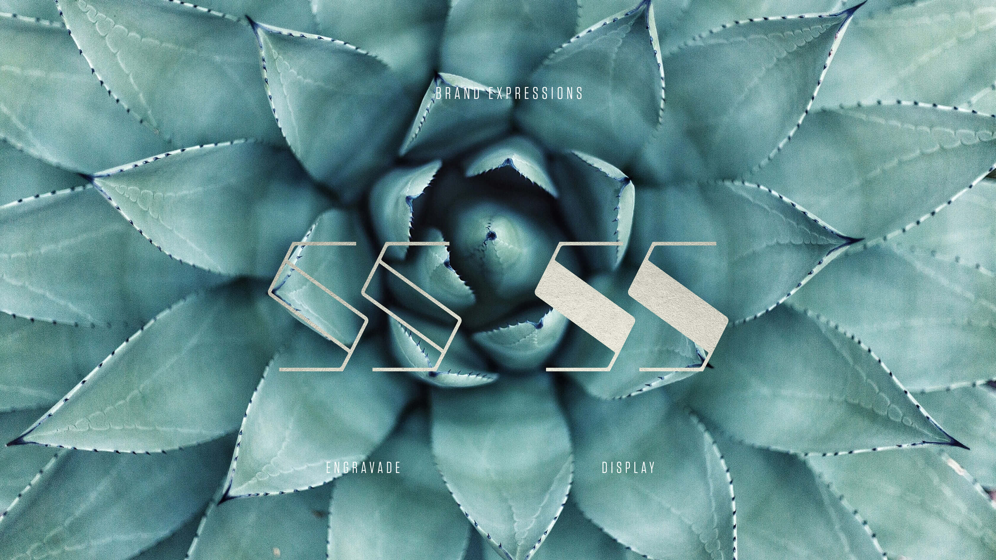
The identity was built as an extension between building and nature, using the diagonal lines and asymmetrical volumes that characterise it. The manifestation of a main block is smoothed out by the curves and non-linear spaces created, allowing us to follow the copper lines of the building floor halls and designing a modern, sophisticated font, that echoes those space elements.
These lines should be understood as strong and directional, as well as an essential element, present in every brand manifestation. Specific colours were created to evoke the singular dichotomy between urbanity and nature: Golden Hour, Blue Dusk and Premium Gold were the main representatives of the sophisticated, intimate and emotional values of the brand.
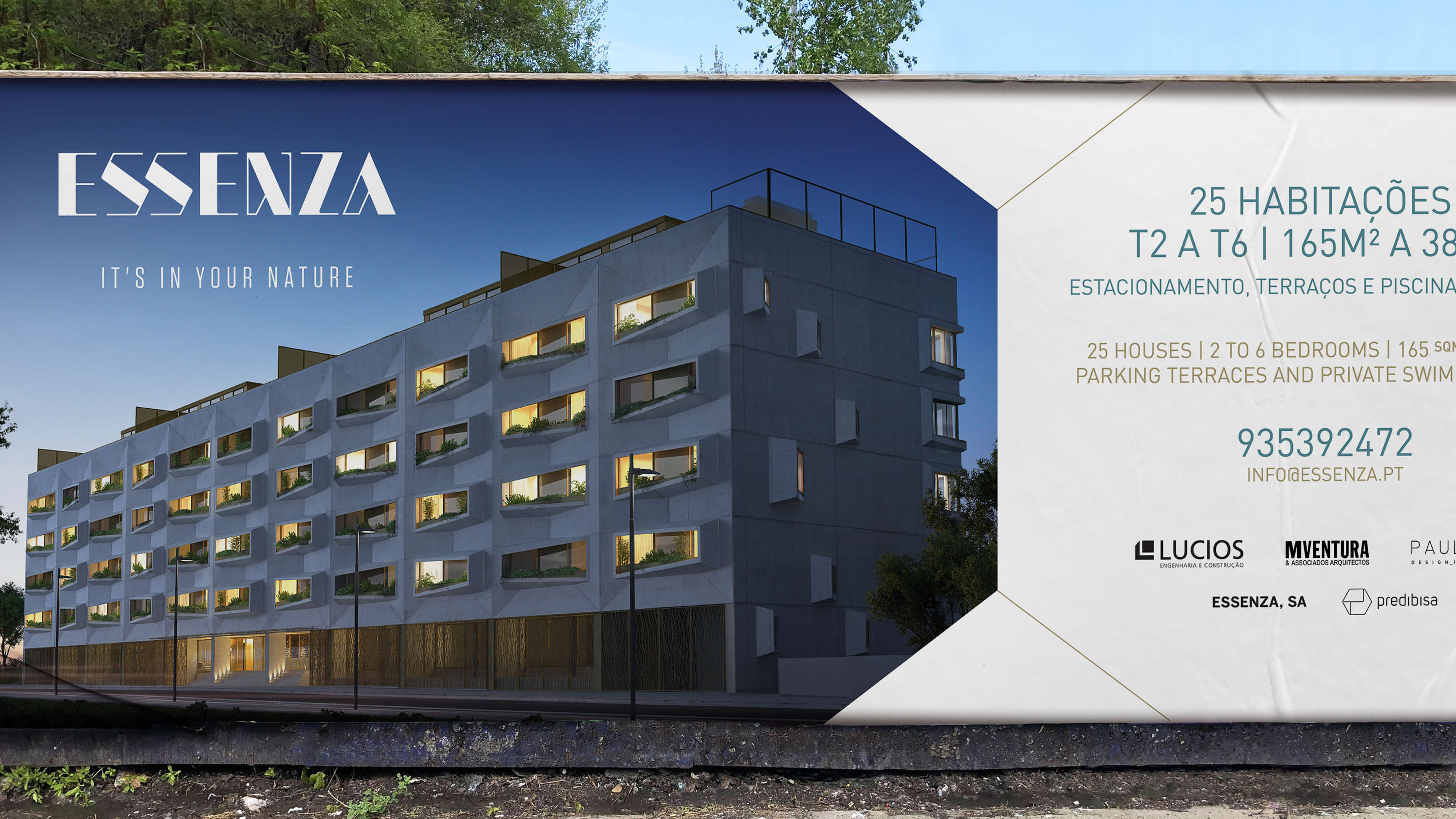
The brand's signature "It's in your nature" creates a unique living experience for every individual. It promotes a healthy, vibrant, luxurious lifestyle. The brand's description - Urban Natural Living - also promotes the meeting of perspectives and the alignment of apparently contradictive natures. Comfort and security meet the rawness of nature and the utmost sophistication of a signature architectural project.
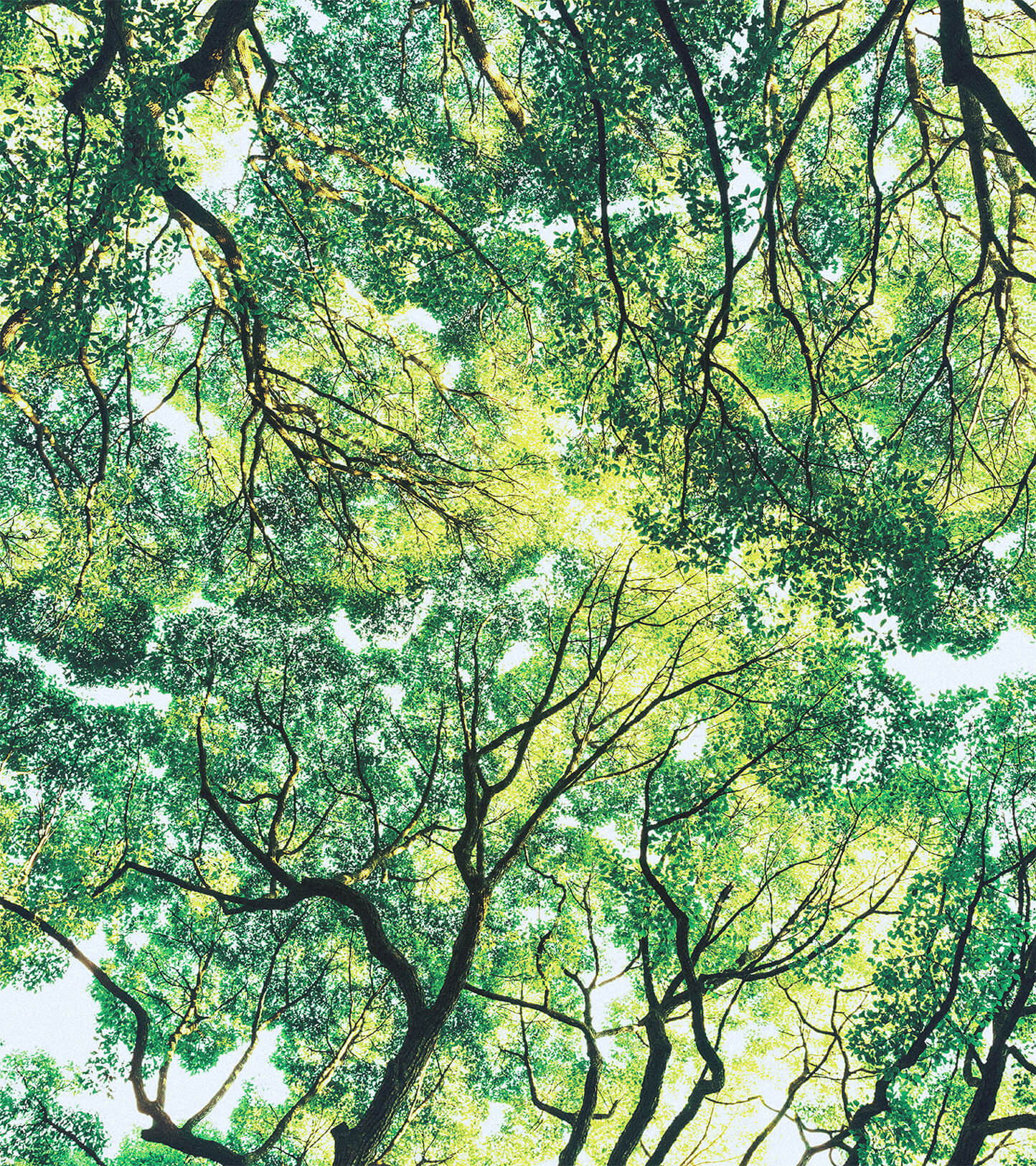
This perspective was our lead for the whole project. We created the necessary mental space to understand that Essenza, due to its nature, was completely aligned with space harmony. A modern architectural project, where straight lines and asymmetrical volumes created a perfect exchange with the natural landscape of the biggest urban park of the country. An exterior-faced, open space, that evoked a natural, active and healthy urban experience.
Our challenge was to define this unique character and create an identity and a lifestyle which were able to reflect these values: harmony, nature, sophistication, emotion and urbanity. To reflect the essential living truth of this project: one that was thought and created to promote the fusion between nature and urbanity, in a premium market segment.
Our target were families, youthful enough to enjoy an urban lifestyle but also seeking an active encounter with nature and sharing a healthy need for open spaces. At Essenza, they can juggle activity and tranquillity, the essential as well as the fun of life. So Blug decided to keep the name of the project, enhancing the author experience and the previous knowledge of the project but bringing it 10 years ahead, looking for the future.
“NATURE CREATES CURVED LINES WHILE HUMANS CREATE STRAIGHT LINES.”
Hideki Yukawa
